Got feedback? Additional questions? Just want to have a friendly chat?
Get in touch!
What is shown on the dwell-time page?
The dwell-time page shows statistics on dwell or wait time:
-
How long on average one stays in selected areas on the map
-
How long each spends individually in different selected areas on the map
Dwell time analysis is sometimes also called wait time analysis or queue time analysis. It has different use cases, such as analyzing how long vessels spend in different anchorage zones, how long people spend in a shopping center, etc.
This page enables you to analyze dwell time and look at aggregate (average) statistics or dive in and analyze dwell times for each entity individually.
Figure 1. Example of a dwell time analysis showing the average time spent in different areas.
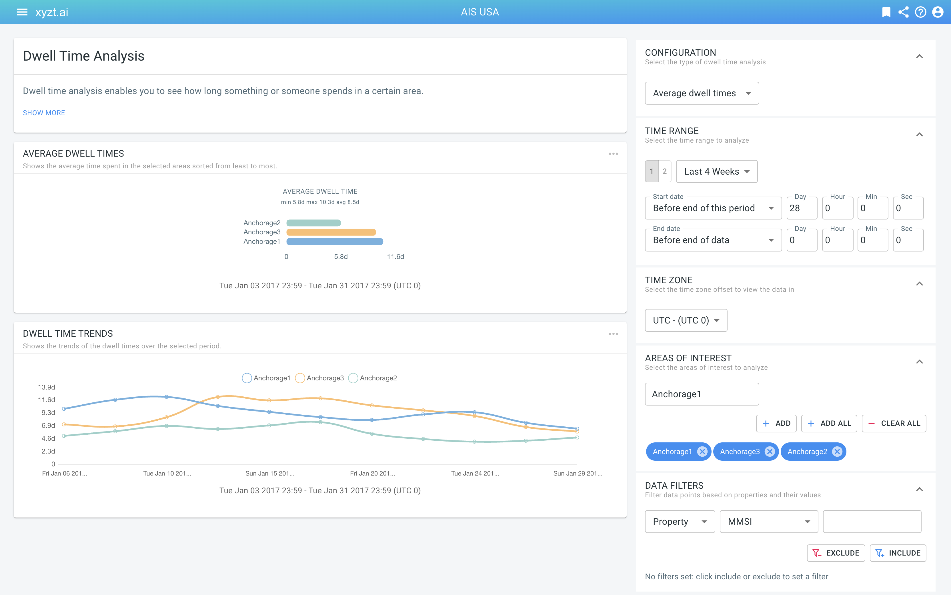
Configuring your analysis
In the top-right corner, in the CONFIGURATION panel, you can select which type of dwell time analysis you wish to use:
-
Average dwell times: This summarizes time spent in each of the selected areas as an average in a bar chart and trends on a line chart.
-
Individual dwell times: This shows a table and sequence diagram where for each individual asset the time entering, exiting, etc. is shown.
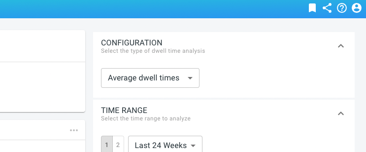
Figure 2. The CONFIGURATION panel allows choosing the type of dwell time analysis: aggregate, or individual.
You can do this analysis for a single time period, or compare two time periods side-by-side and see the difference between those time periods (only available for average dwell times). Here, also, you can configure the time zone, for which areas you wish to perform the analysis, and optionally apply any data record filters.
How to read the average dwell times charts?
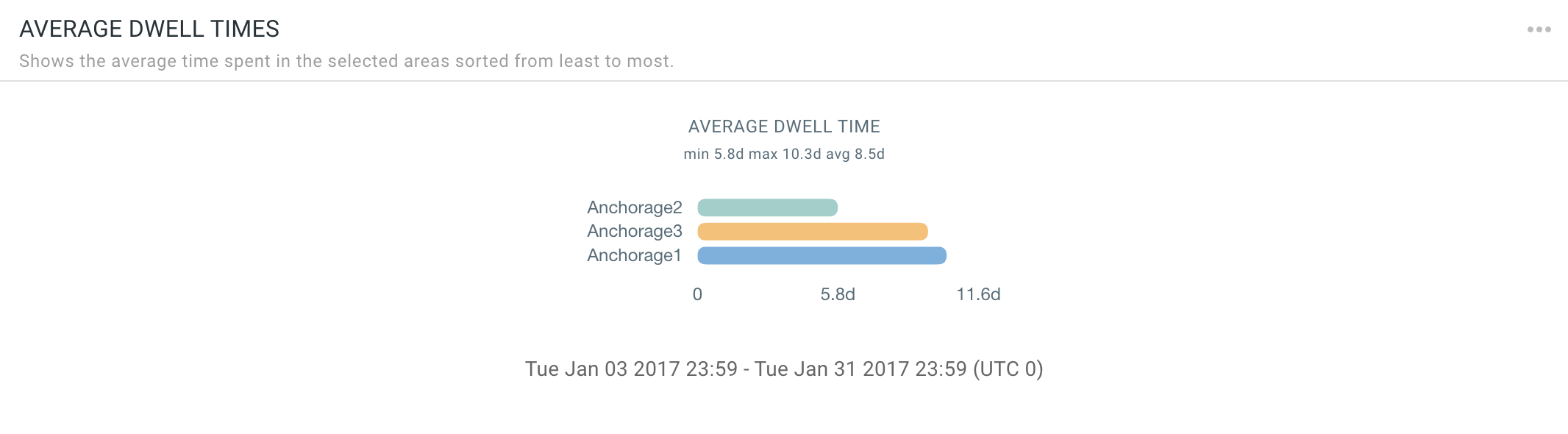
Figure 3. The average dwell time chart. In this example it shows for 3 different areas the average time spent of vessels in those areas.
The average dwell times chart is a rotated bar chart showing for each selected area the average time a person, car, vessel, etc. spent in the region, during the selected time period.
|
The dwell time can be larger than the selected time range.
As an example: A vessel enters a port on April 1st 2022 and leaves again on April 5th 2022. If you set the time range for example to April 3 2022 - April 4 2022, the vessel’s dwell time is reported as 5 days (because the vessel stays 5 days). In fact, its dwell time is 5 days for all time ranges that overlap with April 1st 2022 to April 5th 2022. |
The bar chart is sorted from shortest (top) to longest (bottom) dwell time. When you compare two time periods, each chart is sorted individually.
The difference chart shows the decrease (in green) or increase (in red) comparing the second with the first time period.
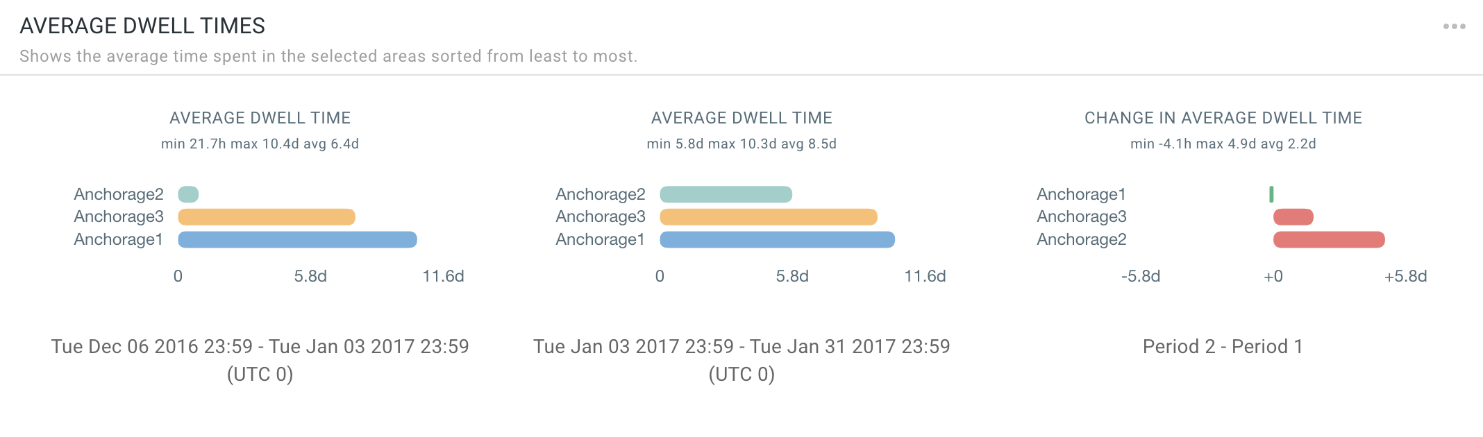
Figure 4. The dwell-time charts of 2 time periods side-by-side, as well as the difference chart
How to read the dwell time trend lines?
The dwell time trends are visualized using a multi-line chart where each line corresponds to one of the selected areas. The horizontal axis is the time dimension, the vertical axis is the dwell time. The line chart covers the selected time region or regions.
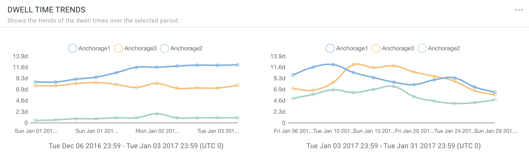
Figure 5. The dwell time trends chart. In this example it shows for 3 different areas how the average dwell time varies over time.
This chart provides more detail on how the average dwell time changes during the selected period. As an analyst you can for example easily see whether dwell times are following an increasing or decreasing trend.
How to read the individual dwell times table?
The individual dwell time analysis is shown as a table where each row corresponds to an entry and exit event for a specific asset and one of the selected areas, overlapping with the selected time period.
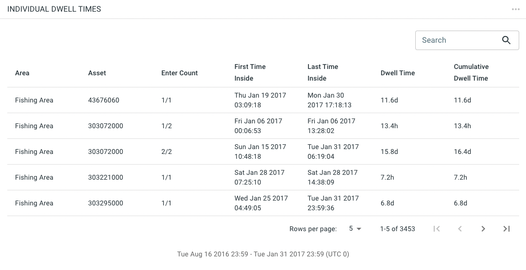
Figure 6. The individual dwell time table. In this example it shows for 4 different areas the individual dwell times.
For example, say that the selected time period is August 16 until Jan 31. Say that a vessel enters a selected Fishing Area multiple times, for example once on Jan 6 and once between Jan 15 and Jan 31. For each of these events, there will be a row showing the following properties:
-
The Area for which the dwell time is computed (e.g., Fishing Area)
-
The Asset ID (e.g., 303072000, a vessel MMSI, or a journey id, or…)
-
Enter Count is a tuple of the form count/total where total is the total number of times the asset entered the area during the time range, and count corresponds to the number of cases it enters the area. E.g., 1/2 means that this is the first time the asset enters the area, out of two cases.
-
First Time Inside shows the time stamp of the first record encountered in the area.
-
Last Time Inside shows the time stamp of the last record encountered in the area.
-
Dwell Time is the difference between the previous two columns and denotes the time the asset spent in the area for this instance.
-
Cumulative Dwell Time shows the total dwell time for this instance (row) and for all previous cases that the asset entered the area.
You can increase the table size, go to the next page, search/filter on the entries in the table and sort the columns in increasing/decreasing order.
How to read the individual dwell times sequence diagram?
Below the table, a sequence diagram is shown. On this chart the horizontal axis is time and each row corresponds to an individual asset. When the asset enters one of the selected areas, a colored region is shown on the chart.
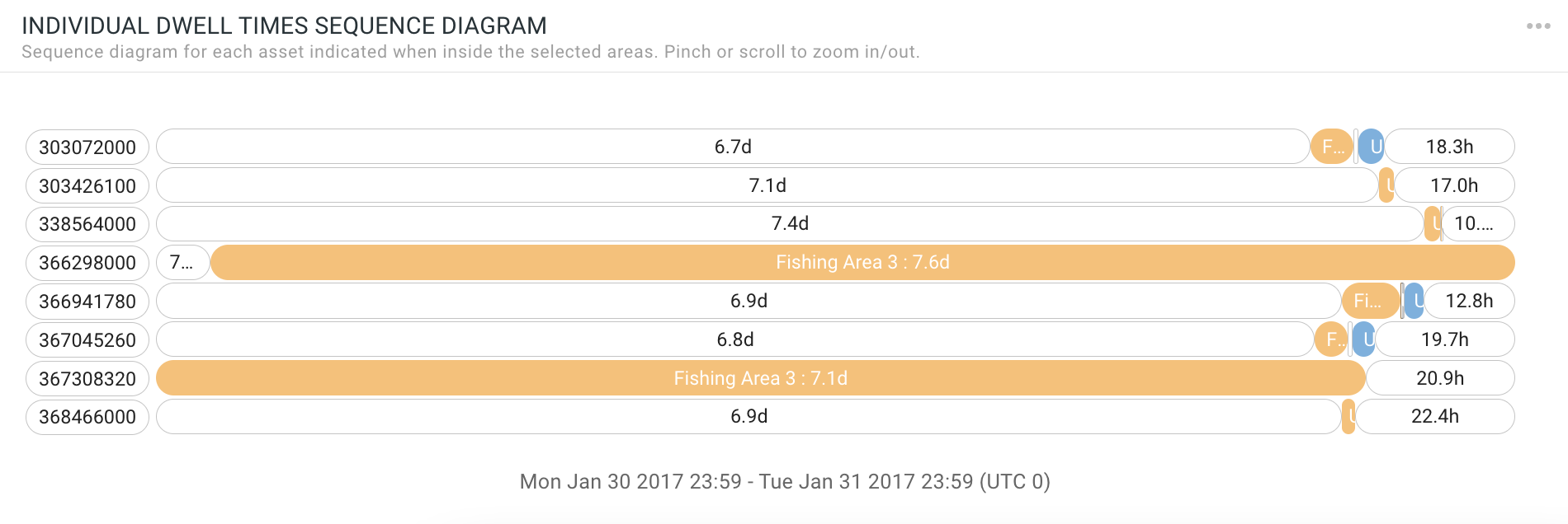
Figure 7. The individual dwell time sequence diagram. In this example it shows for 2 different areas the individual dwell times.
This chart enables easy visual identification of assets entering the same areas at similar time periods. It is a different representation of the data also shown in the table. On the chart one can easily identify two vessels simultaneously spending many days in Fishing Area 3 (orange) and few vessels spend time in Fishing Area 2 (blue).
You can change the timescale by zooming in and out using the mouse scroll wheel or by pinching. You can also drag the chart left and right. There is also a vertical scroll bar if there are more rows than can fit on the screen.
Data requirements
You need a movement data set, where records belong to the same asset that is moving (e.g., a person, a car, a vessel,…). The algorithm handles multiple (re-)entries in the different areas and lists them in the table or averages the different times spent in the bar charts.
Got feedback? Additional questions? Just want to have a friendly chat?
Get in touch!