Got feedback? Additional questions? Just want to have a friendly chat?
Get in touch!
Prerequisites
Before you can perform route analysis, you need:
-
A line network dataset configured with connectivity (start node id and end node id).
-
At least one saved route created by clicking connected segments.
If routes cannot be created or selected, verify the dataset configuration first (start/end node id types).
Opening the route analysis dialog
To open route analysis:
-
Open the visual analytics page.
-
Open the Route Analysis dialog from the Layer Panel. The route analysis icon can be found next to the layer name.
-
Select a route from the “Choose a route” dropdown.
After selecting a route, the dialog loads the analysis visualization and styling controls.
The different route analysis options
Route analysis supports both 1D and 2D analysis modes. The mode changes the visualization and available controls.
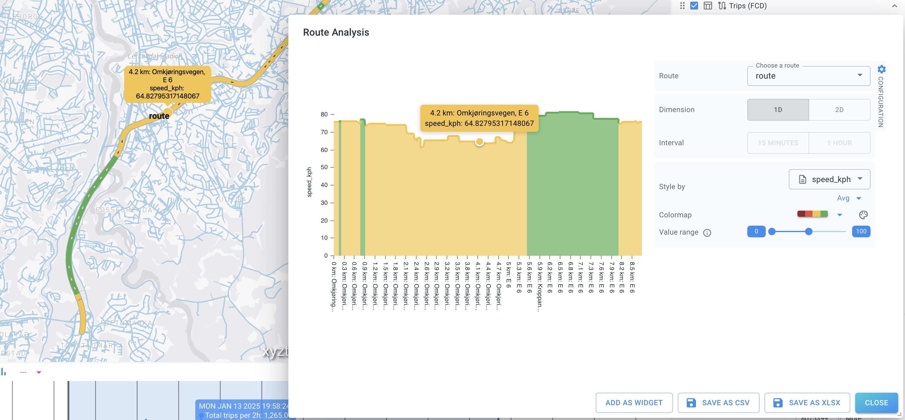
1D analysis (distance along route)
In 1D mode, the visualization shows the selected attribute along the route distance:
-
X-axis: distance along the route
-
Y-axis: value of the selected attribute (e.g.
speed_kph) -
Aggregation: depends on the selected metric (e.g. Avg)
A typical example is styling by speed_kph to see where speeds are lower/higher along the corridor.
2D analysis (distance + time)
In 2D mode, the visualization becomes a heatmap across both route distance and time of day:
-
X-axis: distance along the route
-
Y-axis: time (starting at midnight at the top)
-
Color: aggregated value for the selected metric (for example “Number of trips”)
You can control the time binning using Interval (for example 15 minutes or 1 hour), and choose how the data is aggregated/styled.
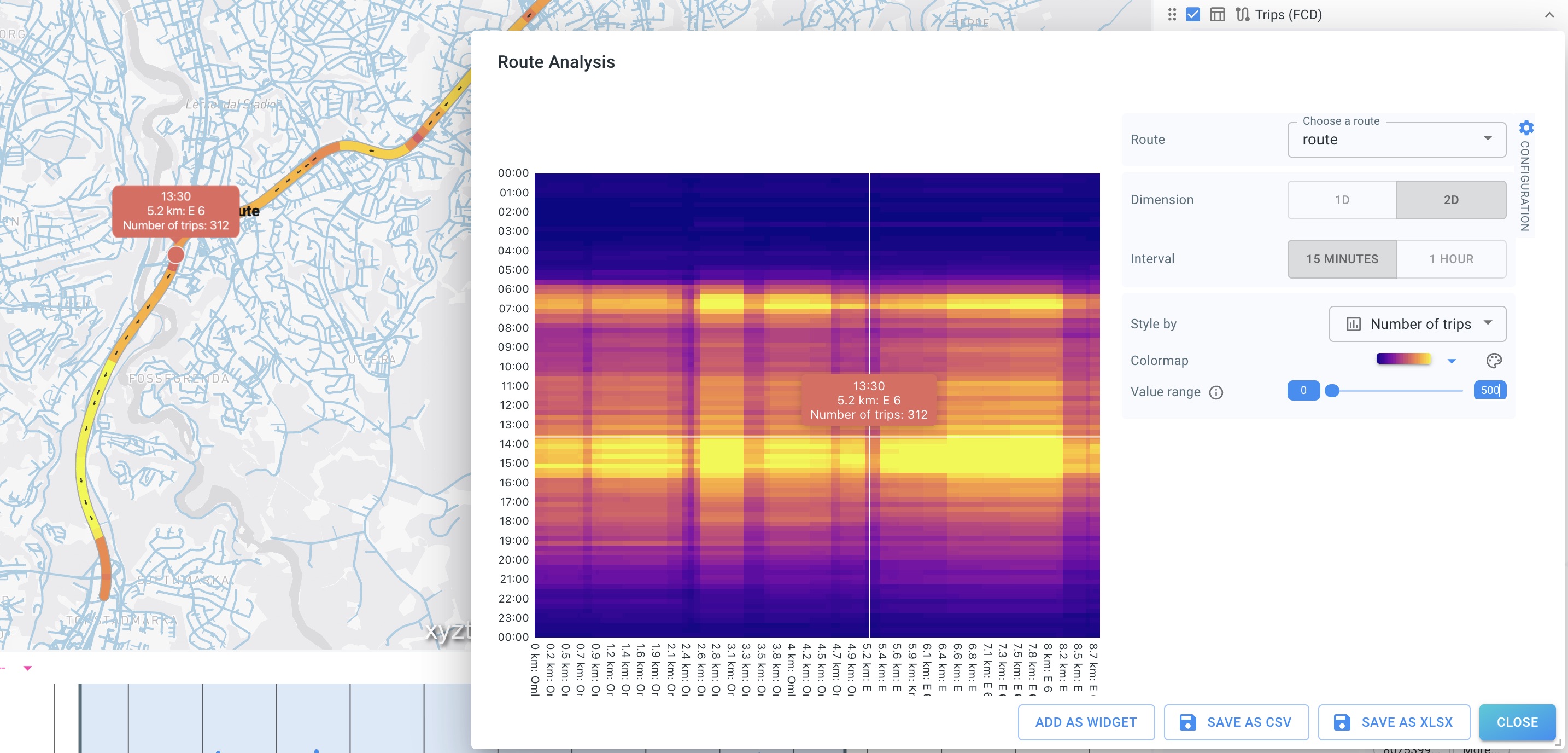
Hover interaction (map and chart)
Inspection is synchronized:
-
Hovering on the route on the map displays the value at that location.
-
Hovering on the diagram/chart displays the value at the corresponding distance/time position.
-
The tooltip and highlight follow the cursor, allowing you to “trace” values continuously along the route.
Styling and value range
The right-side configuration controls include:
-
Style by – choose which attribute to analyze (e.g. number of trips, speed)
-
Colormap – choose how values map to colors
-
Value range – adjust lower/upper bounds mapped into the colormap
Value range is useful to:
-
highlight subtle differences by narrowing the range
-
avoid saturation by widening the range
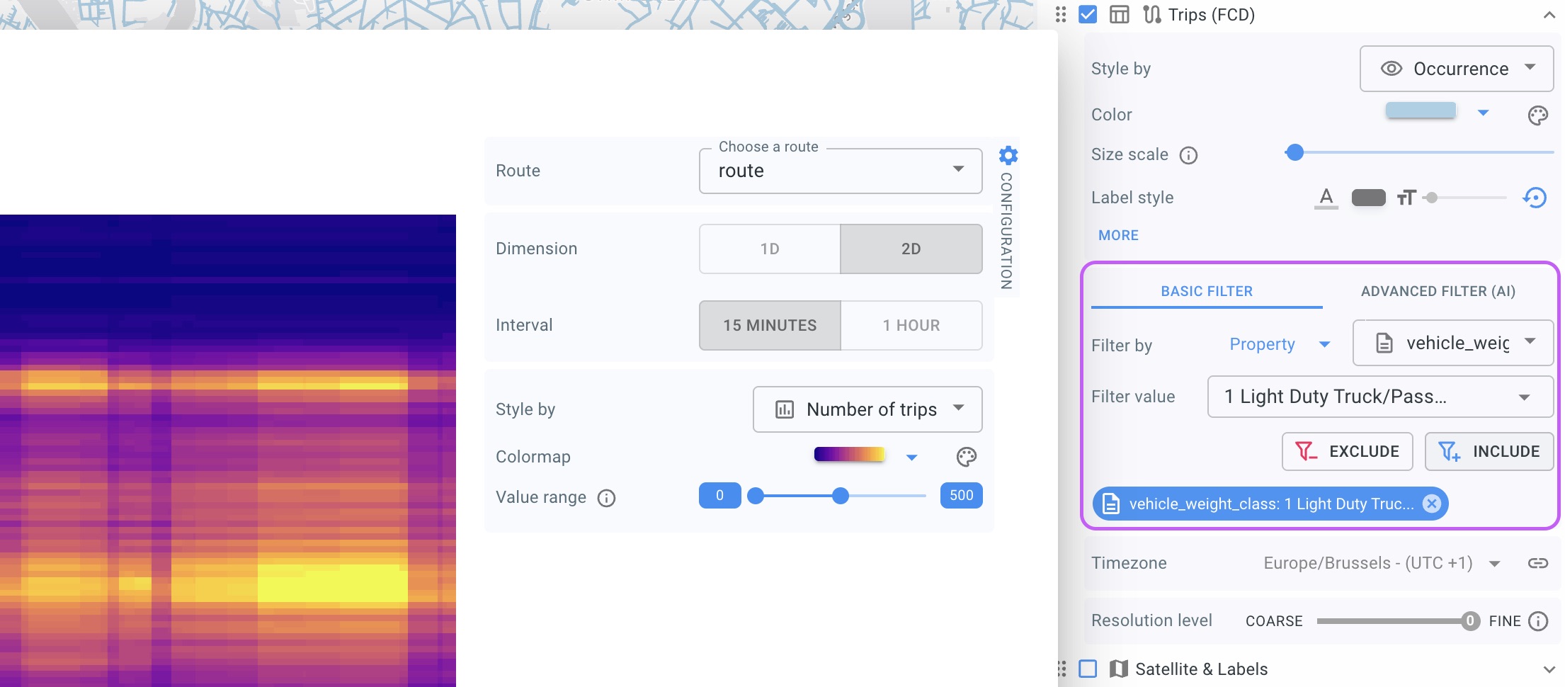
Filtering
You can filter the data records, for instance when you wish to look only at a subset of traffic (e.g., filtering by vehicle_weight_class.). Filtering is performed through the filtering of the corresponding layer.
Creating widgets and exporting data
From the Route Analysis dialog, you can:
-
Add as widget to add the current analysis as a widget on the project’s dashboard
-
Save as CSV to export underlying results
-
Save as XLSX to export to Excel-compatible format
| If you change route, dimension, attribute, colormap, or value range, the widget/export will reflect the current configuration shown in the dialog. |
Got feedback? Additional questions? Just want to have a friendly chat?
Get in touch!