Introduction
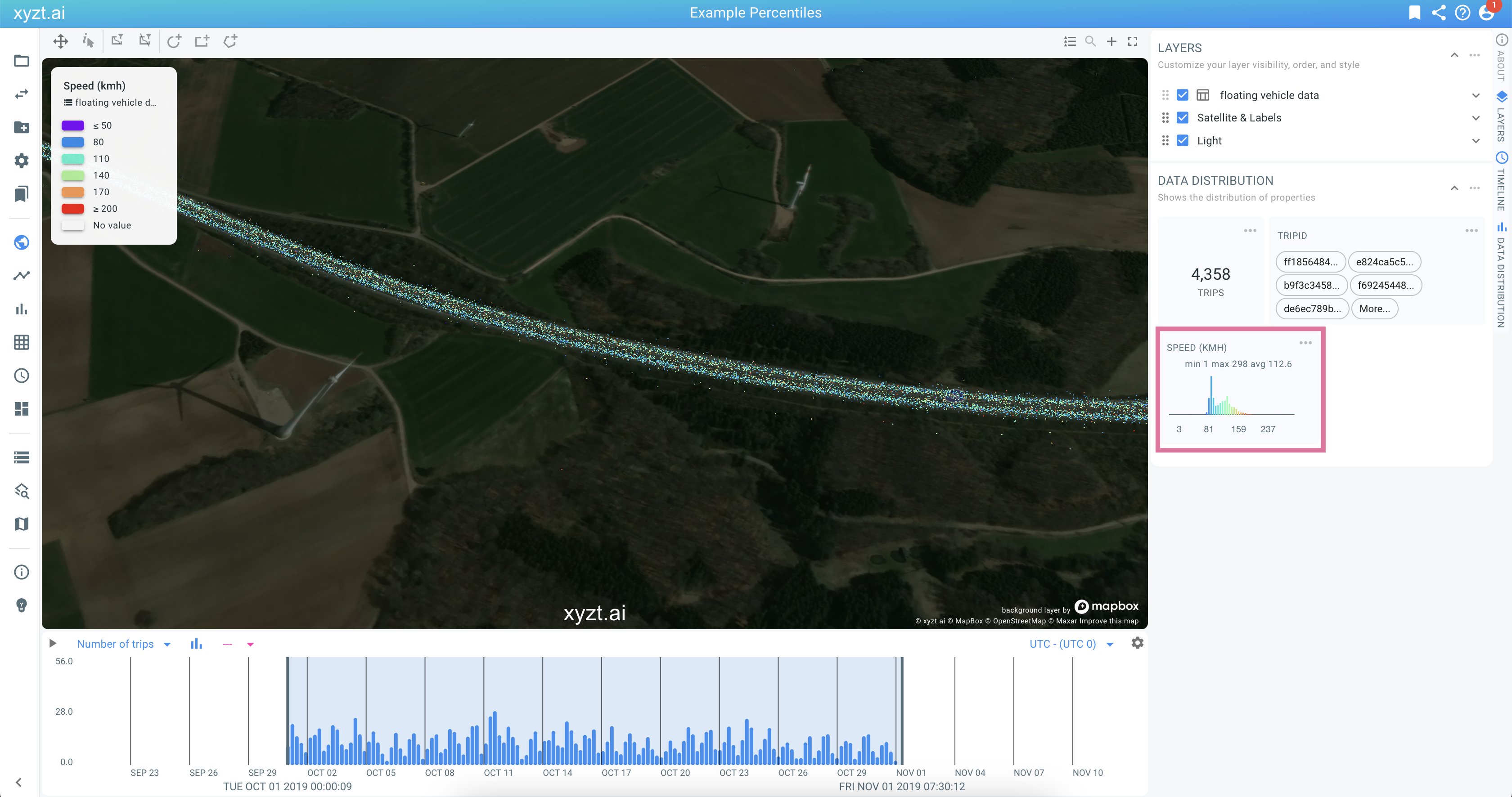
The visual analytics page shows a map, timeline, and bar charts with statistics on your data properties. The latter are shown in the data distribution area, by default on the right side of the page.
When analyzing data, it is sometimes useful to focus your attention to one of the properties, for example the speed property.
This article explains how to put a single data distribution in focus and how to reveal additional information, such as a numeric property’s cumulative distribution, or percentiles.
Focusing on a widget
The widgets in the data distribution area can be singled out and put in focus in 3 ways:
-
By clicking on the title of the widget
-
By opening the context menu by clicking on the 3 dots next to the title and choosing 'Focus on Widget'
-
By right clicking on the widget and opening the context menu and choosing 'Focus on Widget'
In the above example, the analyst is analyzing the speed profile on a highway section in Germany.
Focused numeric widget
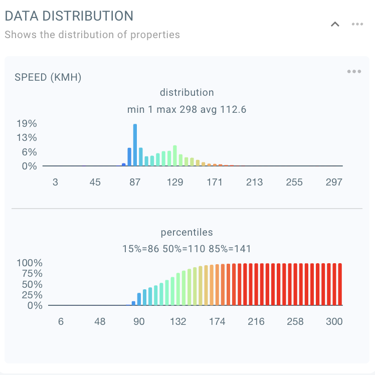
A widget of a numeric property, such as in this example, the speed property, reveals additional information when put in focus.
In addition to the regular distribution, a cumulative distribution is shown with additional information on the property’s percentiles.
In this example, when analyzing speed, the 85% percentile for example shows the speed that 85% of people stay below. This is for example a metric that is often used to assess the safe driving speed: If 85% of people drive 141 kmh or less, like in this example, it can be considered a safe speed for the area at hand.
Disabling focus
You can return to showing all widgets, and exit the focused state, in the same way as you put the widget in focus: by clicking on the widget title, or by going through the widget’s context menu.

