Got feedback? Additional questions? Just want to have a friendly chat?
Get in touch!
What is shown on the trend analytics page
The trend analytics page displays histograms, where the evolution or trend of a numeric property in time is shown. This is the same information as what is shown on the timeline on the visual analytics page.
However, compared to the visual analytics timeline, the trend analytics page:
-
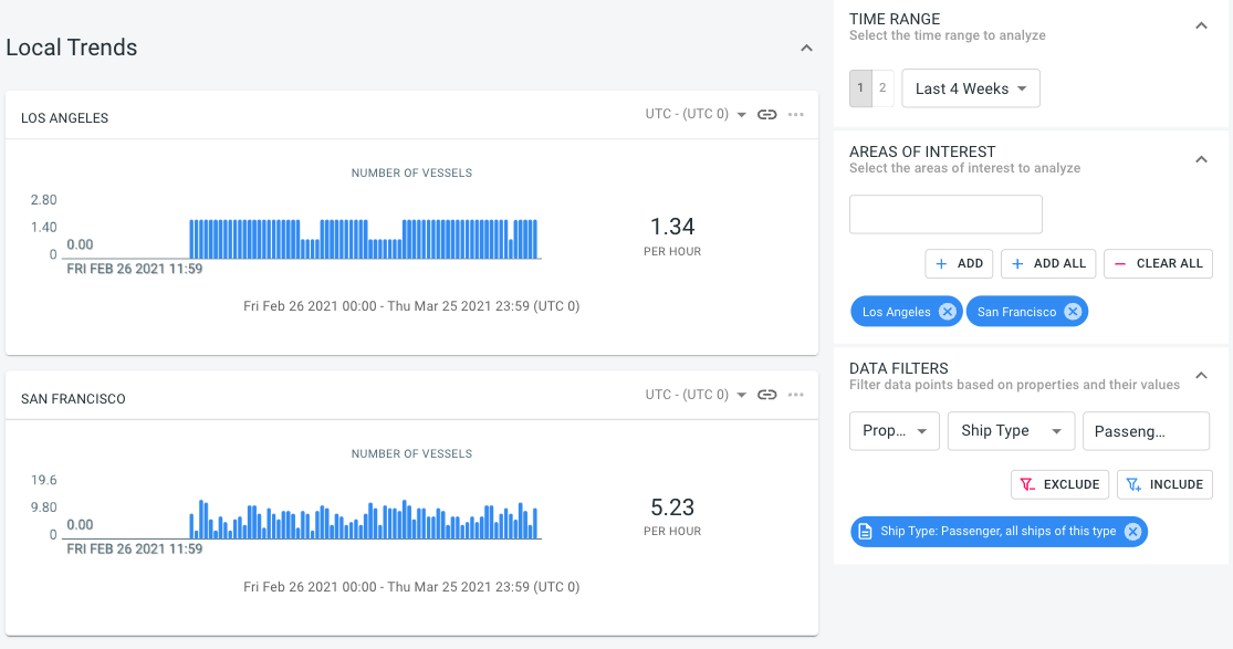
Makes it easy to compare the trend in different regions against each other
Figure 1. Comparing the evolution of a property over time in Los Angeles versus San Francisco -
Makes it easy to compare two time periods against each other, and spotting the differences
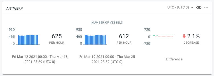 Figure 2. Comparing the evolution of a property during two different time periods
 -
Allows to change the X-axis of the histogram to group by day or hour instead of showing the evolution in time
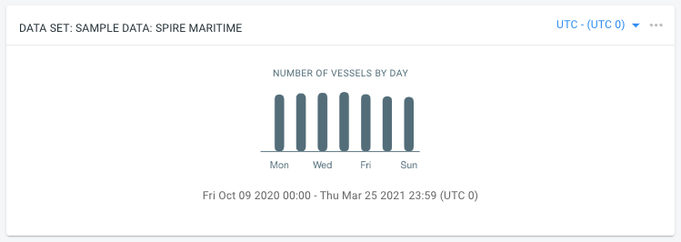 Figure 3. Grouping by day instead of showing the evolution over time
Example use-cases for the trend analytics page include:
-
Comparing footfall traffic in different stores
-
Comparing increase/decrease of business of different terminals in a port
Got feedback? Additional questions? Just want to have a friendly chat?
Get in touch!