The categorized histogram functionality is not yet available for datasets created by connecting to a database.
Got feedback? Additional questions? Just want to have a friendly chat?
Get in touch!
What are categorized trends?
It is the same as the regular trends, but the resulting histograms are divided into multiple categories.
For example, you want to see a histogram of the traffic through a specific area, but you’re interested in:
-
Car traffic
-
Bus traffic
-
Truck traffic
On the regular trend analytics page, this would require 3 separate requests where you adjust the filter each time: one time for cars, one time for buses and the third time for trucks.
On the categorized trend analytics page, you can create a category for your vehicle type, and a single request will return a histogram with 3 columns: one column with the histogram for the car traffic, one for the buses and a third one for the trucks.
UI overview
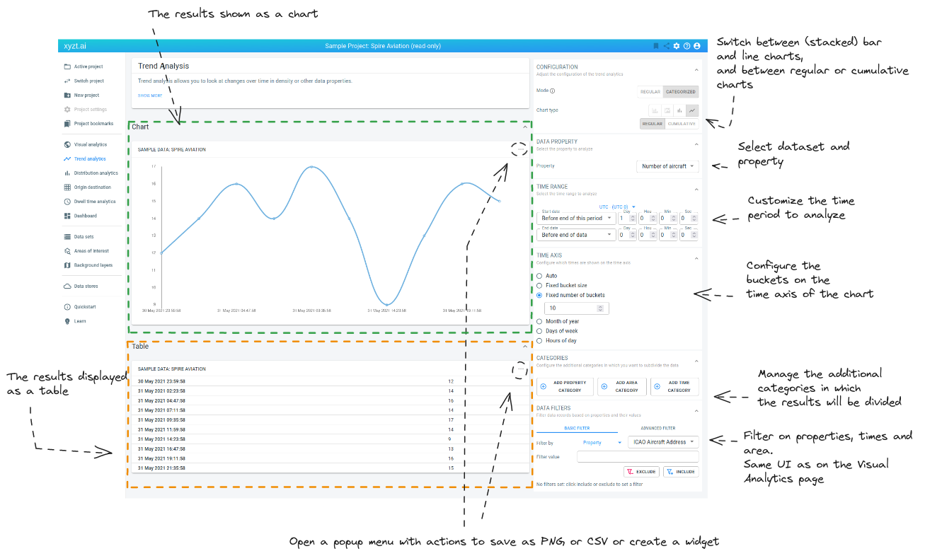
Figure 1. Overview of the Categorized Trend Analytics page UI
Going clockwise, the trend analytics page has the following UI elements
-
Change chart type: toggle between the different types of chart (bar, line, stacked bar, stacked lines), or between regular and cumulative histograms. It depends on the number of categories which chart types are available.
-
Select data set and Y-axis property: allows you to adjust the property that is plotted on the Y-axis on the histograms. When your project contains multiple datasets, there is also a dropdown to select the dataset (not shown in the screenshot).
-
Time period customizer: choose which time period to show on the histograms. The selected timezone controls in which timezone the filters are interpreted as well as the timezone used to show the timestamps on the charts and table.
-
Time buckets configuration: configure the time buckets on the X-axis.
-
Manage categories: you can create, edit and delete categories.
-
Attribute, area and time filters: you can filter the records that are used to calculate the histograms. For example, it allows to only analyze the trend over time for "Cargo vessels" and "Fishing boats" instead of all vessels.
You can filter on properties in your data, as well as some additional time filtering (days of week, hours of day, months of year) or area filtering.
-
Histogram pop-up menu: shows a pop-up menu with additional options. You can access this pop-up through the
…button in the top-right corner of the card, or by right-clicking on it. The pop-up offers the following options.-
Export the data behind the histogram to a
.csvfile. -
Add the histogram chart to the dashboard (only available for the chart, not for the table).
-
Save an image of the histogram chart to a
.pngfile (only available for the chart, not for the table).
-
-
Table results: the histogram in tabular format
-
Chart results: the histogram displayed as a chart
Got feedback? Additional questions? Just want to have a friendly chat?
Get in touch!