Got feedback? Additional questions? Just want to have a friendly chat?
Get in touch!
|
This article only applies to movement data
This article is only relevant when working with movement data, not when working with time series data. You can read more about the differences between the two in this article. |
Working with gridded data, trajectory data and realtime data
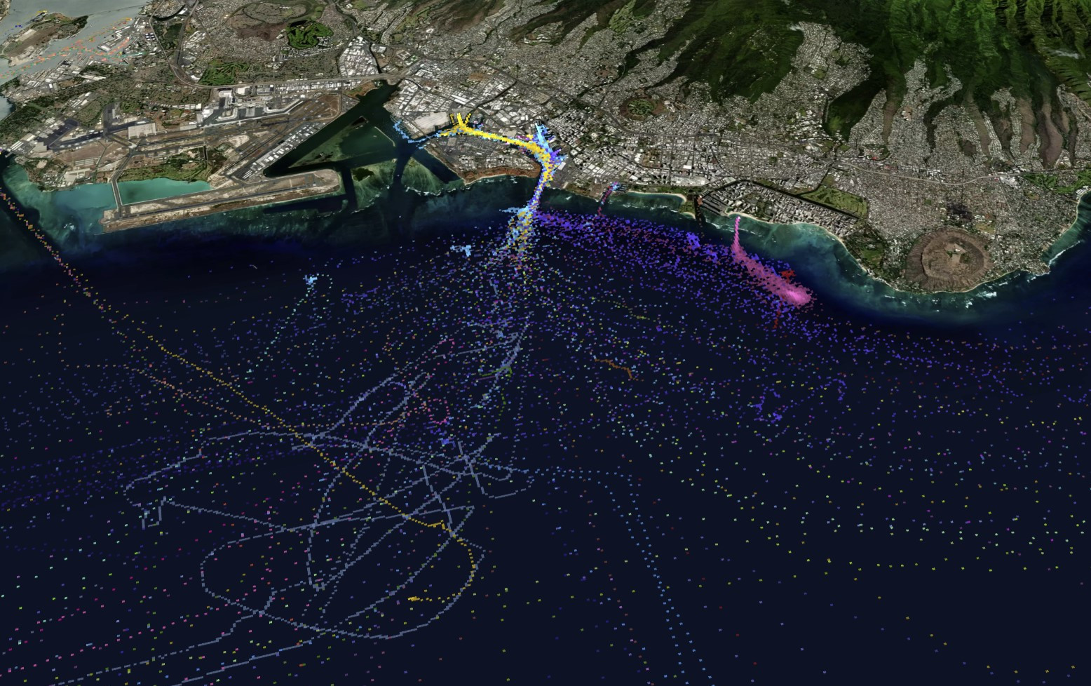
By default, your records are shown in a gridded way. When zoomed out, the grid cells denote larger areas on the map ( e.g., 1km x 1km), when zoomed in the data points are aggregated in smaller cells (e.g., 20m x 20m). This gridded data representation has many benefits:
-
It allows quick aggregation by counting the number of records in a cell
-
It allows multi-resolution representations
-
It shows the data as is, without assuming points are connected to one another
-
Scales easily to multiple billions of records
Figure 1. Visualizing data using the gridded data representation
As location records of the same asset are related to one another, they can be connected to form trajectory lines.
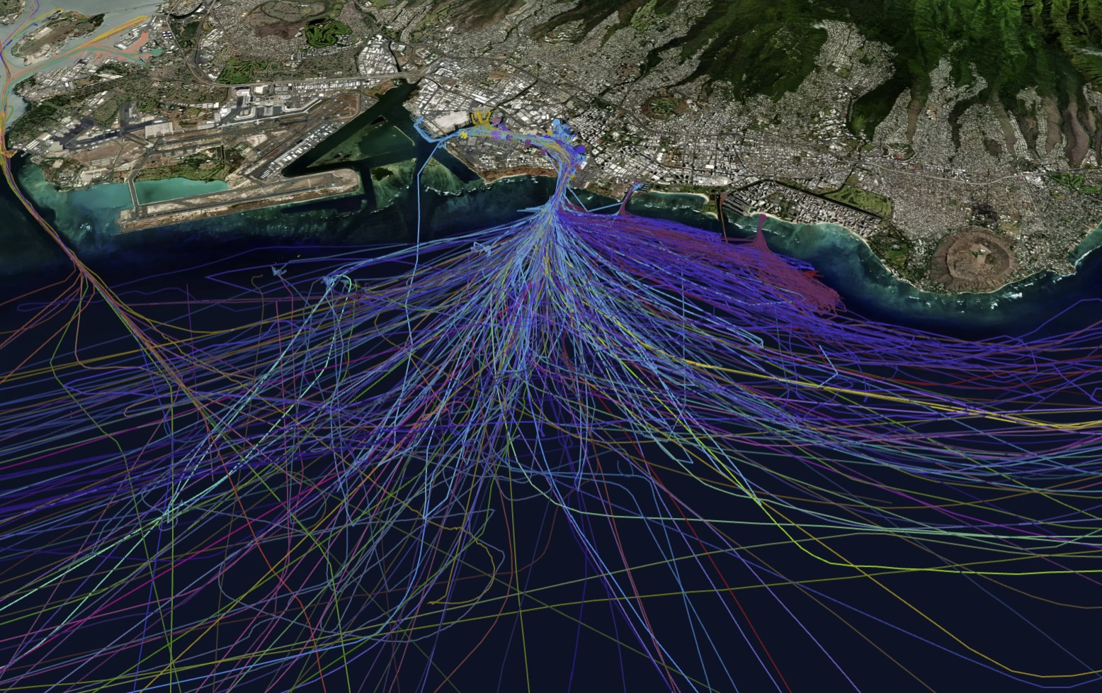
Figure 2. Visualizing data using the trajectories data representation
You can switch between gridded data handling and trajectories data handling using the selection input in the Layers panel.
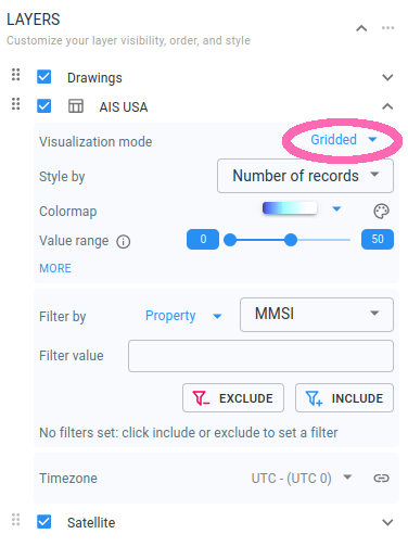
Figure 3. Select the desired data representation in the Layers panel. Only available when there are multiple data representations available for the data set.
You can also choose to show the position at the end of the time interval on top of the trajectory by activating the icon option in the Layers panel.
Figure 4. Trajectory of a ship where the position of the ship is represented by the ship icon
When selecting Realtime, each asset is shown at its last reported location.
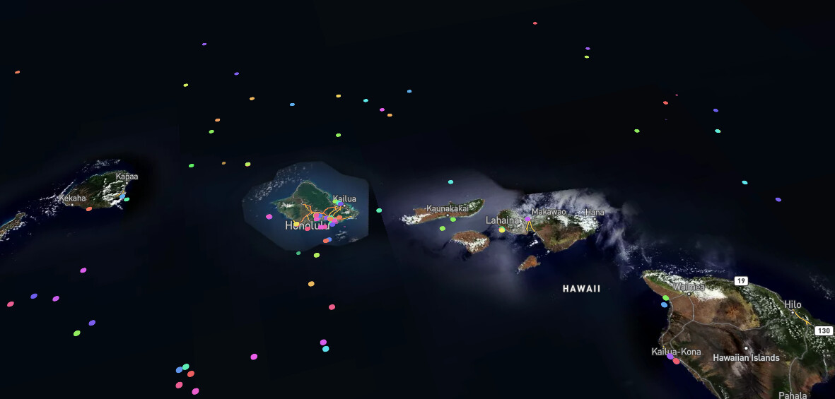
Figure 5. Visualizing data using the realtime data representation
You can change the icon representing the position in the Layers panel for both the trajectories and realtime data representation.
Figure 6. Change the position icon in the Layers panel
Some icons require that the data contains special properties like a heading or asset dimensions to be present in the data. When missing (or missing for a specific asset), the platform will fall back to the circle icon. See the Data properties file syntax article for more details on how to include those properties.
|
Data will automatically update
When pushing/or uploading new data the map (and timeline and attribute) views are automatically updated. This allows you to have an always up-to-date view, for example, when looking at real-time data. |
Got feedback? Additional questions? Just want to have a friendly chat?
Get in touch!