Got feedback? Additional questions? Just want to have a friendly chat?
Get in touch!
Available parts
- Goal
- Roadworks, traffic diversions, and floating vehicle data
- Setting up a traffic flow analysis project
- Analzying traffic flows using basic filters (current)
- Analzying traffic flows using advanced filters
- Further reading
Step 3: Introduction to data filtering
A big part of an analyst’s task is identifying what is happening in the real world. In the case of floating vehicle data analytics this means understanding traffic flows.
However, data sets, such as INRIX trips data, cover the entire flow of traffic: between all cities, heavy and light traffic, traffic on highways and small roads. Note that by entire we do not mean that it captures every single vehicle, instead we mean that the floating vehicle data samples the flow of traffic everywhere and every time and with statistical relevance, i.e., a sufficiently high number of vehicles is captured.
Starting from this data set, covering the traffic everywhere, analysts often need to look at subsets of data:
-
Only the light vehicle traffic
-
Only the traffic during the morning commute
-
Only the traffic passing through Münich
-
Only the traffic that stands still
-
Etc.
Hence, a core concept of data-driven analytics is data filtering. And as you can imagine this entails filtering on data attributes, and filtering on the spatial and temporal dimensions.
Step 4: Using basic traffic flow filters
As an exercise, let’s do some basic data filtering using the data set that we attached to our newly created project.
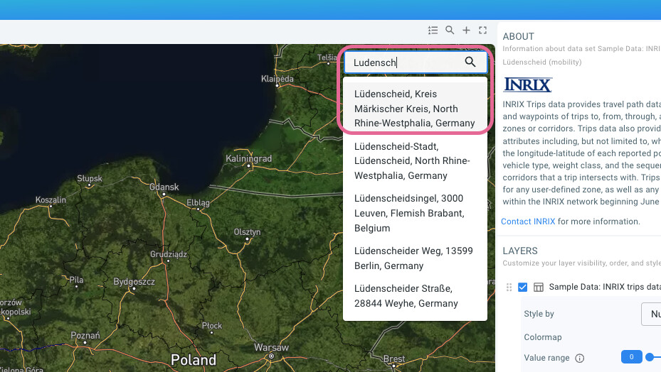
-
Enter
Ludenscheidin de search box at the top right of the map and hitenter
Figure 1. Using the search box to navigate to the Lüdenscheid area.
-
The map now fits on the region around Lüdenscheid
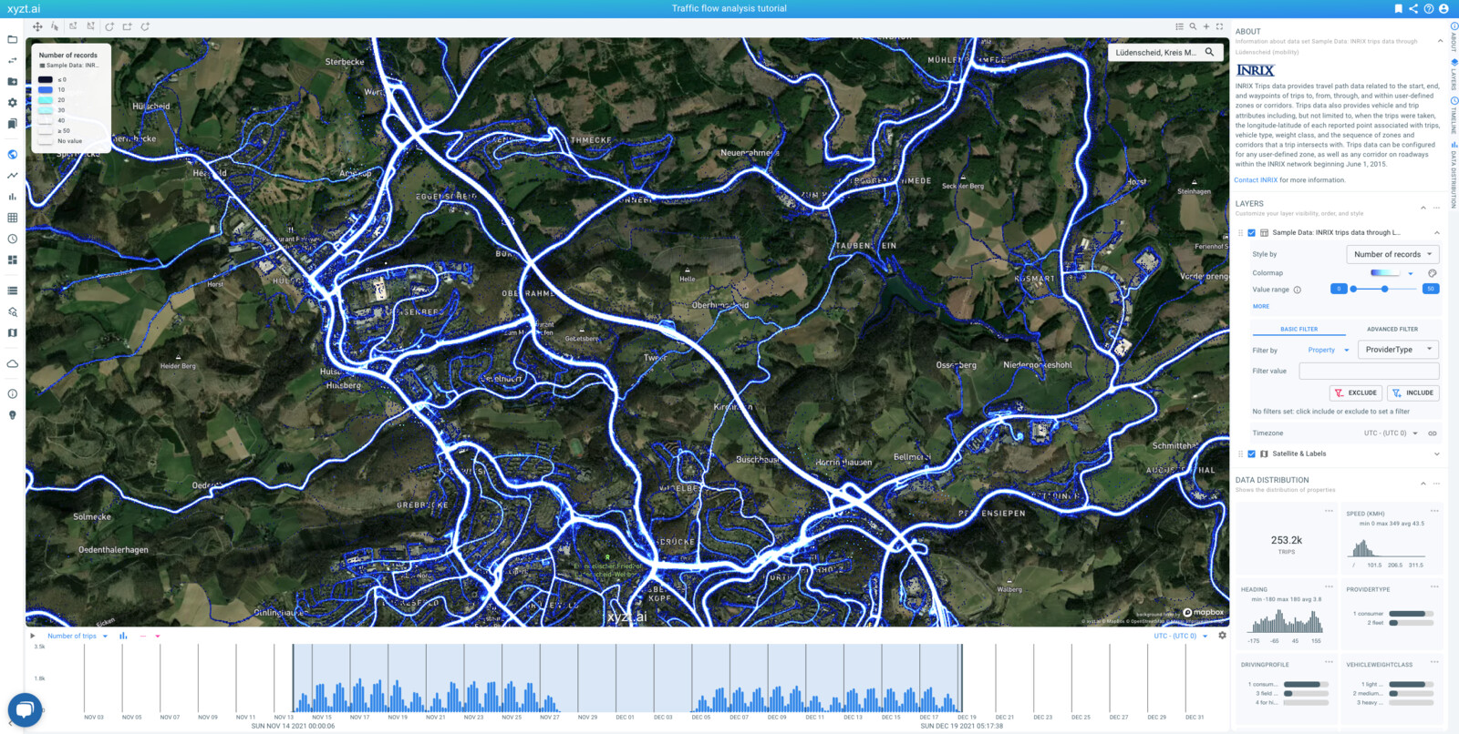
Figure 2. The Lüdenscheid area.
-
Now zoom in on the A45 as in the screenshot below
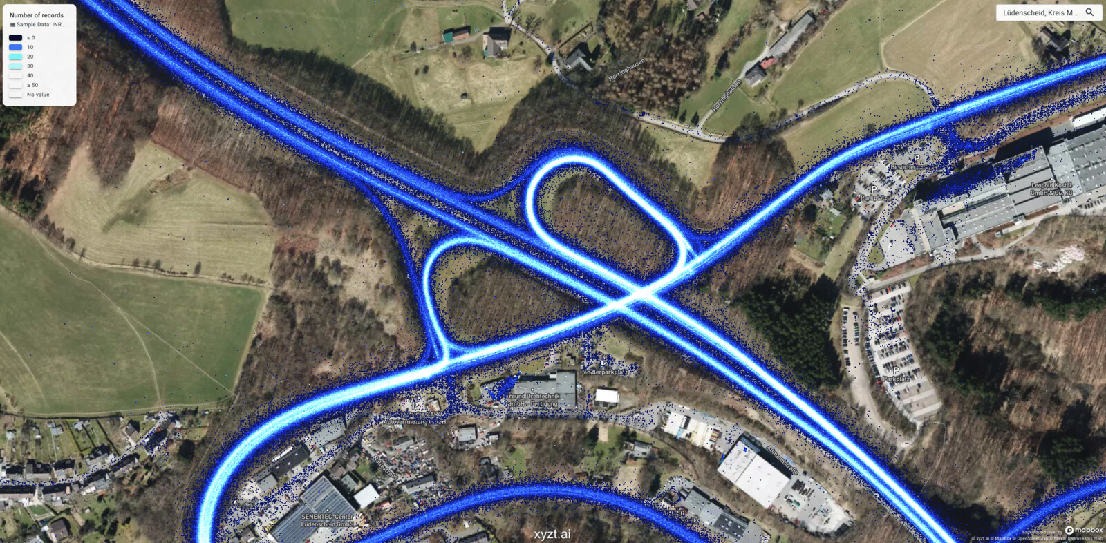
Figure 3. Last accessible exit on the A45 near the Lüdenscheid area.
-
Every single dot that you see is a GPS record of a floating vehicle trip
-
This is the last exit from the south before the closed highway section
-
If you navigate north along the highway you will pass the demolished Rahmede bridge
-
Zoom out again so that the entire highway section is visible again
-
-
On the timeline at the bottom of the screen, move the vertical line on the left side to around December 4.
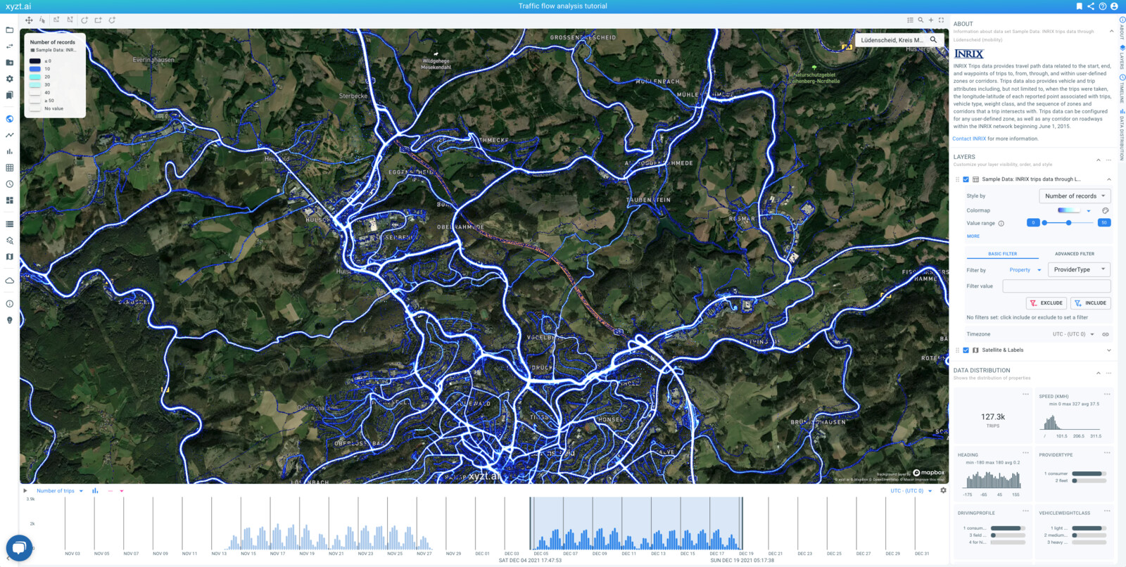
Figure 4. Looking at the last 2 weeks.
-
Notice how the map updates and that there (almost) no GPS waypoints on the closed highway section
-
The ones that are there are most likely from service vehicles or construction workers
You maybe did not realize, but in the above steps, we were constantly filtering the data.
Step 4.1: Filtering on the temporal dimension
In the last step above, by moving the time range slider to December 4, you performed temporal filtering. I.e., by doing so we focused our analysis only on the last two weeks of data, i.e., the weeks after the closure of the highway bridge.
There are a number of ways to filter data temporally:
-
By moving the range slider on the timeline, dragging the whole time window, or only the left and right.
-
By zooming in and out on the timeline using the scroll wheel. Zooming in reduces the time range, zooming out expands it.
-
By clicking on the wheel icon on the right side above the timeline and setting a time range. Time ranges can use absolute dates or relative offsets compared to the beginning and end of the data set.
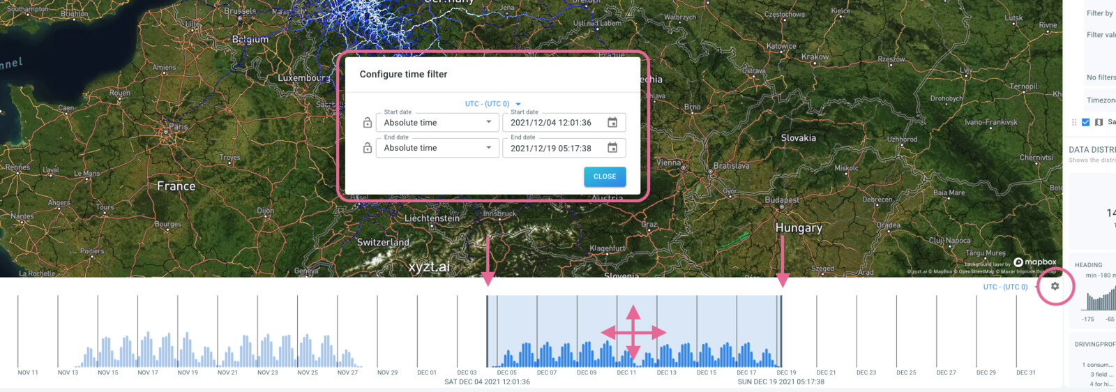
Figure 5. Time range filtering by manipulating the range slider on the timeline or by going through the settings dialog.
The above filters enable you to focus on a continuous time period, e.g., from December 4 2021 until December 16 2021. With such time range filter, you cannot focus your analysis only on the morning commute. Therefore, there are additional temporal filters:
-
By filtering on Hours of the day: i.e.,
0,1,2,… -
By filtering on Days of the week: i.e.,
1for Monday,2for Tuesday,… -
By filtering on Months of the year: i.e.,
1for January,2for February,…
Let’s filter on the weekdays during our December period:
-
On the filters panel on the right side of the screen:
-
Select
Timenext to Filter by -
Select
Days of the weekin the select next toTime -
Adapt the Filter value range slider to the range
1to `5 -
Click on the INCLUDE button to add the filter and include only records with weekdays Monday till Friday.
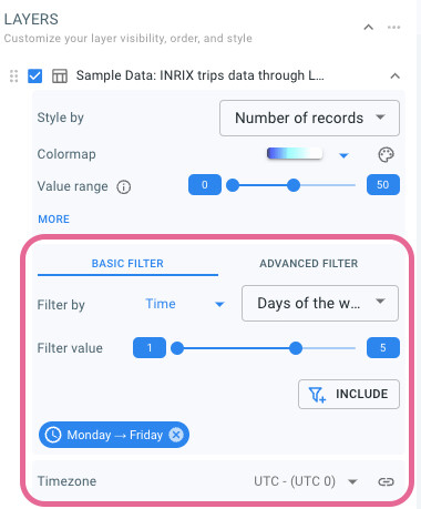 Figure 6. Day of week filtering.
-
Note how after setting the filter, the map, timeline, and data statistics update, only taking into account the records on weekdays. As a result we now have two temporal filters in place:
-
The time range filter covering two weeks in December
-
The time filter covering only the weekdays
Both filters are combined with a logical AND, meaning that a record is retained if and only if it complies with both filters.
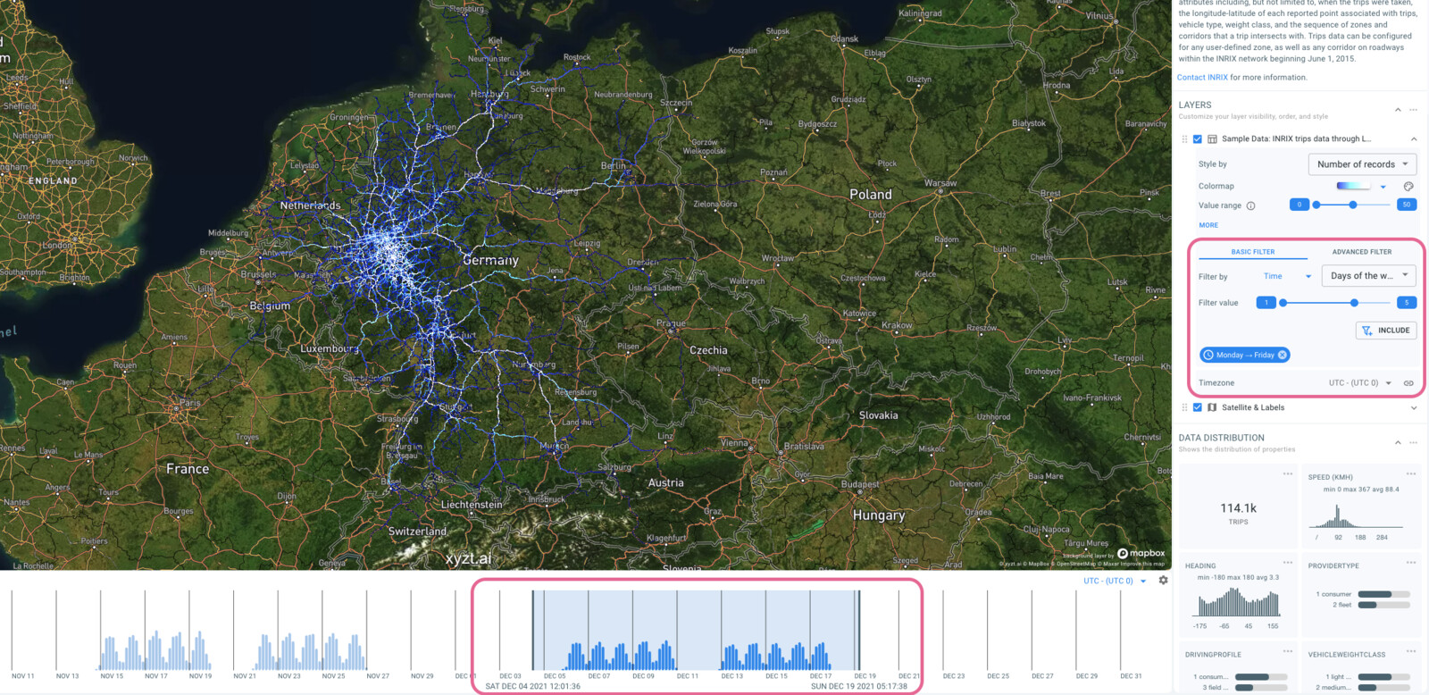
Figure 7. Resulting time filtering.
Step 4.2: Filtering on data properties
Now that you know how to filter on time, let’s also filter on two data properties:
-
On the same filters panel next to Filter by select
Property -
Next select the property
ProviderTypeand the value1 consumerand click on INCLUDE
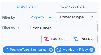
Figure 8. Filtering on a data property
ProviderType.You are now looking at all consumer traffic in December during weekdays.
Let’s further filter using another data property:
-
On the same filters panel next to
PropertyselectSpeed (kmh) -
Next to Property value change the range slider to the range
0-10 -
Press INCLUDE to set this speed filter
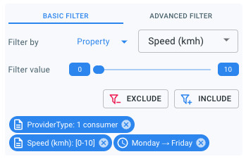
Figure 9. Filtering on a data property
Speed (kmh).Both property filters are now also combined with a logical AND: You are now looking at all slow consumer traffic during weekdays in December.
Let’s zoom in on the hotspot area on the map. You can now see all areas where regular cars are in slow traffic during those weekdays.
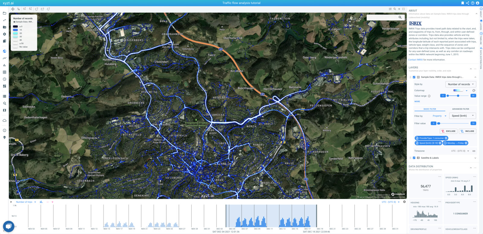
Figure 10. Slow consumer traffic during weekdays in December.
|
In this tutorial we focus on data filtering. Another way that analysts discover insights is by using different visualizations, such as for example styling the data on the map by a data property such as velocity. This is of course also possible and feel free to experiment with the Style by section in the layers panel. |
Step 4.3: Spatial filtering
To conclude the basic filtering part of this tutorial, let’s also learn about spatial filtering.
Spatial filtering removes or retains records that are in one or more specific areas on the map. For example, an analyst might want to look only at traffic in the city center, and ignore the traffic outside.
The platform supports many different spatial filters:
-
Inside: retains only the waypoints inside the area
-
Outside: retains only the waypoints outside the area
-
From: retains only the waypoints of the trips inside the area and after the trip leaves the area again
-
Strict from: retains only the trips and all their waypoints for the trips that start in the area (i.e., the first waypoint is in the area)
-
To: retains only the waypoints of the trips inside the area and before the trip enters the area
-
Strict to: retains only the trips and all their waypoints for the trips that end in the area (i.e., the last waypoint is in the area)
-
Through: Retains only the trips and all their waypoints for trips that have at least one waypoint inside the area
-
Not through: Retains only the trips and all their waypoints for trips that never enter the area (i.e., there is not a single waypoint inside the area)
The areas to filter on can be drawn using the drawing controllers above the map. The platform supports drawing of circles, boxes, and polygons. You can also upload shapes as GeoJSON and SHP files and use them during filtering.
|
The map itself also serves as a spatial filter. This means that the bounds of the area that you are looking at serves as an Inside filter and is continuously applied when zooming in or panning the map. You will notice that the timeline updates and the data distribution statistics update while doing so. This enables you as an analyst to interactively narrow your focus on the area of interest. |
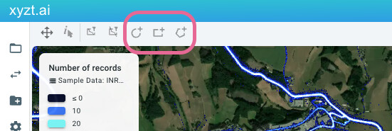
Figure 11. Shape creation controllers.
Let’s try some of these spatial filters. To start afresh, reload the page and search for Ludenscheid like before. This should be what you are looking at:
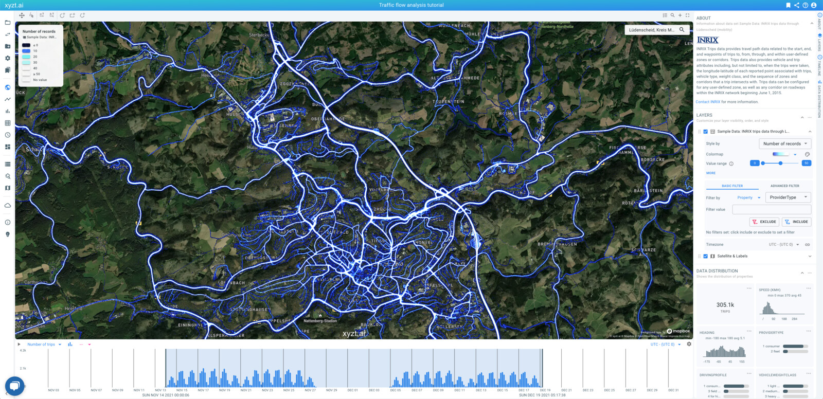
Figure 12. Lüdenscheid area with no filters and entire time range.
Follow these steps to analyze how traffic flows from south to north over the A45 near Lüdenscheid:
-
Zoom in on the last exit south of the closed highway section.
-
Draw a polygon over the A45 south of this exit as in the screenshot.
-
Click to add points, double click to end the drawing.
-
After the popup appears provide the name
Southand immediately check the box to use this shape as an area filter of typeFrom.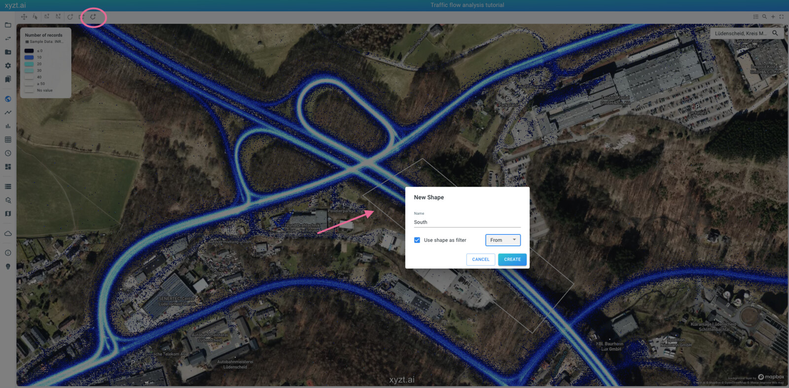 Figure 13. Polygon
Southover the A45 south of the highway closure.
-
-
Now pan the map to move the viewpoint to the exit just north of the closed section.
-
Draw a polygon over the A45 north of this exist as in the screenshot.
-
Click to add points, double click to end the drawing.
-
After the popup appears provide the name
Northand immediately check the box to use this shape as an area filter of typeTo.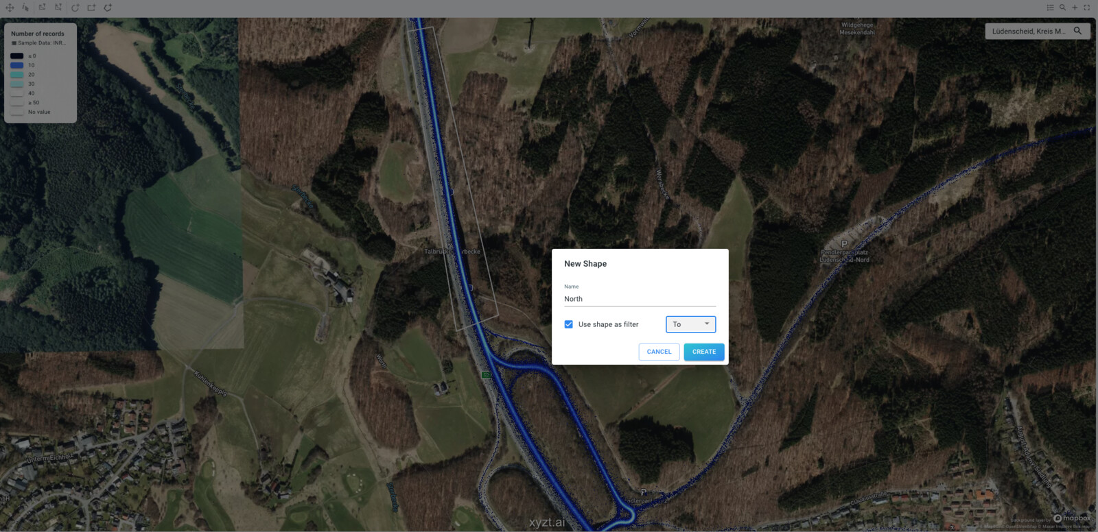 Figure 14. Polygon
Northover the A45 north of the highway closure.
-
-
Now zoom out again to see the entire Lüdenscheid area.
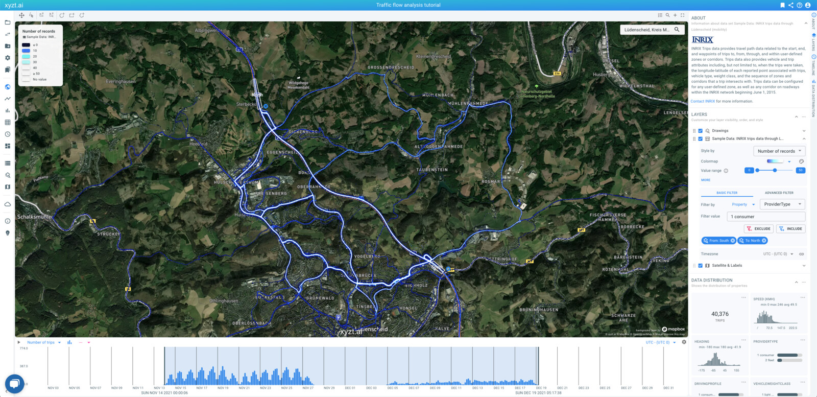
Figure 15. Traffic from
South to North.We are now looking at all traffic coming from the south on the A45 and continuing their journey to the north area. In a normal situation, most of this traffic should be on the A45. However, because the A45 is closed since December, during this period traffic flows on the local roads.
In this case we applied two spatial filters: From and To and they are combined in a logical AND fashion: all traffic coming from South AND driving to North.
Let’s compare the situation before with during the closure using following steps:
-
Add a second map and timeline by clicking on the '+' button on the top right of the map.
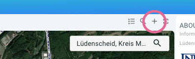 Figure 16. Creating a second map.
 -
Unlink the timelines by clicking on the link button on the top right of the timeline.
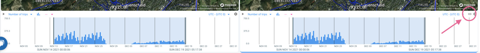 Figure 17. Unlinking the two time range filters.
 -
Focus the left map on the first two weeks (i.e., the situation before).
-
Focus the right map on the last two weeks (i.e., the situation after).
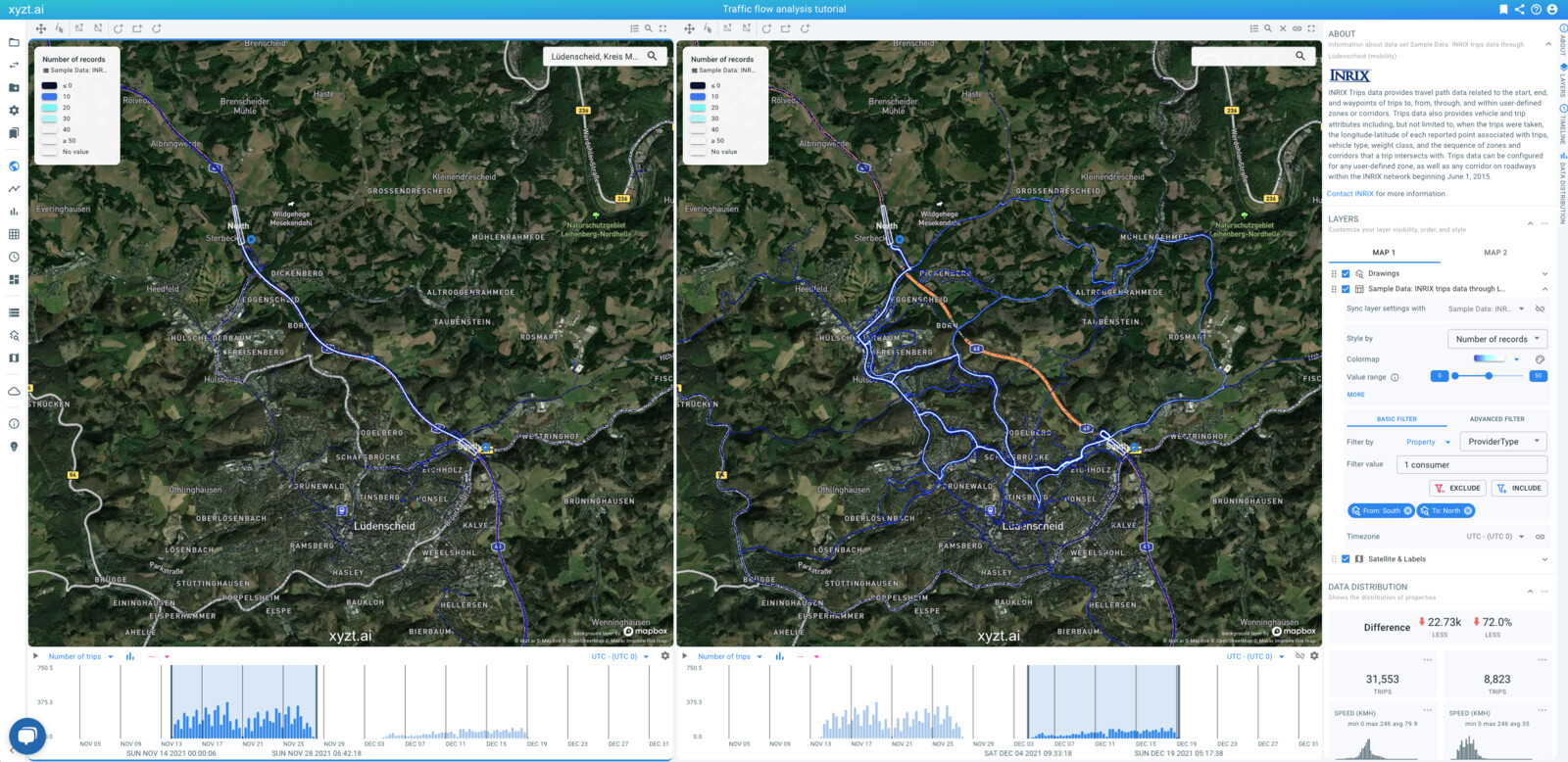
Figure 18. Comparing traffic before and during the closure driving south to north on the A45.
Notice the drastically different traffic flow during these two periods. Notice also the drop in traffic since the closure of the highway, most likely due to people avoiding the area.
|
Once you set filters you can not only consult the map, but also the timeline, and the data distribution panel on the right. Looking at all these statistics together will provide you information on increase/decrease of the amount of traffic, the average speed, and more. Note that while setting filters, by zooming in on the map, or changing time ranges, or applying other spatial and attribute filters, the map, the timeline and the statistics all update to immediately report on what you’re looking at. |
Next part
Go to the next part: Analzying traffic flows using advanced filters
Got feedback? Additional questions? Just want to have a friendly chat?
Get in touch!