Got feedback? Additional questions? Just want to have a friendly chat?
Get in touch!
Available parts
- Goal
- Roadworks, traffic diversions, and floating vehicle data
- Setting up a traffic flow analysis project (current)
- Analzying traffic flows using basic filters
- Analzying traffic flows using advanced filters
- Further reading
Step 1: Create a new project and attach the needed resources
Let’s start with setting up a new project for our analysis. Once you have created a project, you can attach an existing background layer and the sample data set for this tutorial.
Follow these steps:
-
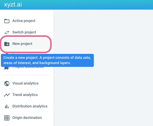
Create a new project
-
Click on New project
Figure 1. Create a new project. -
Provide the following name:
Traffic flow analysis tutorial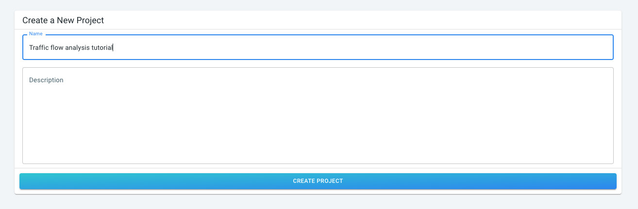 Figure 2. Provide a name for the project.
 -
Click on CREATE PROJECT
-
-
Attach a background layer
-
Click on Background Layers
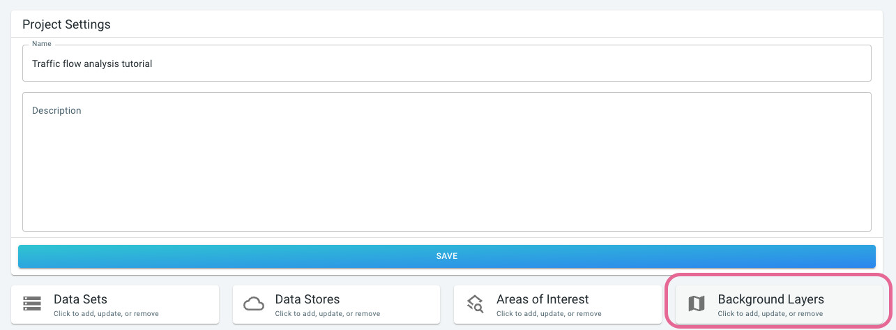 Figure 3. Go to the background layers.
 -
Click on the SAMPLE BACKGROUND LAYERS tab
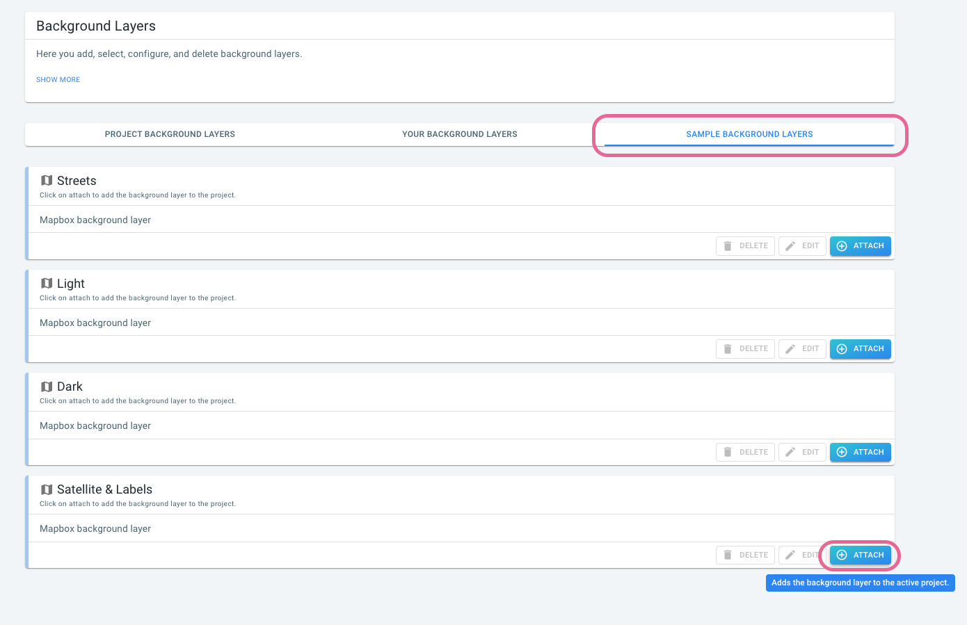 Figure 4. Sample background layers.
 -
Click on ATTACH on the
Satellite & Labelscard
-
-
Attach a data set with the INRIX floating vehicle data
-
Click on Data sets
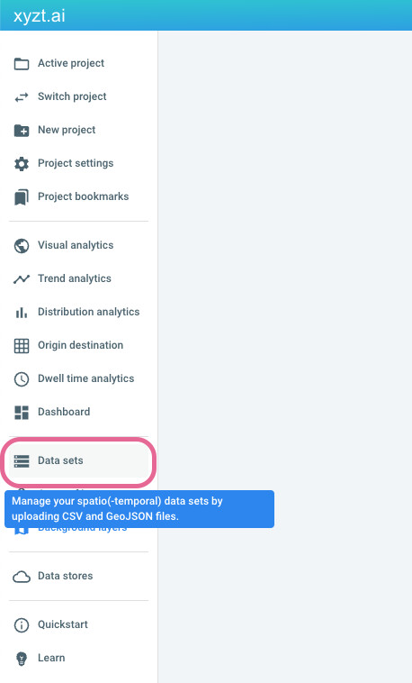 Figure 5. Navigate to the data sets.
 -
Click on SAMPLE DATA SETS
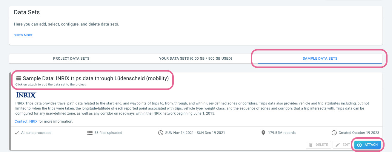 Figure 6. Navigate to the sample data sets.
 -
Look for the data set card with name
Sample Data: INRIX trips data through Lüdenscheid (mobility) -
Click on the ATTACH button to add the data set to your project
-
Step 2: Navigate to the visual analytics page
Now that we have created our new project, you can look at the data by clicking on the Visual analytics button on the left.
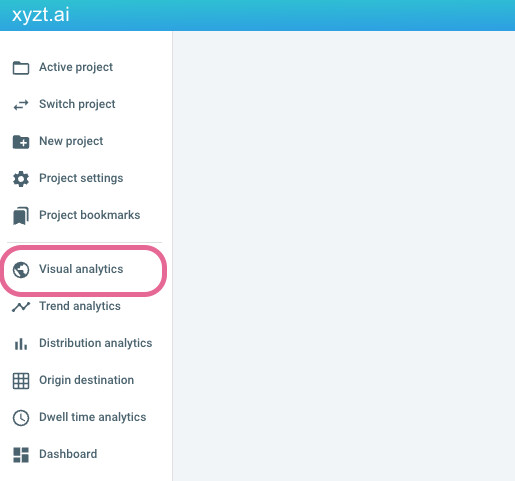
Figure 7. Navigate to the visual analytics page.
You should now see a map, a timeline, the layers panel, and the data distribution statistics. The map shows a heatmap of INRIX trips data, which is as discussed above, floating vehicle data through the Lüdenscheid area.
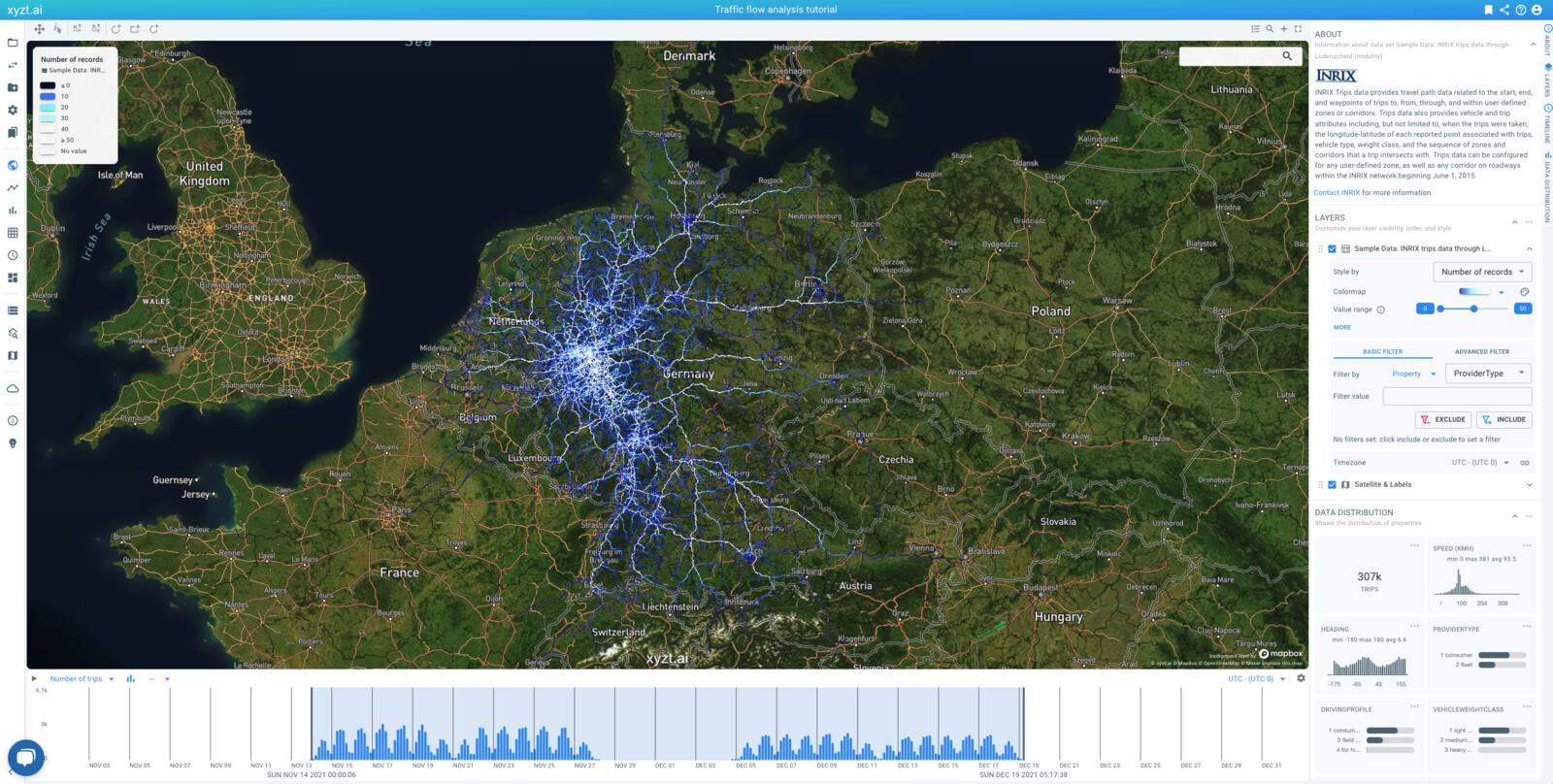
Figure 8. Visual analytics page with the attached background and data set layers.
The data spans 2 weeks before December 2 2021, and 2 weeks after December 2 2021 when the highway section was closed. In the remainder of the tutorial, you will focus your analysis on the two weeks after closure of the highway section.
Next part
Go to the next part: Analzying traffic flows using basic filters
Got feedback? Additional questions? Just want to have a friendly chat?
Get in touch!