Got feedback? Additional questions? Just want to have a friendly chat?
Get in touch!
Available parts
- Goal
- Understanding aggregate time series data
- Create new project
- Visual analytics
- Trend analytics (current)
- Create a dashboard
- Sharing your insights
- Conclusion
Step 3: Analyzing trends
Next to the Visual analytics page, the platform provides dedicated pages for specific spatio-temporal analytics. The first one is Trend analytics.
This page focuses on how things change over time.
Step 3.1: Analyze taxi fares and trip distances by day of week and hour of day
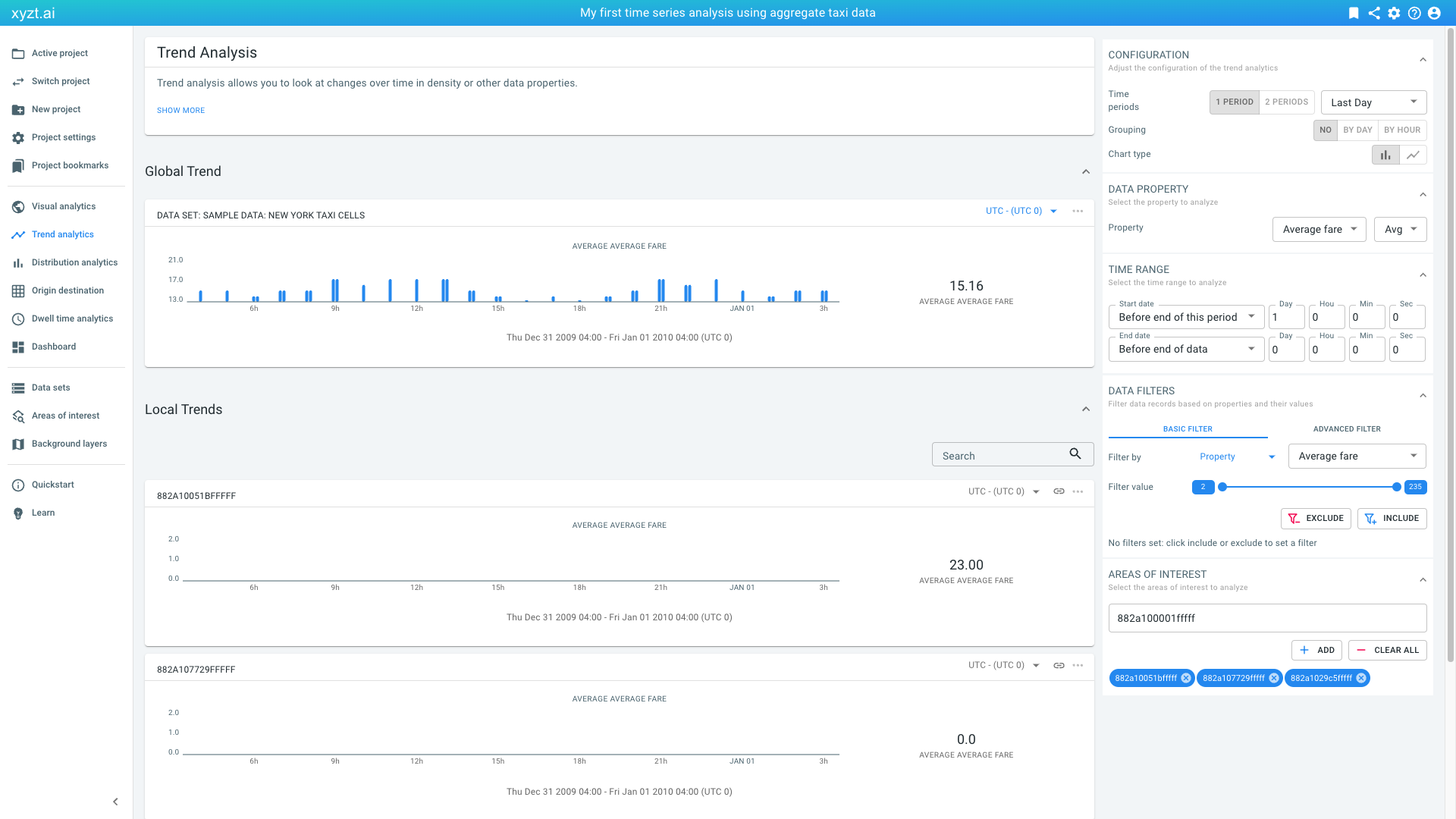
Let’s click on Trend analytics in the navigation bar on the left. The page opens and loads some default statistics:
Figure 1. Default trend analytics view.
-
By default it focuses on the last day in the data set.
-
It shows the
Average faretrend during this days. -
It shows the trend statistics for the entire data set under Global Trend.
-
It also shows the statistics for local areas, in this case for the hexagonal cells. By default, the page selects 3 areas from your drawings and/or your uploaded Areas of interest GeoJSON files.
-
It uses a default UTC 0 time zone.
Let’s first focus on the global trend:
-
On the Global Trend card change the time zone to America/New_York - (UTC -4) or America/New_York - (UTC -5).
-
On the AREAS OF INTEREST panel:
-
Click on CLEAR ALL. This removes the local trend analysis for the individual cells.
-
-
Click on
2 PERIODSin the CONFIGURATION panel on the right and select Last Day vs Day Before in the drop-down box to the right of it.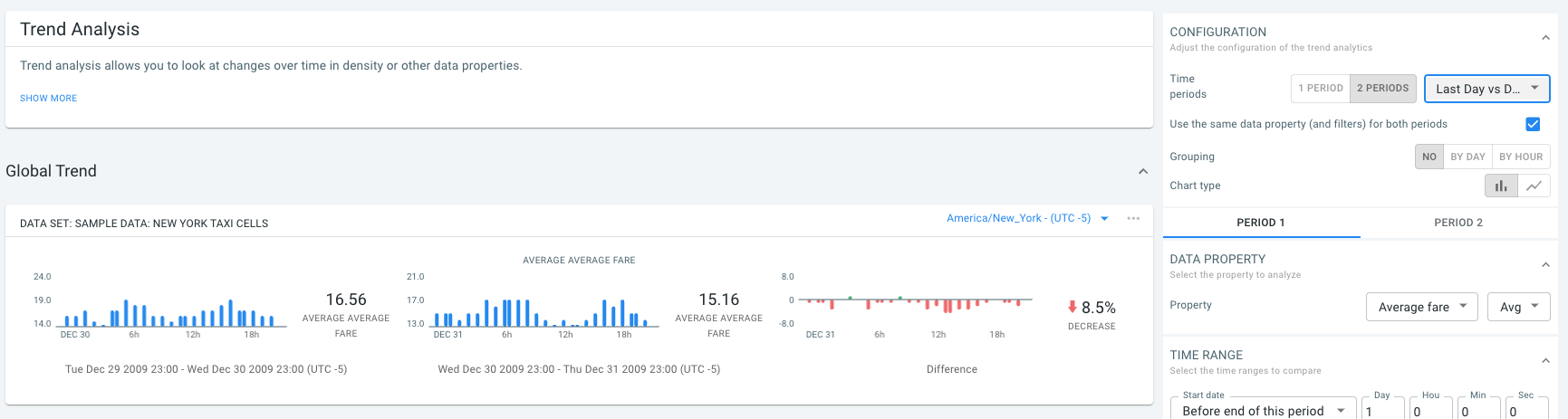 Figure 2. Global trend showing the average fare for the last and the next-to-last day.
You should now see that the global average taxi fare is around 16 USD with a decrease of over 8% comparing the last with the previous day.
Let’s look at a single period of 24 weeks:
-
Under CONFIGURATION
-
Click on '1 PERIOD'.
-
Select Last 24 weeks from the drop-down box.
-
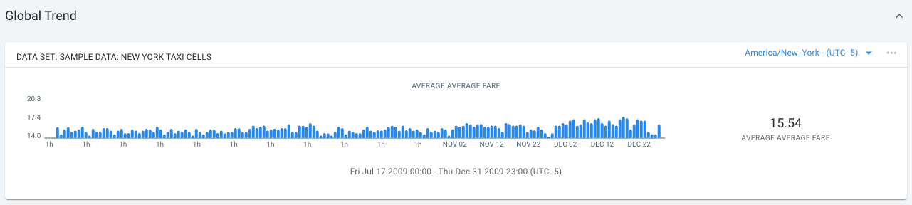
Figure 3. The global average fare for the past 24 weeks.
The global average fare remains mostly constant with a small increase during the month of December.
Let’s identify when during the day the fares are highest:
-
Under CONFIGURATION click on BY HOUR to group by hour.
You should now see that around 5am fares are highest.
Let’s bookmark our analysis, like we did before, naming it 'Average fare by hour of day'.
Step 3.2: Local trend analysis
You can analyze local trends by filtering on areas. For this you can use the areas or shapes defined in your GeoJSON time series data. Or you can draw shapes on the map, or load additional area of interest GeoJSON files.
In this step of the tutorial we will draw two shapes ourselves: one surrounding Newark Airport and one surrounding JFK. We will then use these shapes for trend analysis to compare both areas.
Follow these steps to obtain the shapes:
-
Switch back to the visual analytics page.
-
Disable our data set layer
Sample Data: Yellow Taxi New York -
Search for
John F. Kennedyand hit Enter. Zoom out a bit with the scroll wheel or by pinching. -
Above the map select the circle icon and draw a circle on the map.
-
Give the shape the name
JFKand hit enter.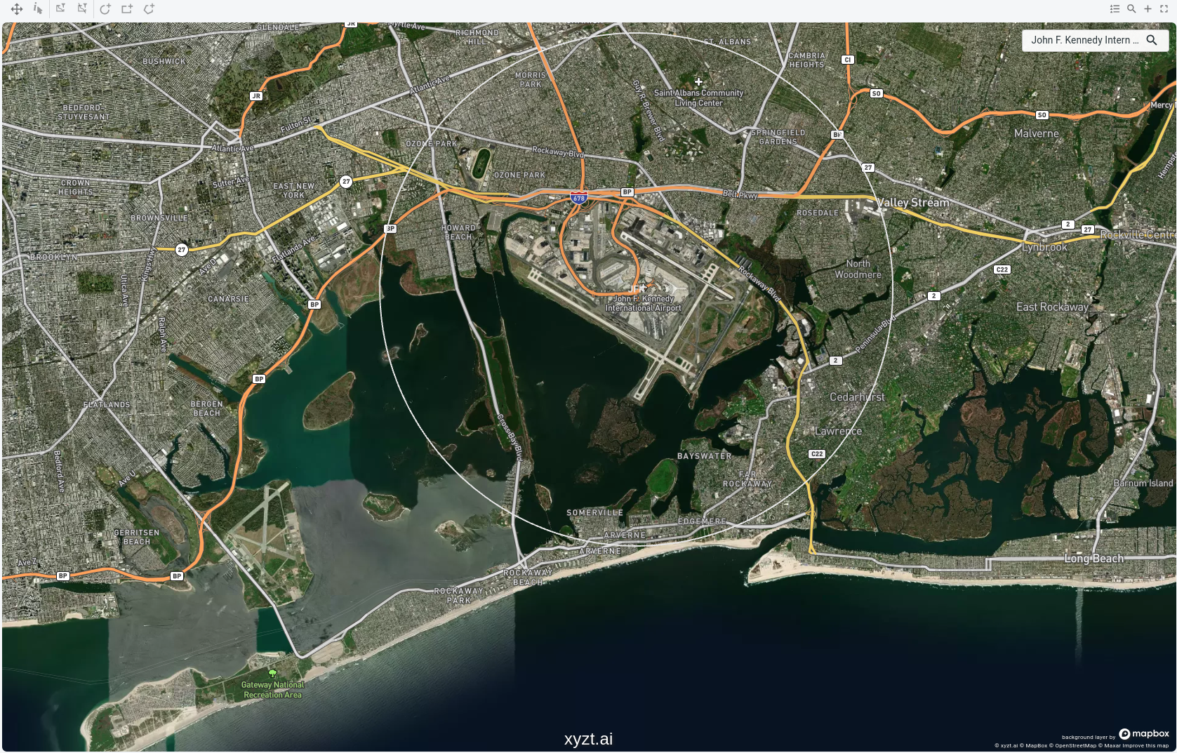 Figure 4. Drawing a circle shape surrounding the JFK area.
Now also create a circle shape surrounding Newark Liberty Airport:
-
Search for
Newark Libertyin the search box and hit enter. Zoom out a bit to obtain an overview of the area. -
Draw a circle shape and name it
Newarkand hit enter.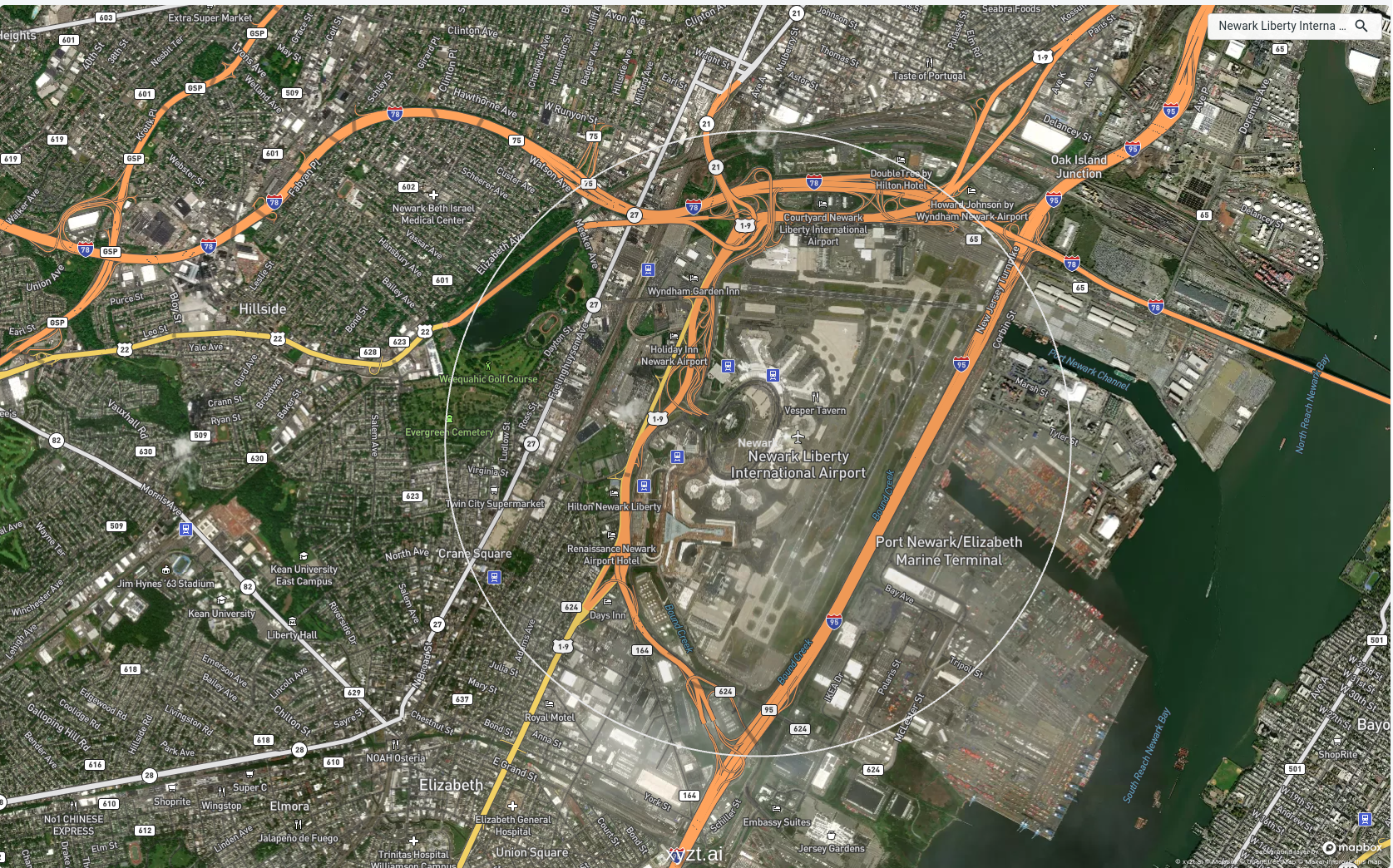 Figure 5. Drawing a circle shape surrounding the Newark Liberty Airport area.
Now return to the Trend analytics page and follow these steps to analyze and compare taxi fares in both areas:
-
In the AREAS OF INTEREST panel remove all areas and add our newly drawn
JFKandNewarkareas. -
Select Average fare from the DATA PROPERTY panel.
-
Select NO for
Groupingin the CONFIGURATION panel. -
Select two time periods and select Last Week vs Week Before from the TIME RANGE panel.
-
Collapse the Global Trend and scroll to the two cards with the Local Trends.
You can now see the Average fare change for the two areas we drew on the map and can compare. You should see that the average fare for pickups around JFK has decreased slightly and is much lower than the ones at Newark, which have increased significantly.
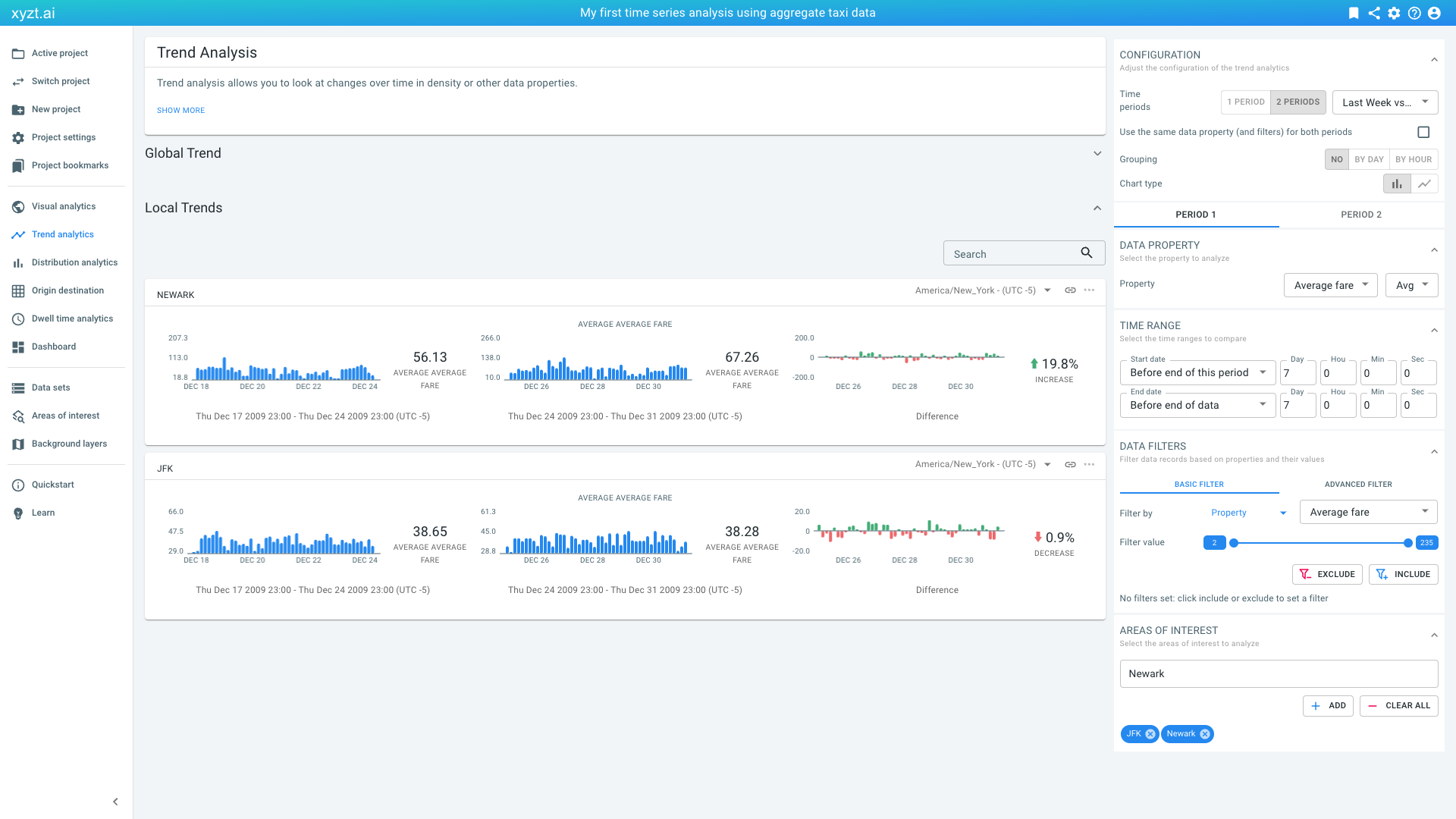
Figure 6. Local trend analysis of the average pickup fares at JFK and Newark Liberty.
Let’s bookmark this page and name it Last week fare change at JFK and Newark.
|
You can update bookmarks
When you loaded a bookmark before and try to create a new bookmark, the platform will ask you if you want to update the previously loaded bookmark. If you do not want to update, but instead create a new one, select CREATE NEW. |
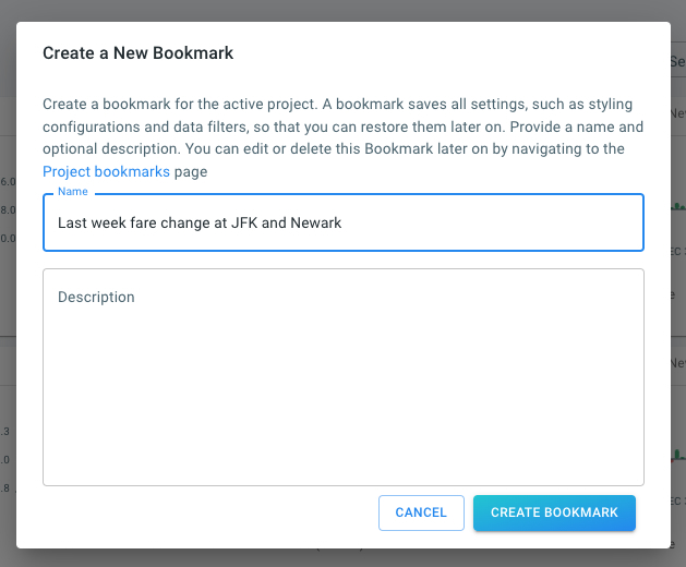
Figure 7. Bookmarking our trend analysis.
Step 3.3: Export the computed results to a CSV file for opening in another tool, such as Microsoft Excel
All analyses on the xyzt.ai platform can be downloaded and saved to a .csv file:
-
Right-click on the widget and select Save as CSV.
-
Or click on the 3 dots (…) in the top-right corner of the widget and select Save as CSV.
A CSV file with the statistics used to render the widget will be downloaded. You can then use this information for example in Excel, or for further data processing, for example using Python.
|
Disable blocking of multiple downloads at once
Some browsers block the download of multiple files at once. In some places in the xyzt.ai platform, the download will trigger multiple downloads at once (e.g., for the first period and second period when comparing two periods). Most browsers show a warning message at the top right of your browser that you can click to disable the blocking of multiple downloads. |
Next part
Go to the next part: Create a dashboard
Got feedback? Additional questions? Just want to have a friendly chat?
Get in touch!