Got feedback? Additional questions? Just want to have a friendly chat?
Get in touch!
Available parts
- Goal
- Understanding aggregate time series data
- Create new project
- Visual analytics (current)
- Trend analytics
- Create a dashboard
- Sharing your insights
- Conclusion
Step 2: Performing visual traffic analysis tasks
Now that we have set up our own project, we are ready to explore the data, and use it for analysis.
We will use the Visual analytics page for this. Visual analytics is the science of analytical reasoning using interactive visual interfaces.
With visual analytics you can explore and answer questions on-the-spot, without having to run long and complex algorithms beforehand.
Step 2.1: Analyze the average fare for different regions and time periods
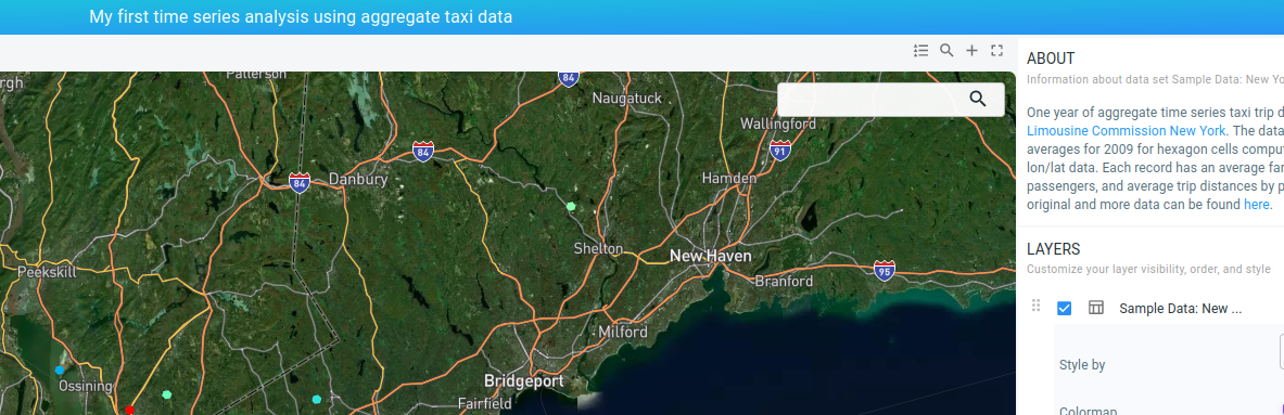
Click on Visual analytics to open the visual analytics page for your newly created project. Note by the way how the name of the active project is shown at the top of the page.
|
Use the browser’s zoom functionality
If you don’t see the active project name at the top, this means your screen is using a low resolution. In that case, you can use the browser’s zoom functionality to reduce the font size and give the different components such as the map, timeline, etc. more screen space. |
Figure 1. The active project is indicated at the top of the Visual analytics page.
In this part of the tutorial we will do a basic first analysis to better understand the data.
Let’s first set the time zone to the New York area time zone:
-
Click on the time zone select on the top right of the timeline
-
Choose America/New_York (UTC-4) or America/New_York (UTC-5)
Using the right time zone is important when filtering for example by hours of the day.
Figure 2. Adjusting the time zone.
By default the map shows a color map for the average fare amount, i.e., showing how much a trip costs on average for the different regions. This amount is shown as follows:
-
On the map using a color map going from blue for the lowest average fare to red for the largest average fare. The mapping is from 2 USD to 235 USD by default.
-
Note that this color map is different from the one that we saw previously in the sample project. This is because this sample project had configured a different color map. Below you will learn how to configure the color map.
-
-
On the timeline a histogram is shown with the average fare over time. You can move your mouse over the timeline to see a specific date and average fare.
Since the entire data is shown on the map, and since the time filter on the timeline is fitted on the entire time range, the statistics shown on the map are for the entire period. The map shows then the mode of the average fare. This is the most common average fare for each area (configured in buckets of 1 USD).
Given that most taxi trips are short and not as expensive, the map is predominantly blue.
Configuring the map
Let’s change the color map to better identify regions with different average fares:
-
In the LAYERS panel on the right, find the Styling section for the
Sample Data: New York Taxi Cellslayer. Click on the Colormap dropdown. This is the one showing the blue-to-red gradient. Select the 4th last gradient going from blue over green and yellow to red. Using a more discriminative gradient will allow us to see more variation. -
Underneath this drop-down box there is a Value range slider. This slider defines how the values of the average fare are mapped to the color map. By default, it fits the two knobs on the entire value range. Move the right knob to the left, for example to a value around 20 USD.
You should now see more color variation as all values above about 20 USD are mapped to red and everything between 2 USD and 20 USD is mapped to our gradient.
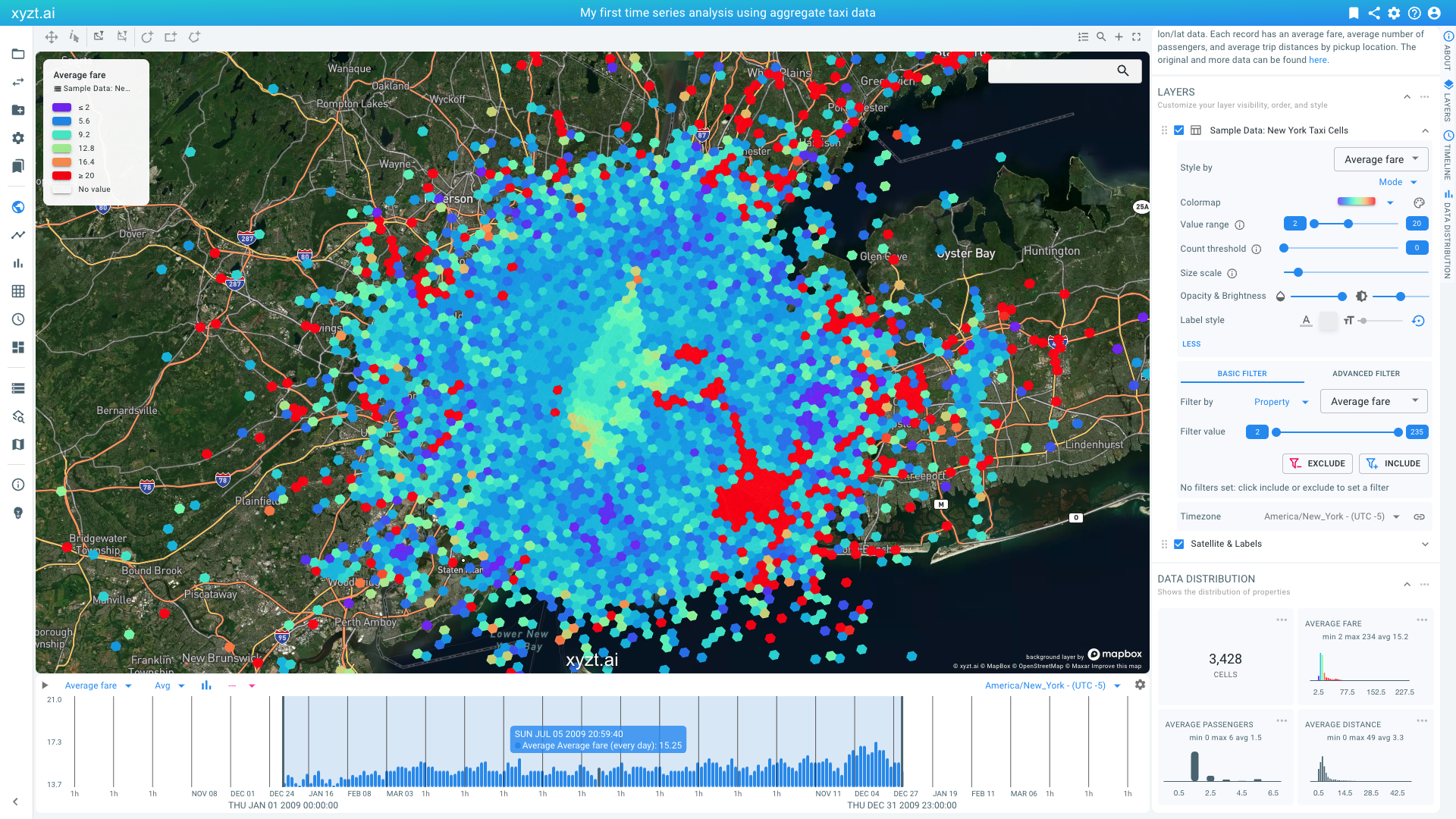
Figure 3. Adjusting the color map and value range.
Becoming familiar with the map and timeline
To get familiar with the Visual analytics page, zoom in and out on the map with the scroll wheel and on the timeline. Note how the histogram on the timeline updates when you zoom in on the map: The histogram corresponds to the data shown on the map. This means that the map viewport itself serves as a filter.
Similarly, when zooming in on the time line, the time range is reduced and the map updates.
Zooming in on the map or the timeline allows you to restrict your analysis to the region or period of interest.
If you zoom in on the map, you should start seeing the contours of the individual hexagon cells.
These cells come from a .geojson file that was uploaded to create the sample data set.
Finally, also statistics on the time series data properties on the right side in the DATA DISTRIBUTION panel update and reflect the summary statistics of the data being shown on the map.
Analyzing your data
Now, let’s do a first comparison analysis:
-
Let’s remove the higher fares from the analysis by adding a property filter as follows:
-
In the Filters section on the LAYERS panel select Filter By Property from the first drop-down box and Average fare from the second. These should be the default selected.
-
Move the right knob of the range slider in the Filter Value option underneath these to the value 100. Note that you can use the keyboard arrow keys once clicked on the knob for finer control.
-
Press INCLUDE. All statistics, including the visualization now only use time series records where the average fare is below 100 USD.
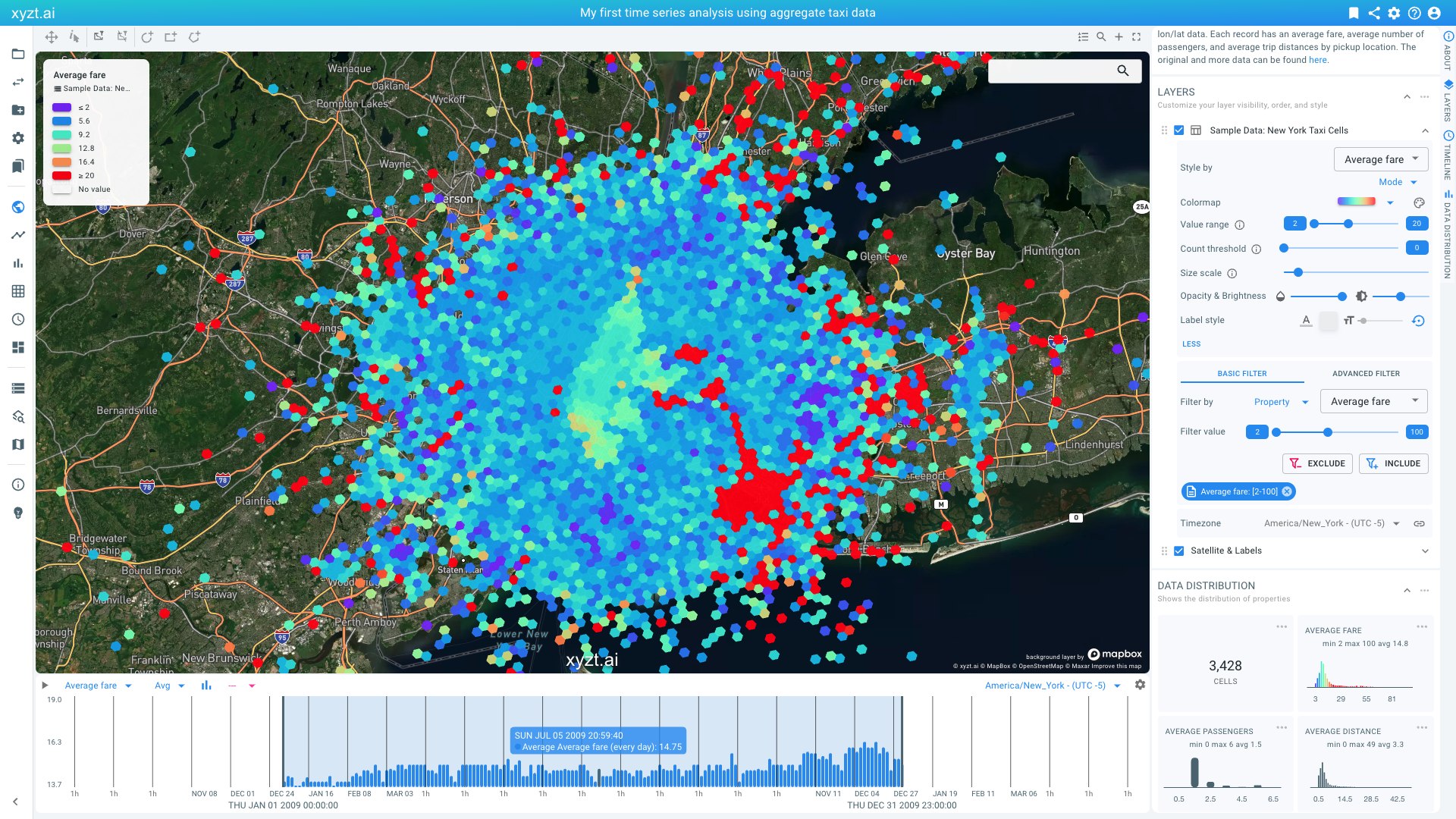 Figure 4. Applying a filter to retain the records with fares below 100 USD.
-
-
Now, let’s navigate to Newark Airport.
-
First make the time series layer slightly transparent to reveal the background imagery.
-
First click on MORE underneath
Value rangeto reveal additional style controls. -
Next to
Opacity & Brigthness, move the knob on the first slider to the right.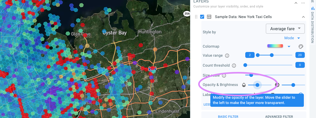 Figure 5. Increasing transparency for the New York Taxi Cells layer using the transparency slider.
-
-
You can now navigate to Newark Airport by manipulating the map, or by filling in Newark Liberty in the search box in the top right corner on the map and hitting Enter.
-
The map fits on the airport. Zoom out with the scroll wheel to obtain an overview again.
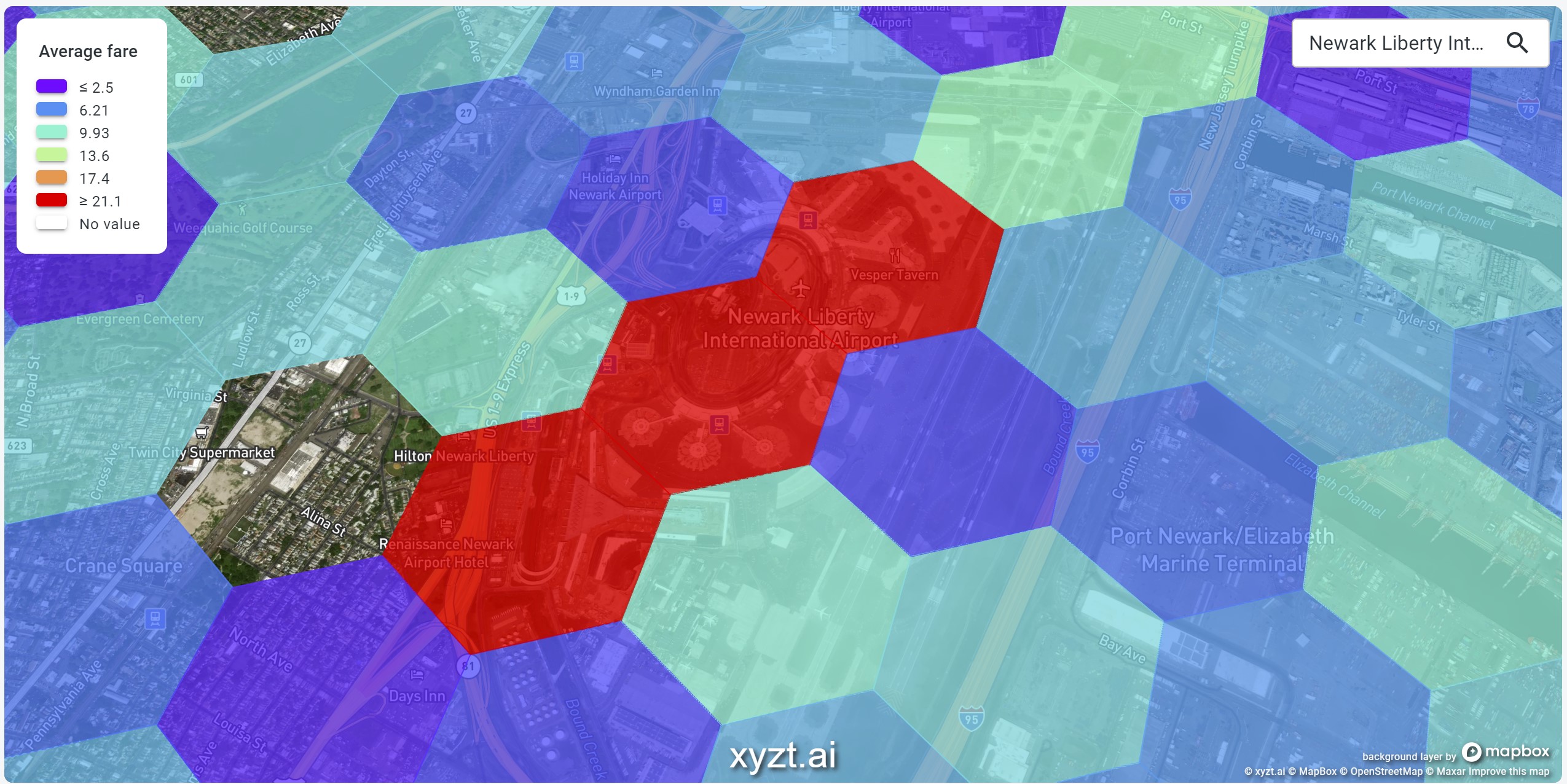 Figure 6. Searching for Newark Liberty Airport and zooming out again to analyze the region around the airport.
-
-
We now are looking at the average taxi fare for people leaving the Newark Liberty Airport area.
Let’s compare this with the situation at John F. Kennedy International Airport. This is done in following steps:
-
Create a second map and timeline by clicking on the '+' button in the top right corner above the map.
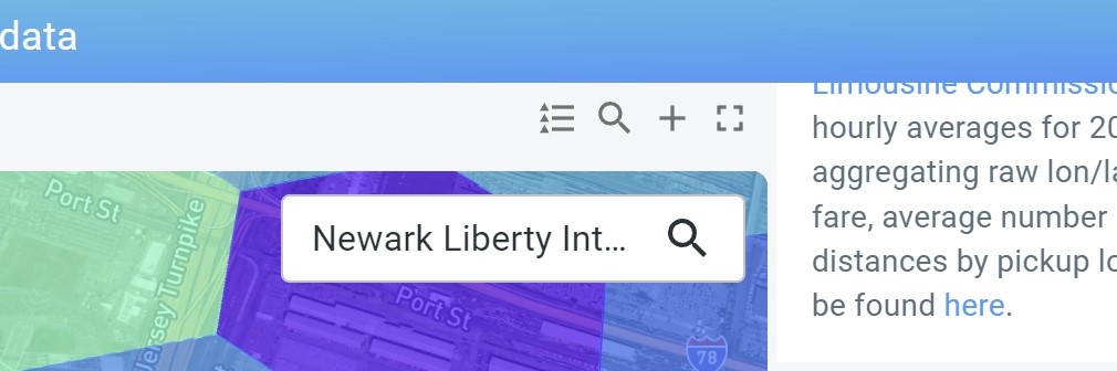 Figure 7. The '+' button above the map can be used to create a second view on the data.
 -
By default both maps and timelines are linked, meaning that if you manipulate one the other will follow. In this case we want the timelines to be linked, but the map to be unlinked so that we can look at Newark on the first and JFK on the second. Click on the link button to unlink the maps. You can find it in the top right corner above the second map.
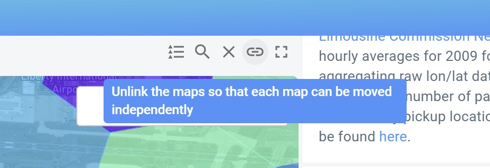 Figure 8. The link button allows to unlink the two maps and manipulate them separately.
 -
Now type "John F. Kennedy International" in the search box in the top right corner of the second map and hit Enter. The map now fits on the JFK airport.
-
Zoom out a bit with the scroll wheel to obtain an overview again.
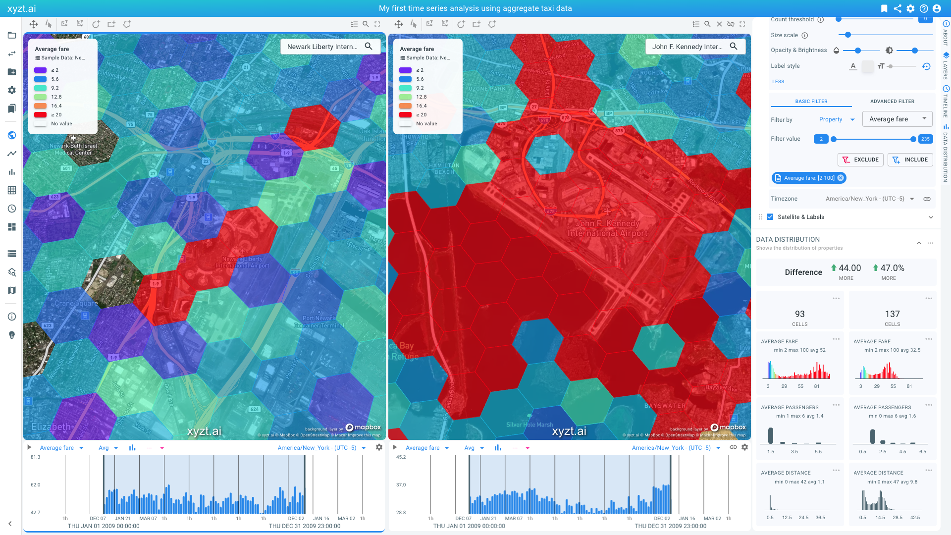
Figure 9. Comparing Newark Airport with JFK.
We can now compare both airport regions:
-
On the map we see that close to the airport, airport fares are higher.
-
On the data distribution widgets, we see that average fares are slightly higher for Newark, while the average trip distance is much lower.
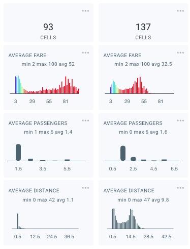 Figure 10. Average fare distribution for pickups at Newark Airport (left) and JFK (right).
Let’s bookmark our analysis, so that we can come back later. You bookmark by clicking on the bookmark icon in the top-right corner of the screen.
Figure 11. You can save the state of any analytics page by bookmarking. The bookmark button can be found in the top-right corner.
Provide a name ('Comparison Newark and JFK') and optional description ('Comparing taxi fares for pickups in Newark Airport and JFK Airport.') and click on CREATE BOOKMARK.
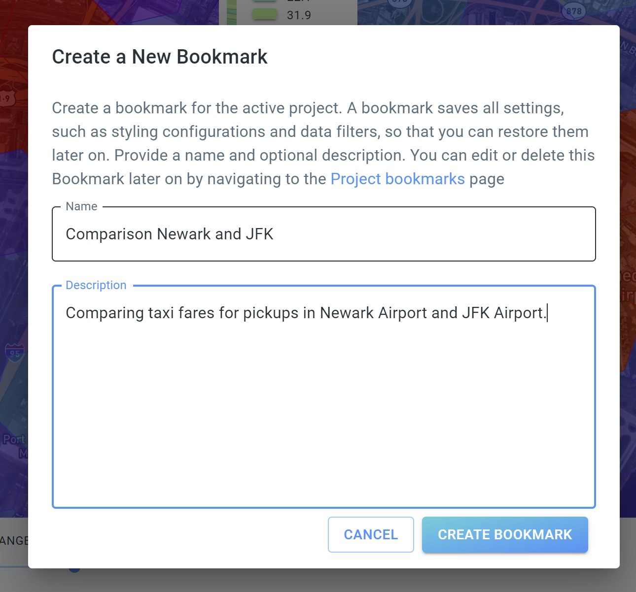
Figure 12. Specifying the bookmark.
You can now always return to this page by going to the Project bookmarks on the navigation panel on the left side of the screen.
You can further analyze the data in many ways:
-
By restricting the time range by manipulating the timeline.
-
By using the filter controllers above the map, or by drawing shapes (circles, boxes, polygons) on the map and using them as a filter.
-
By adding additional filters from the FILTERS panel, for example by adding additional time filters to look certain days of the week or hours of the day.
Step 2.2: Density analysis to identify areas with many query results
In the previous part of the tutorial, we looked at average fare in different regions. We colored the map using a color map to easily identify where, over time, high fares were dominantly present in the data (by visualizing the so-called mode).
Another way to analyze the data is to look at densities. In this case, we will be counting records that pass a filter ('how many 1-hour buckets are there that fulfill the query?'), and plotting the retained records as a density map.
Problem statement
Let’s assume we are solving following problem.
Imagine you are considering starting a side hustle and becoming a taxi driver during weekend day evenings. You have an electric car and prefer to drive short distances, while at the same time maximizing your income. The question now is 'What would be the ideal location for you to operate'?
Finding the best location
Let’s first start by reloading the visual analytics page to start afresh. Put your mouse in your brower’s URL bar and hit enter to reload the page.
Follow these steps to identify the ideal location for your side hustle:
-
Set the time zone again to America/New_York (UTC-4) or America/New_York (UTC-5)
-
First set the map to show Number of records. You can do so from the Style By drop-down box in the LAYERS panel.
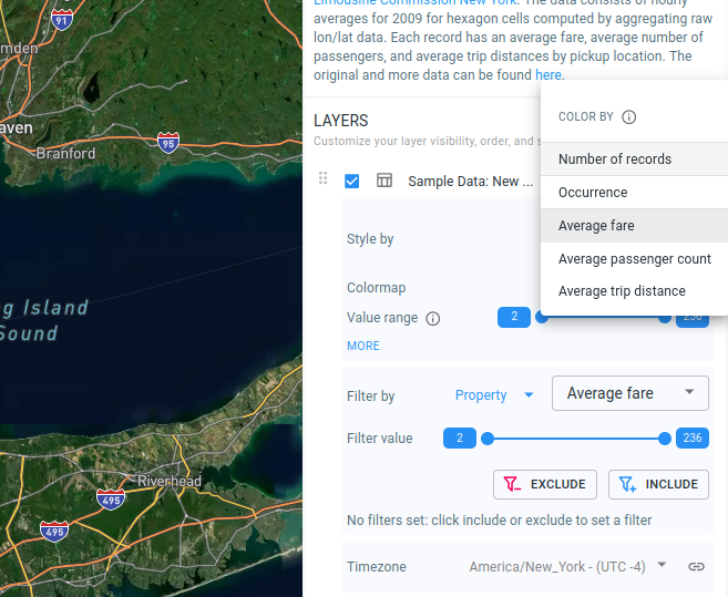 Figure 13. Selecting color by number of records.
This shows now a heatmap of areas with many records colored as white and few records as dark blue. In the default setting, almost all areas are white as we are looking at one year of data with records for almost every cell every hour of the day (=24 * 365 = 8760 records).
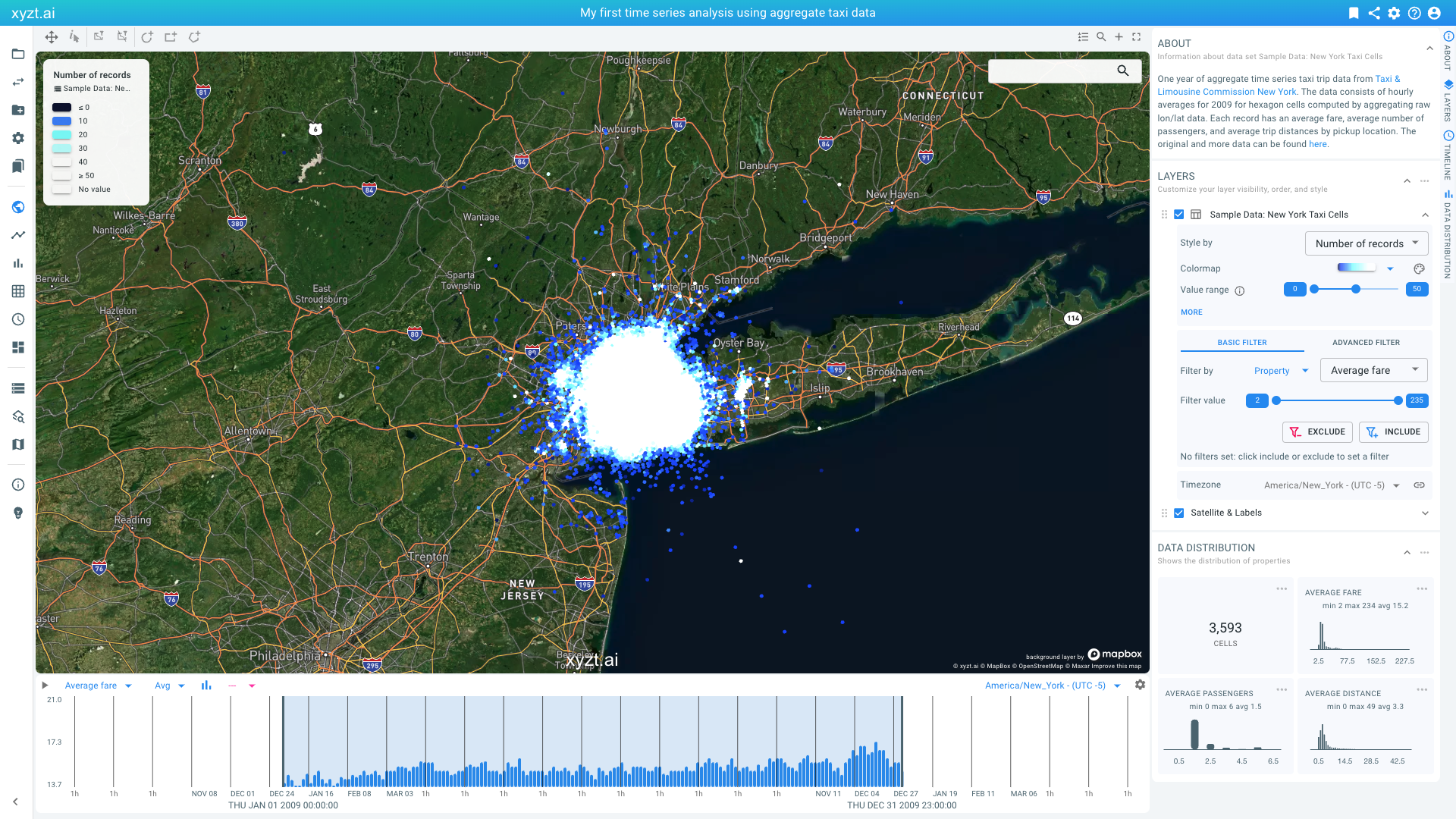 Figure 14. Selecting color by number of records.
Don’t worry about this, we are going to filter out some data to answer our question.
-
First, let’s only look at Saturdays and Sundays. On the right side of the screen underneath in the Filter By section in the LAYERS panel select Time in the first drop-down box and Days of the week in the second. Then move the left knob of the range slider to 6 (Saturday). The second knob should remain on 7 (Sunday). Now click on Include to apply the filter. We are now looking only at data for weekends.
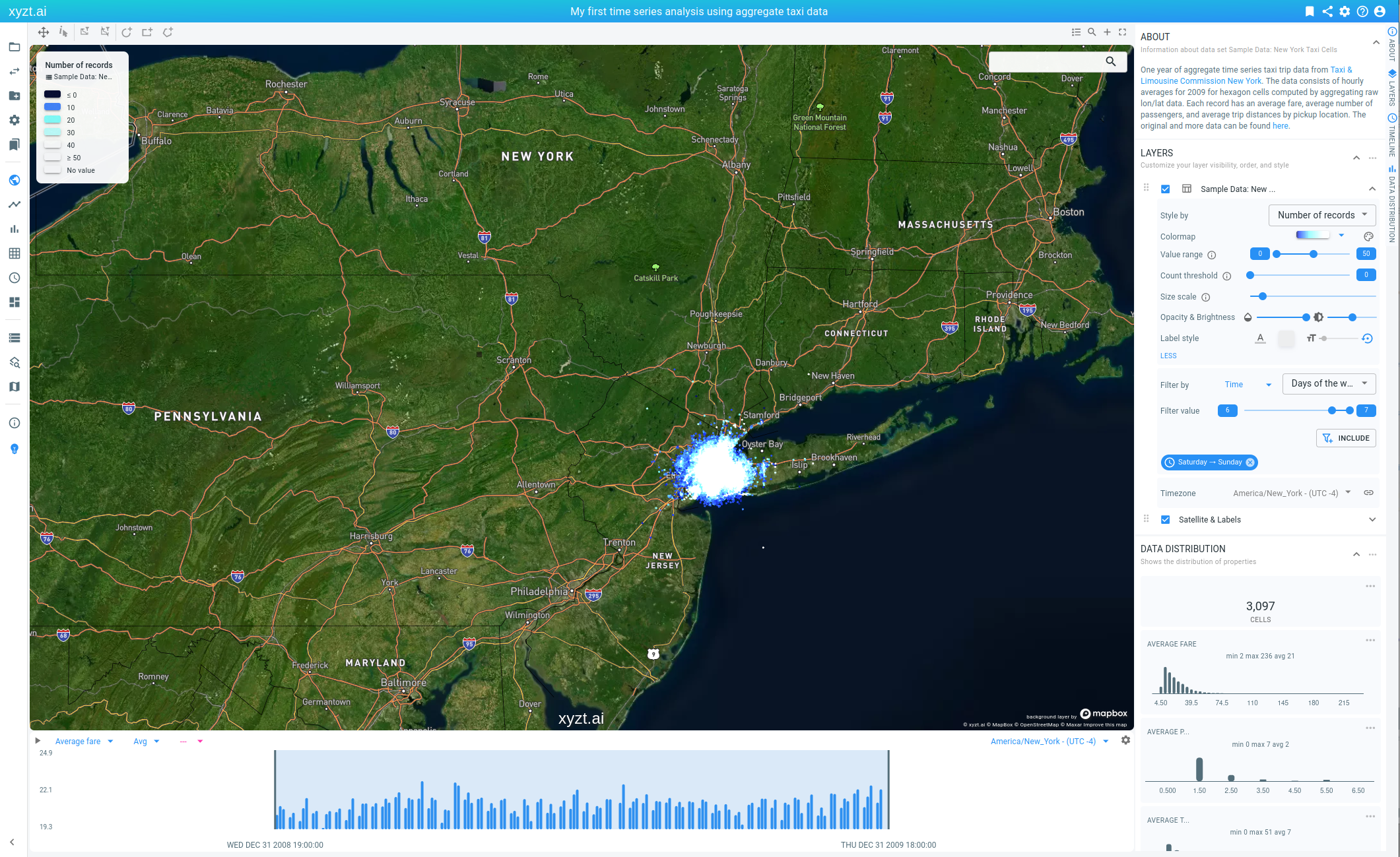 Figure 15. Selecting color by number of records.
 -
In addition, also change the opacity like we did before, modify the colormap, and maximize the range slider to map values from 0 to 100 to the colormap.
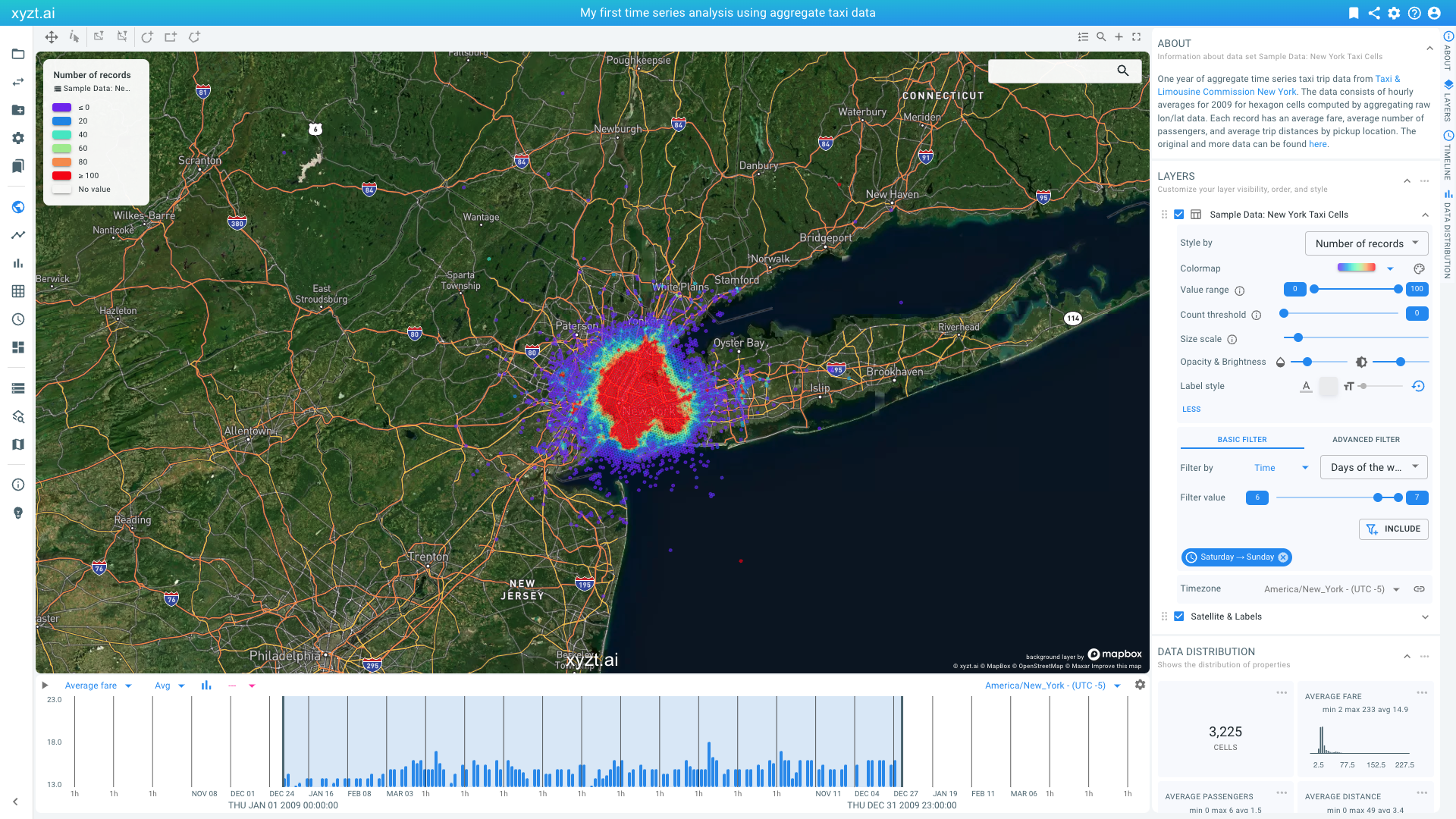 Figure 16. Selecting color by number of records.
 -
Now let’s look at evenings. Similarly as before, in the Filter By section of the LAYERS panel select Time, but now select Hours of the day and move the left slider to 18. Click on Include. We are now filtering and retaining only the rides from 6pm until midnight.
-
Finally, let’s focus on areas where pickups are mostly resulting in short rides. Change the Filter By to Property, and then Average distance, and move the right knob to the value 2. Click on Include. We have now further reduced the data by only retaining rides from 0 to 2 miles.
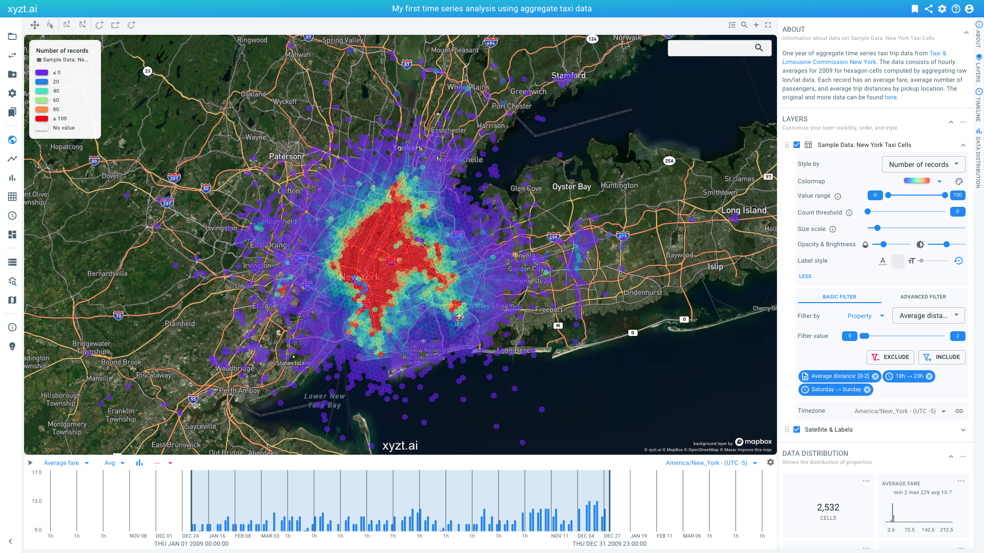 Figure 17. Looking at areas with many short trips during the weekend evenings.
We now have a map that shows the looked for areas in red. Zooming in on the biggest red area, we see that our target area is still quite big.
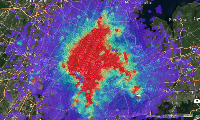
Figure 18. Red areas are areas with many records with short trips during weekend evenings.
We can further identify the hot spots, by eroding the map using the Count threshold slider in the LAYER panel. This slider allows to remove shapes from the map with records below the threshold value.
-
Move the slider to the value
250.
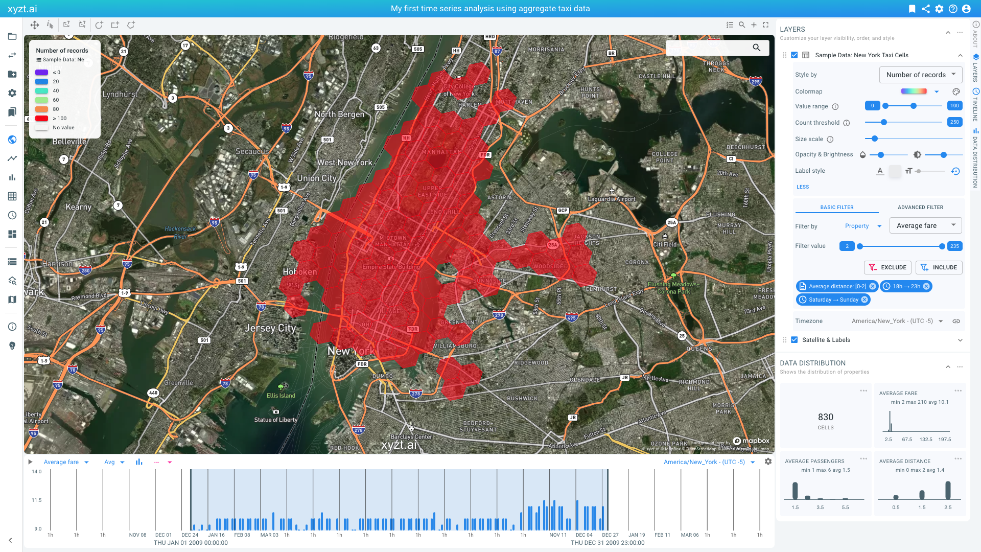
Figure 19. Hiding areas with few records by moving the threshold slider.
Recall that we are looking to find the region where to operate our taxi business during weekend evenings, maximizing our profit with short trips.
For our final decision on where to focus on, let’s visualize the average trip fare for the identified areas. You do so by selecting average trip fare from the Color by option in the LAYERS panel and reducing the value range as on the image below.
You should now see only a few red cells. These are the areas that see many short weekend evening trips, and maximize the taxi fare income.
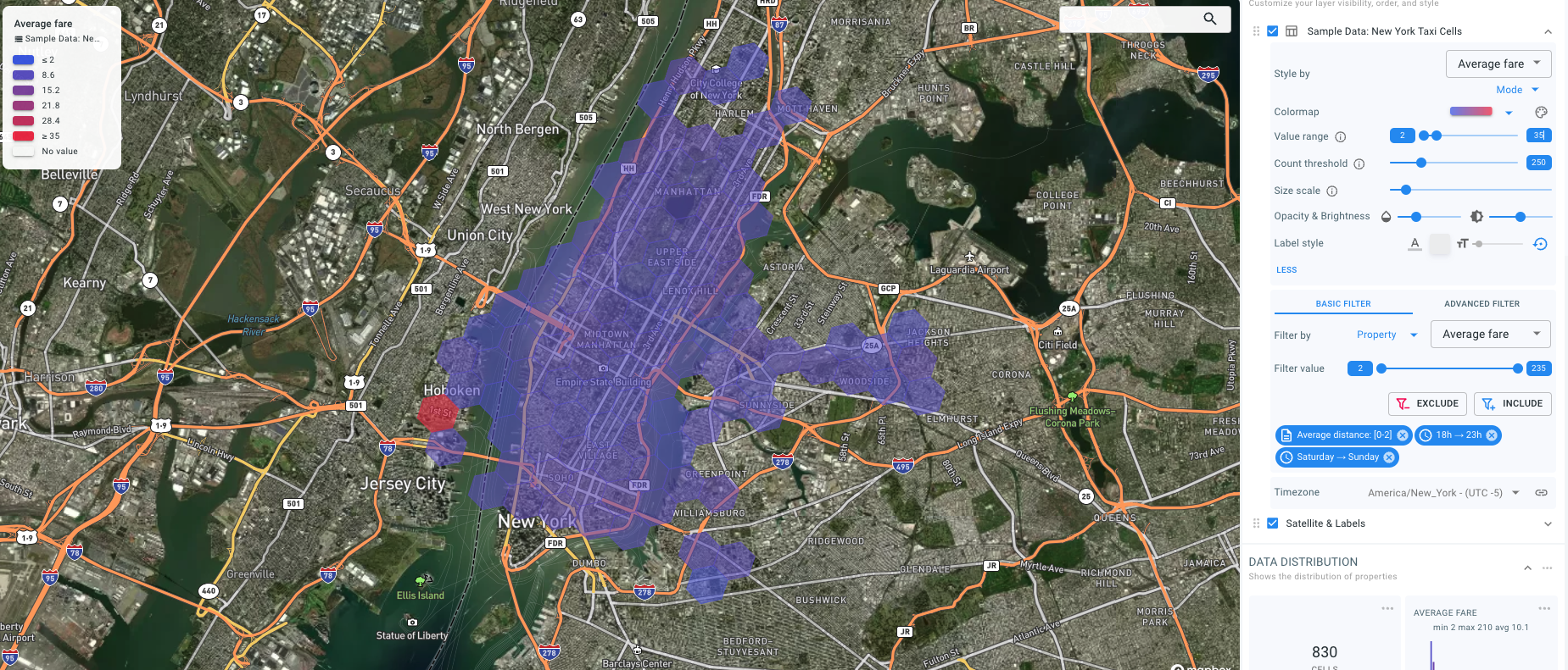
Figure 20. Trip fare identified for our identified areas.
Let’s bookmark this analysis as 'My weekend job'.
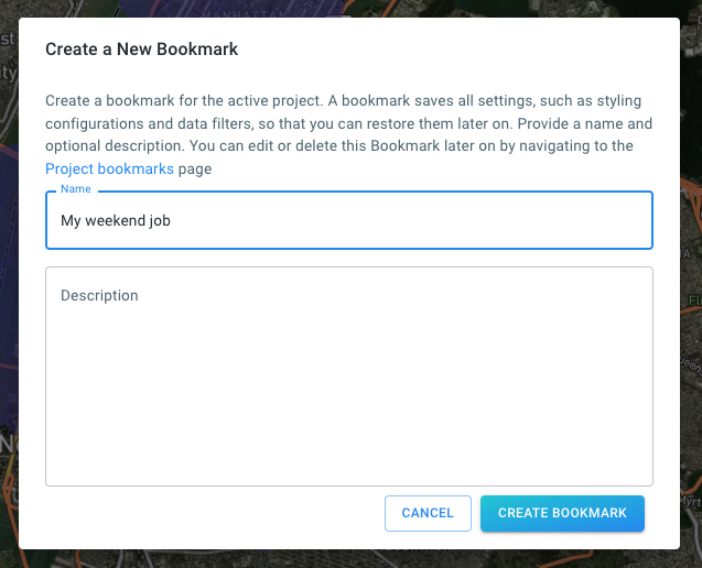
Figure 21. Saving the analysis as a bookmark.
Let’s zoom in on the area in Hoboken and look at the Average Fare on the Data Distribution panel on the right side. Click on the three dots and select Focus on Widget. This shows the average fares in this area are quite high around 40 USD
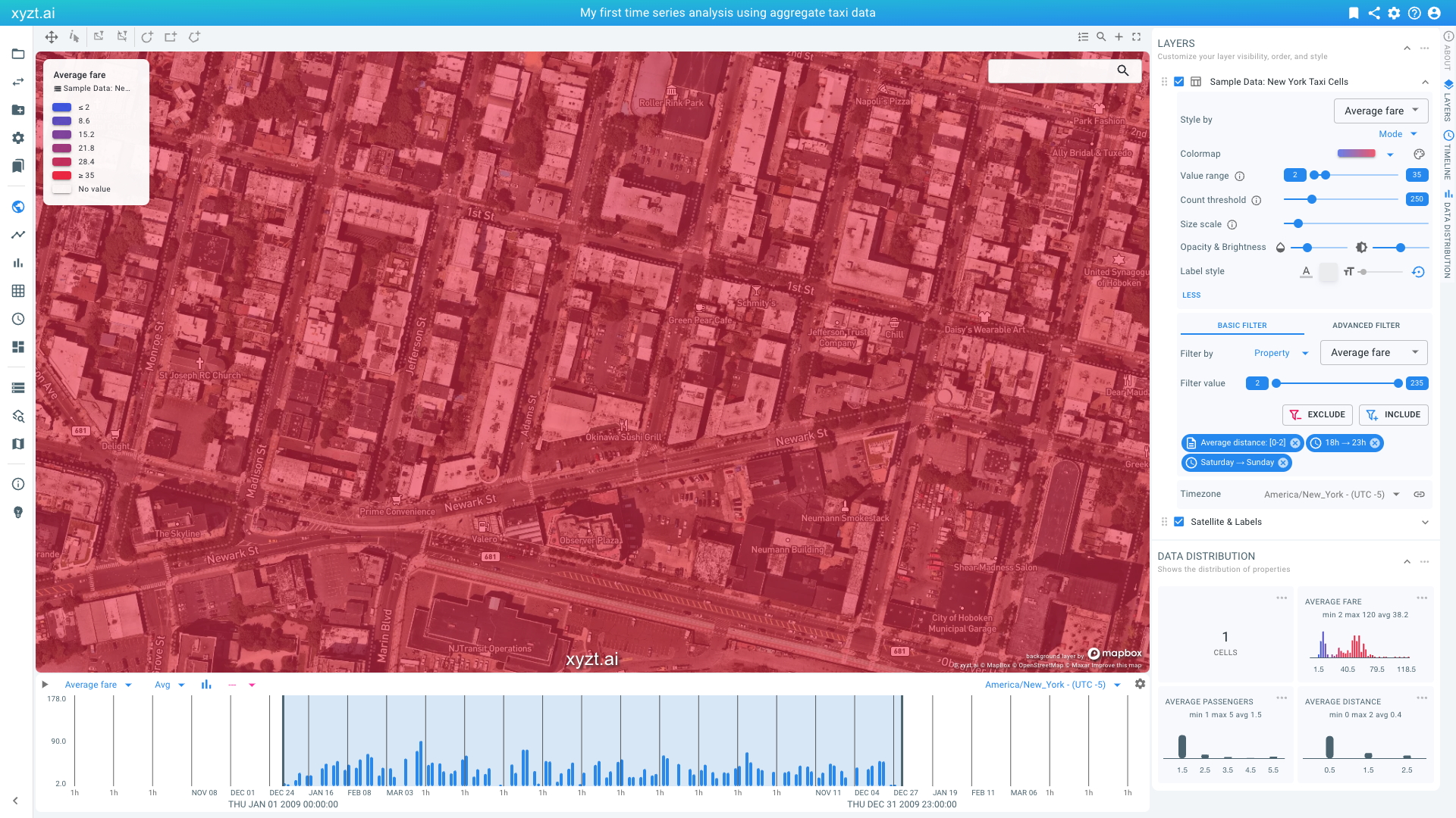
Figure 22. 1st Street in Hoboken is identified as a good spot to earn the most money for short rides during the weekend evenings.
This looks like the perfect place to start your weekend taxi side hustle.
In the next part of the tutorial, we will look at analyzing trends over time to compare different days of the week days, hours of the day, and also analyze change over time.
Next part
Go to the next part: Trend analytics
Got feedback? Additional questions? Just want to have a friendly chat?
Get in touch!