Got feedback? Additional questions? Just want to have a friendly chat?
Get in touch!
Available parts
- Goal
- Understanding aggregate time series data (current)
- Create new project
- Visual analytics
- Trend analytics
- Create a dashboard
- Sharing your insights
- Conclusion
Step 0: Understanding aggregate time series data
The data that we will be using in this tutorial is a time series data set with statistics on taxi usage (including ride fares, passenger counts, and trip distances) for different areas in New York, USA.
To load a project containing this data set:
-
Click on Switch project on the left navigation bar
-
Click on SAMPLE PROJECTS
-
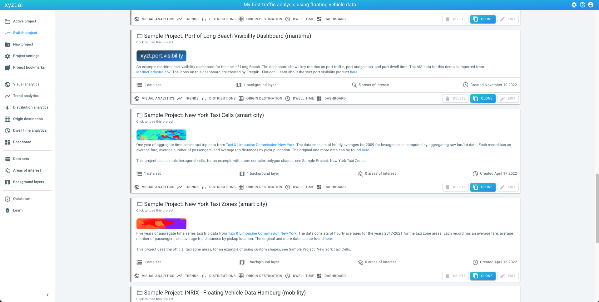
Click on the VISUAL ANALYTICS on the card Sample Project: New York Taxi Cells (sma
Figure 1. Example project with aggregate taxi usage time series data.
This will take you to the Visual analytics page.
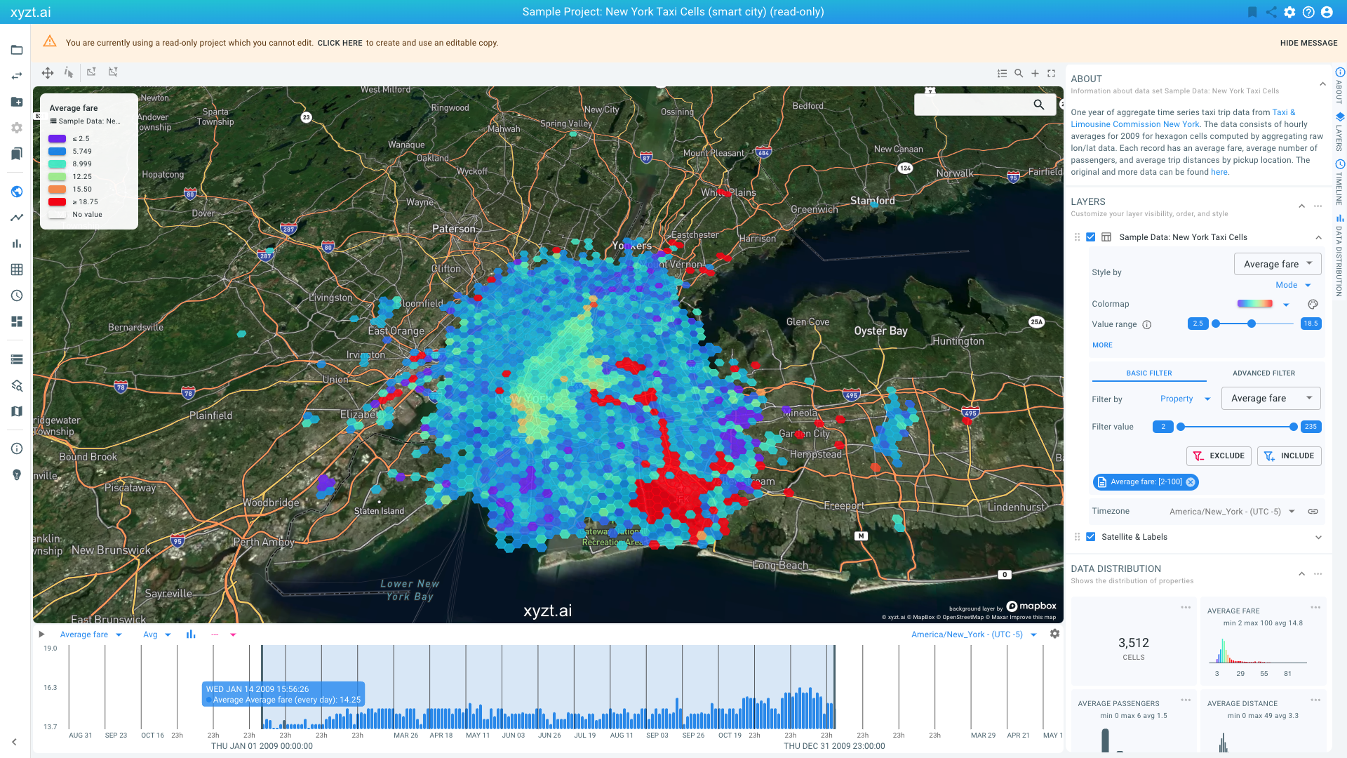
Figure 2. Analyzing one year of taxi usage.
This map-centric page is the center of the platform, and probably what you will use most.
The visualizations you are looking at are different views on the data:
-
The center area shows a map with the different areas or shapes, which in this case are hexagonal cells, colored based on average fare (from purple is low fare to red is high fare).
-
The timeline at the bottom of the screen shows a histogram with average fare over time.
-
The lower-right side shows smaller widgets with distributions of properties in the data. You might have to scroll down to reveal the widgets.
The data set is time series data and consists of two parts:
-
The shapes or features over which the time series are defined. These were added to the platform as
.geojsonfiles. In this case the shapes are polygons in the form of hexagonal cells. This representation is popular to aggregate data spatially. -
Each individual cell or shape defined in the
.geojsonfile contains time series data. This is data with properties that vary over time, such as average fares, average passenger counts, and average trip distance. These properties are available for buckets of 1 hour for a period of an entire year (2009) in this example. The time series data itself is added to the platform as.csvfiles where each line or record in the file corresponds to one 1-hour bucket for one cell or shape in the.geojsonfiles.
In the example data set, following properties make up each record:
-
Cell id: a unique identifier that tells the platform which records belong to which shape (the hexagon cells in this case).
-
Time stamp: the time the record corresponds to. In this data set the time stamp corresponds to the beginning of the 1-hour time bucket.
-
Average fare: the average ride amount paid for trips starting in the corresponding cell during the corresponding 1-hour time bucket.
-
Average passenger count: the average number of passengers for trips starting in the corresponding cell during the corresponding 1-hour time bucket.
-
Average distance: the average trip distance for trips starting in the corresponding cell during the corresponding 1-hour time bucket.
These properties (the fare, passenger count, distance) are numeric properties. You can also assign non-numeric properties such as enumerations (e.g., the operator of the taxi).
When opened for the first time, the Visual Analytics page focuses on the entire data set, showing the most commonly occurring fares on the map, and the average fares on the timeline.
In the following steps you will learn how to customize the styling and apply filtering to extract relevant insights. But let’s first learn how to create your own project.
|
You can use time series data for points, lines, and polygons
In this example, we will be using polygons as the areas for which the time series data is defined. You can also use points, for example, the location of air quality sensors, or lines, for example, street segments for which traffic counts exist. The overall concept of using fixed geometric locations and time series defined for those locations remains the same. |
Next part
Go to the next part: Create new project
Got feedback? Additional questions? Just want to have a friendly chat?
Get in touch!