Got feedback? Additional questions? Just want to have a friendly chat?
Get in touch!
Available parts
- Goal
- Understanding aggregate time series data
- Create new project
- Visual analytics
- Trend analytics
- Create a dashboard (current)
- Sharing your insights
- Conclusion
Step 5: Creating a dashboard
Now that we have analyzed the taxi time series data, let’s put our analysis result on a dashboard and share it with others.
For this, let’s revisit the analyses we did:
-
Click on the Project bookmarks button in the navigation bar on the left. You should now see a page with 4 bookmarks called
Comparison Newark and JFK,My weekend job,Average fare by hour of day, andLast week fare change at JFK and Newark. -
Click on the VISUAL ANALYTICS button under
Comparison Newark and JFK. -
You should again see the two maps focused on Newark and JFK.
Let’s put two widgets on the dashboard, the maps and average fare widgets:
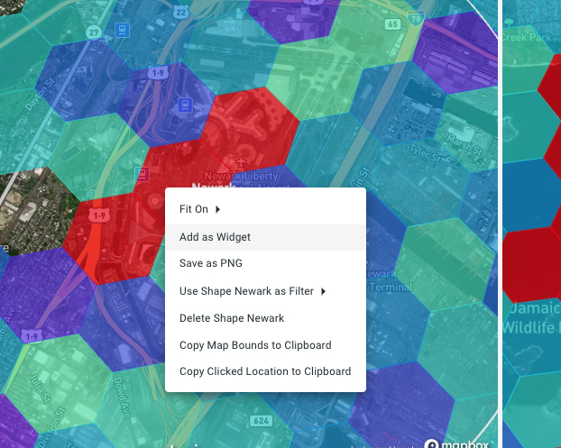
Figure 1. Each map, timeline, widget, can be added to the dashboard by right-clicking.
-
Right-click on one of the maps and select Add as Widget.
-
Give the widget a title:
Newark vs JFK Average Fare -
Add a description (optional):
Fares color coded from low purple to high red.. -
Choose a widget group. Since this is the first widget we create, we also have to create a widget group. Type
Newark vs JFK.
-
-
Press the CREATE button.
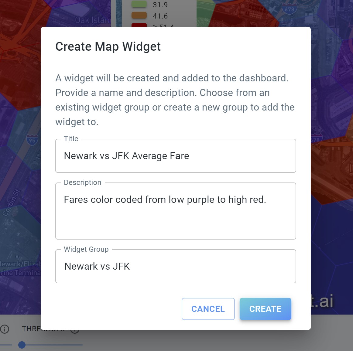 Figure 2. Widgets on the dashboard have a title, an optional description, and a widget group.
You should now see a notification in the lower right corner that the widget was created successfully.
Let’s add a second widget:
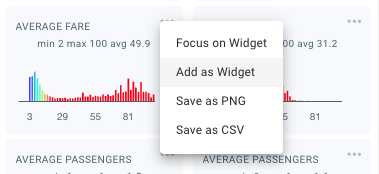
Figure 3. Also bar charts can be added as a widget on the dashboard.
-
Click on the 3 dots (…) in the top right corner of one of the AVERAGE FARE widget in the DATA DISTRIBUTION panel.
-
Select Add as Widget.
-
Give the widget a title:
Newark vs JFK Average Fare -
Add a description (optional):
Distribution of average fares.. -
Select the previously created widget group
Newark vs JFK.
-
-
Press the CREATE button.
Now click on Dashboard to open the newly populated dashboard. Note how the two widgets are present.
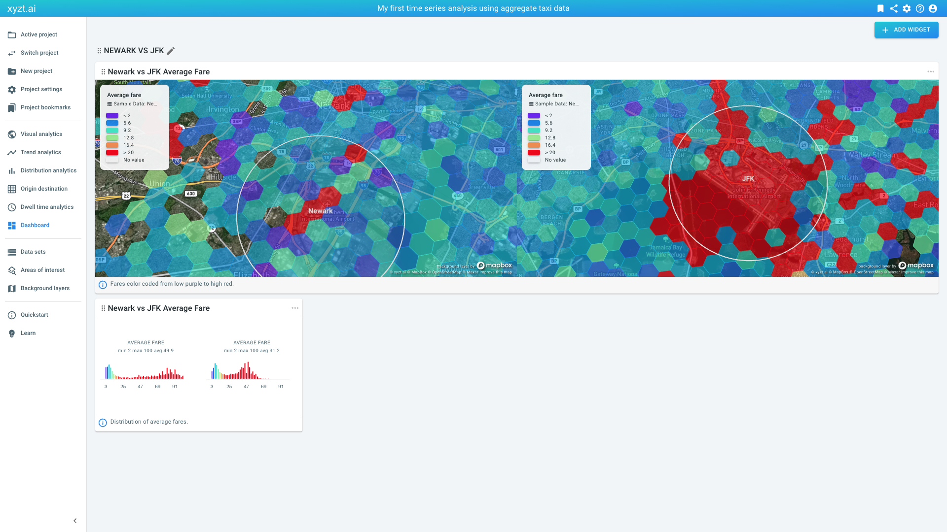
Figure 4. Dashboard with two widgets from the Visual analytics page.
Let’s add a 3rd widget to provide more information to the dashboard:
-
Click on the ADD WIDGET button in the top right corner of the Dashboard page.
-
Provide a title:
About -
Provide content, this can be basic html:
This dashboard is the result of my first taxi time series data analysis applying styling and filtering to gather insights. -
You can leave the description empty.
-
Select the previously created widget group
Newark vs JFK.
-
-
Press the CREATE button.
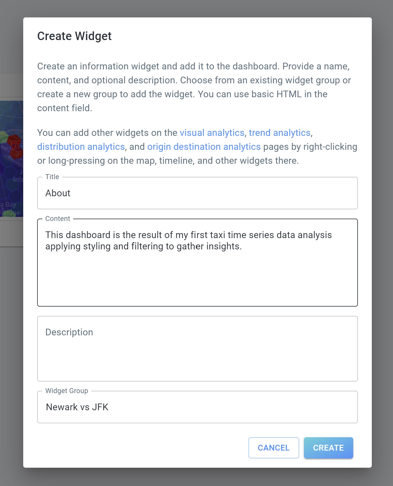 Figure 5. On the dashboard page you can add HTML-only widgets, for example to add About information.
The new widget is now added to the right. You can drag it, for example to the first place, using the drag handles left to the 'About' title.
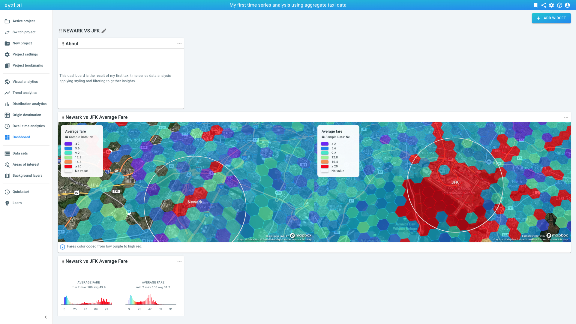
Figure 6. Widgets can be moved around by dragging them with the mouse.
Let’s now also add our trend analysis to the dashboard:
-
Click on Project bookmarks on the navigation bar.
-
Click on TREND ANALYSIS on the Last week fare change at JFK and Newark card.
-
Right-click on the JFK Local Trends card and select Add as Widget.
-
Provide a title:
Last week fare change JFK -
Provide a description:
Shows change in average pickup taxi fare at JFK. -
Choose our only widget group.
-
Do the same with Newark Local Trends card and use
Last week fare change Newarkas title andShows change in average pickup taxi fare at Newark.as description.
-
Now go back to the dashboard by clicking on Dashboard on the navigation bar. Scroll down to reveal the two added widgets.
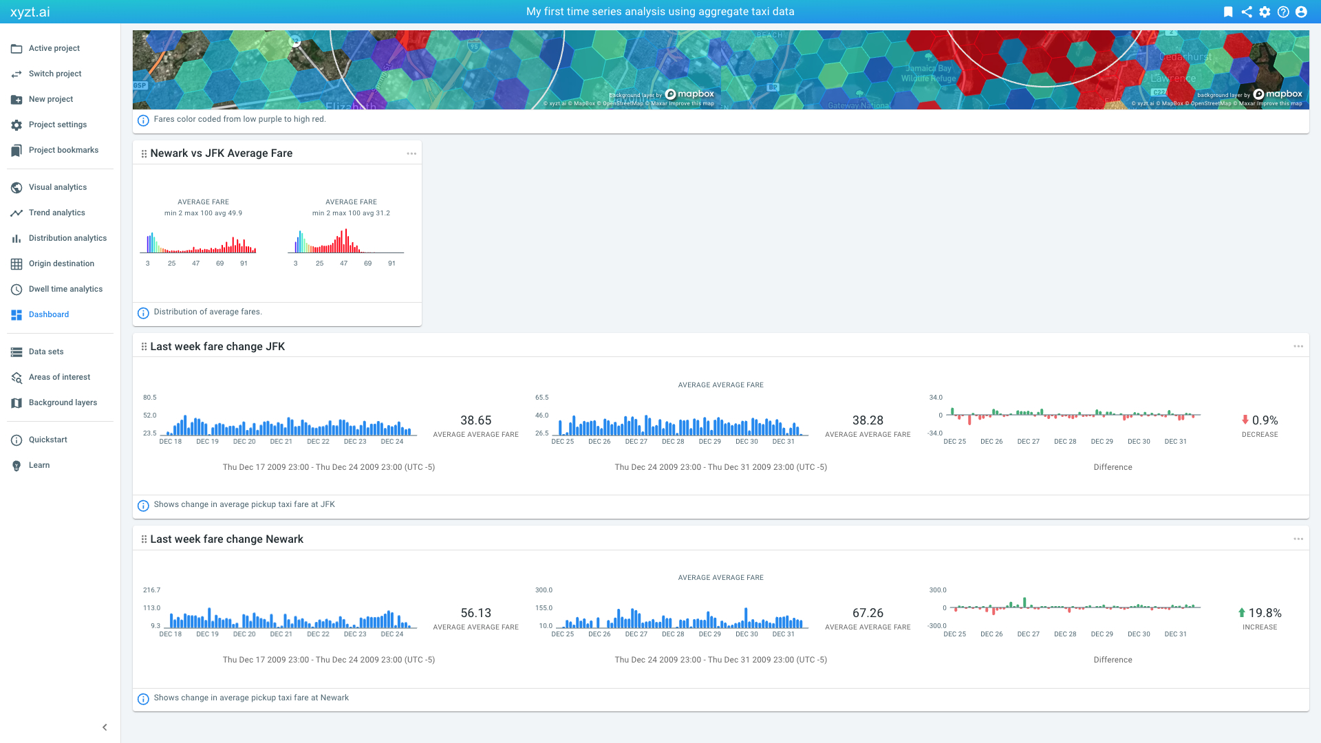
Figure 7. Dashboard now also showing a widget from the Origin destination page.
You created your first dashboard. You can always change the title and description of a widget by clicking on the pencil icon, or drag a widget around. Changing the contents of a widget can be done by clicking on a widget, changing the filters/styling/settings, and creating a new widget.
|
Customizing the position and size of widgets
When you create a widget, they take a default size. You can customize the size of the widgets by clicking on the three dots in the top-right corner of the widget. You can change the position of a widget, by dragging it around. |
Next part
Go to the next part: Sharing your insights
Got feedback? Additional questions? Just want to have a friendly chat?
Get in touch!