Got feedback? Additional questions? Just want to have a friendly chat?
Get in touch!
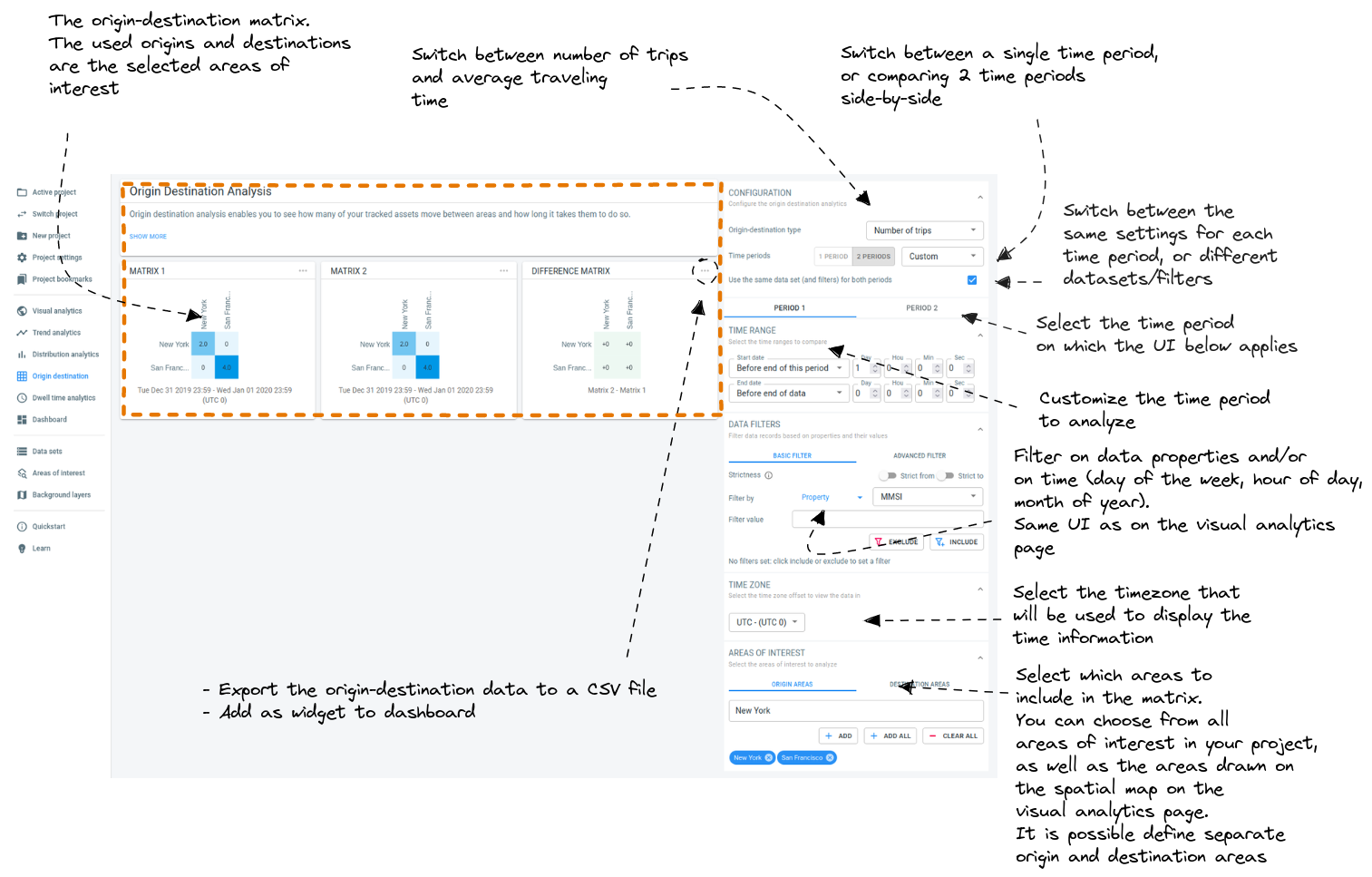
UI overview
Figure 1. Overview of the Origin-destination page UI
Going clockwise, the origin-destination page has the following UI elements
-
Select type: allows you to switch between showing the (relative) number of trips in the matrix, or the average travel time.
-
One/Two time periods toggle: toggle between analyzing a single time period, or doing side-by-side comparisons of 2 different periods
-
Sync properties toggle: when working with 2 time periods, the default is to use the same dataset/filter combination for both time periods. For example when you change the filter in the UI, the filter will be updated for both time periods.
By disabling the checkbox, you can use different filters or even different datasets for the 2 time periods.
-
Select time period: this button determines what the UI elements below control.
For example, when Period 1 is selected, and you adjust the filter in the UI, this will affect the filter for period 1 and not the filter for period 2 (unless the sync properties checkbox is checked).
-
Select data set: when your project contains multiple datasets, there is a dropdown to select the dataset (not shown in the screenshot).
-
Time period customizer: choose which time period to use for the origin-destination calculations.
-
Attribute filters: you can filter the records that are used to calculate the matrices. For example, it allows to only analyze the origin destination matrix of the status property "Cargo vessels" and "Fishing boats" instead of all vessels.
You can filter on properties in your data.
-
Timezone selector: select in which timezone you want to see the results displayed.
-
Areas of interest selector: choose the areas to include in the matrix. You can choose a different set of areas as origin and as destination.
The areas you can choose from are obtained from the areas of interest included in your project, as well as the areas you have drawn on the spatial map of the visual analytics page using the map controllers.
-
Matrix pop-up menu: shows a pop-up menu with additional options:
-
Export the data behind the matrix to a
.csvfile.The format of the exported csv dataIn case the matrix is showing average travel times, the data saved to the
.csvfile is in seconds where '-1' or NaN means there is no travel time computed because there was no data. -
Add the matrix to the dashboard.
-
-
Matrix: the computed matrix
Got feedback? Additional questions? Just want to have a friendly chat?
Get in touch!