Got feedback? Additional questions? Just want to have a friendly chat?
Get in touch!
UI overview
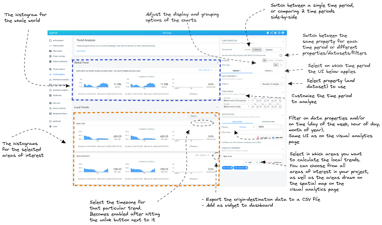
Figure 1. Overview of the Trend Analytics page UI
Going clockwise, the trend analytics page has the following UI elements
-
One/Two time periods toggle: toggle between analyzing a single time period, or doing side-by-side comparisons of 2 different periods
-
Sync properties toggle: when working with 2 time periods, the default is to use the same dataset/property/filter combination for both time periods. For example when you change the filter in the UI, the filter will be updated for both time periods.
By disabling the checkbox, you can use different filters or even different properties and datasets for the 2 time periods.
-
Grouping: switch between grouping by day or hour on the Y-axis, or choose None to show the evolution over time
-
Bar/Line charts: switch between bar charts and line charts
-
Select time period: this button determines what the UI elements below control.
For example, when Period 1 is selected, and you adjust the filter in the UI, this will affect the filter for period 1 and not the filter for period 2 (unless the sync properties checkbox is checked).
-
Select data set and Y-axis property: allows you to adjust the property that is plotted on the Y-axis on the histograms. When your project contains multiple datasets, there is also a dropdown to select the dataset (not shown in the screenshot).
-
Time period customizer: choose which time period to show on the histograms.
-
Attribute and time filters: you can filter the records that are used to calculate the histograms. For example, it allows to only analyze the trend over time for "Cargo vessels" and "Fishing boats" instead of all vessels.
You can filter on properties in your data, as well as some additional time filtering (days of week, hours of day, months of year).
-
Areas of interest selector: choose the areas for which you want to see local trends calculated.
The areas you can choose from are obtained from the areas of interest included in your project, as well as the areas you have drawn on the spatial map of the visual analytics page using the map controllers.
-
Histogram pop-up menu: shows a pop-up menu with additional options. You can access this pop-up through the
…button in the top-right corner of the card, or by right-clicking on it. The pop-up offers the following options.-
Export the data behind the histogram to a
.csvfile. -
Add the histogram to the dashboard.
-
Save an image of the histogram to a
.pngfile.
-
-
Timezone selector: you can decide in which timezone you want to see the data. See the timezones article for more information.
-
Local trends: the histograms for the selected areas of interest
-
Global trend: the histogram for the whole world
Got feedback? Additional questions? Just want to have a friendly chat?
Get in touch!