Got feedback? Additional questions? Just want to have a friendly chat?
Get in touch!
Available parts
- Goal
- Understanding AIS data
- Create new project
- Visual analytics
- Trend analytics (current)
- Origin-destination
- Create a dashboard
- Sharing your insights
- Conclusion
Step 3: Analyzing trends
Besides the Visual analytics page, the platform provides additional dedicated pages for specific spatio-temporal analytics.
The first one is Trend analytics. This tutorial focuses on how things change over time and how you can easily monitor and analyze those changes to gather insights using the xyzt.ai platform.
The Trend analytics page displays a section to monitor and analyze global trends, local trends, and panels to filter the trends based on property, time range, areas of interest, or other data filters.
Step 3.1: Look at vessel movements for different ports
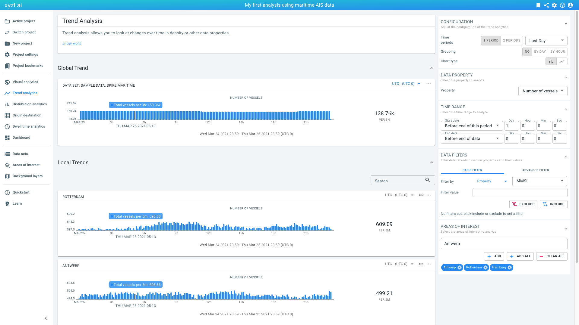
Let’s click on Trend analytics in the navigation bar on the left. The page opens and loads some default statistics:
Figure 1. Default trend analytics view.
-
By default it focuses on the last day in the data set.
-
It looks at the trend of the
Number of vesselsduring this last day of data. -
It shows the trend statistics for the entire data set under Global Trend.
-
It also shows the statistics for local areas. By default, the page selects 3 areas or less from your drawings and/or your uploaded Areas of interest GeoJSON files. In this case, the Trend analytics page displays local trends for Antwerp, Hamburg, and Rotterdam as you have downloaded the areas of interest document in the previous tutorial, Visual analytics.
Let’s modify some of these settings, and look at the number of vessels for the last week for our 3 port areas:
-
On the AREAS OF INTEREST panel, click on the (x) of the Suez chip to remove Suez from the analysis, if it is there. Make sure Antwerp, Rotterdam, and Hamburg are added to the AREAS OF INTEREST.
-
On the CONFIGURATION panel:
-
Select Last Week from the dropdown box that now says Last Day.
-
-
Scroll down to see a comparison of vessel movements for the 3 ports.
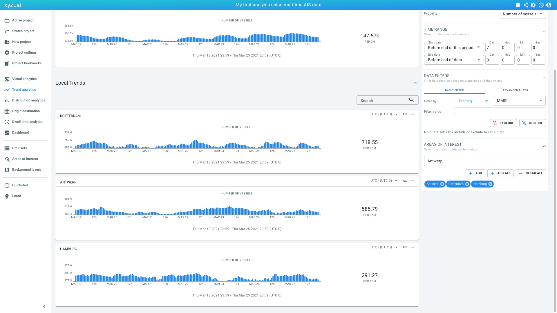 Figure 2. Vessel movements over the last week in the data comparing the 3 port areas.
Let’s apply a filter to the data to look at Tankers and compare the change in the last week with the week before:
-
On the CONFIGURATION panel:
-
Click on 2 PERIODS to compare two time periods and select Last Week vs Week Before
-
-
On the DATA FILTERS panel:
-
Next to Filter by, select Property in the first drop-down box (this is the default)
-
Next to Filter by, select Ship Type in the second drop-down box
-
Next to Filter value, select Tanker, all ships of this type as the value in the final auto-complete field
-
Click on INCLUDE to set the filter
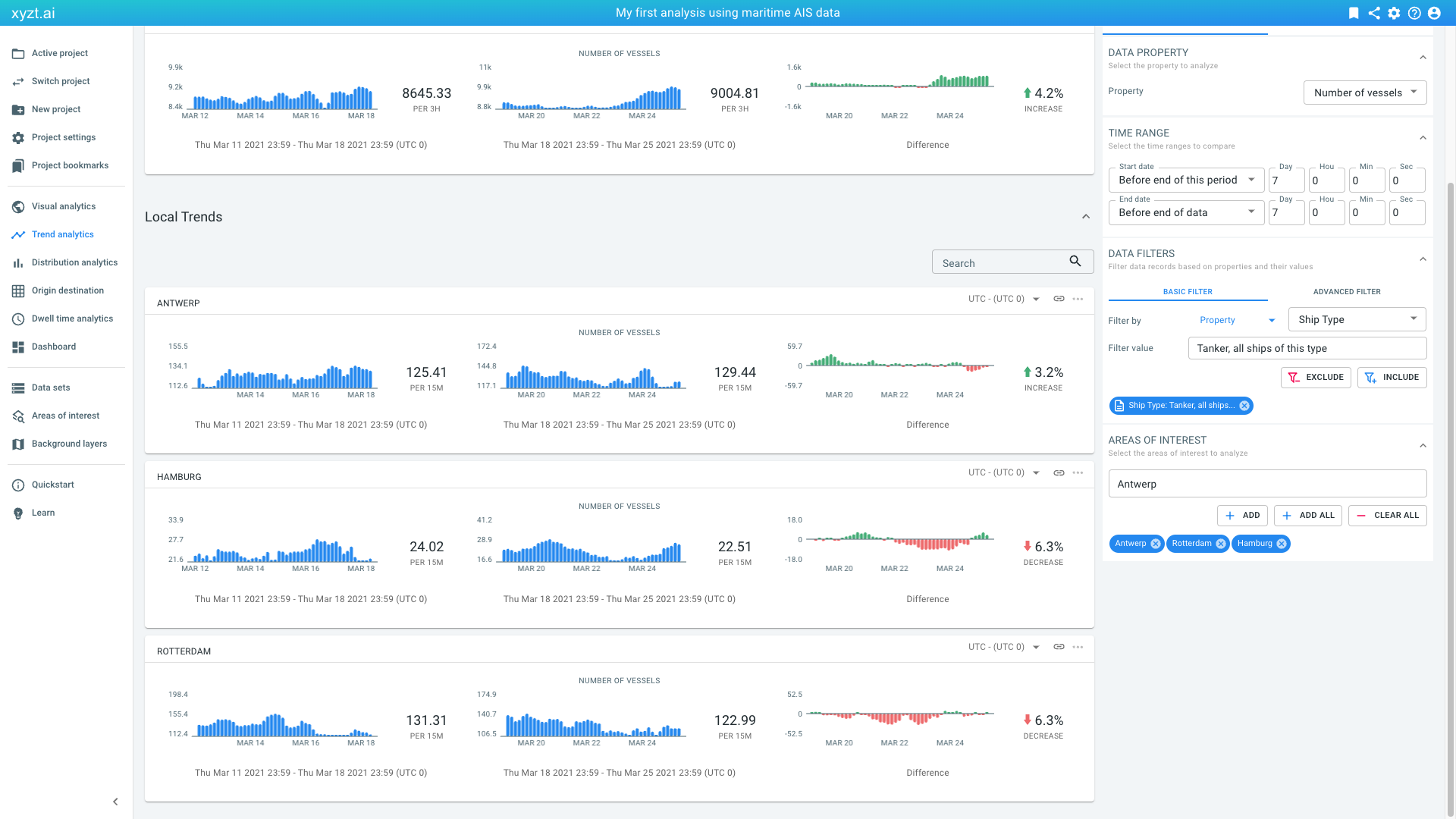 Figure 3. Comparing change in Tanker movements in the 3 major European ports.
-
Step 3.2: Export the computed results to a CSV file for opening in another tool, such as Microsoft Excel
All analyses on the xyzt.ai platform can be downloaded and saved to a .csv file:
-
Right-click on the widget and select Save as CSV.
-
Or click on the 3 dots (…) in the top-right corner of the widget and select Save as CSV.
A CSV file with the statistics used to render the widget will be downloaded. You can then use this information for example in Excel, or for further data processing, for example using Python.
|
Disable blocking of multiple downloads at once
Some browsers block the download of multiple files at once. In some places in the xyzt.ai platform, the download will trigger multiple downloads at once (e.g., for the first period and second period). Most browsers show a warning message at the top right of your browser that you can click to disable the blocking of multiple downloads. |
Next part
Go to the next part: Origin-destination
Got feedback? Additional questions? Just want to have a friendly chat?
Get in touch!