Got feedback? Additional questions? Just want to have a friendly chat?
Get in touch!
Available parts
- Goal
- Understanding AIS data
- Create new project
- Visual analytics (current)
- Trend analytics
- Origin-destination
- Create a dashboard
- Sharing your insights
- Conclusion
Step 2: Performing visual traffic analysis tasks
Now that we have set up our own project, we are ready to explore the data, and use it for traffic analysis.
We will use the Visual analytics page for this. Visual analytics is the science of analytical reasoning using interactive visual interfaces.
With visual analytics you can explore and answer questions on-the-spot, without having to run long and complex algorithms beforehand.
The visual analytics page provides three views on the data: a map, a timeline, and the data distribution panel. The three views are linked, for example, if you zoom in on the map, the timeline and data distributions will show statistics for only the data visible on the map.
Step 2.1: Analyze maritime traffic near Suez during the Ever Given incident
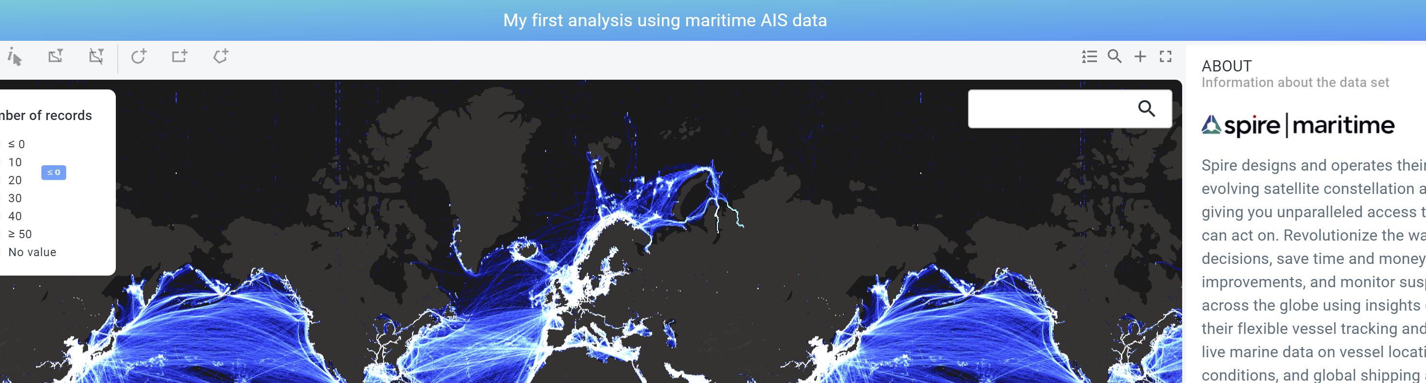
Click on Visual analytics to open the visual analytics page for your newly created project. Note by the way how the name of the active project is shown at the top of the page.
|
Use the browser’s zoom functionality
If you don’t see the active project name at the top, this means your screen is using a low resolution. In that case, you can use the browser’s zoom functionality to reduce the font size and give the different components such as the map, timeline, etc. more screen space. |
Figure 1. The active project is indicated at the top of the Visual analytics page.
In this part of the tutorial we will zoom in on the data, and perform a local analysis by styling and filtering the data.
To get familiar with the Visual analytics page, zoom in and out on the map with the scroll wheel and on the timeline. Note how the histogram on the timeline updates when you zoom in on the map: The histogram corresponds to the data shown on the map. This means that the map viewport itself serves as a filter.
Similarly, when zooming in on the time line, the time range is reduced and the map updates.
Finally, also the statistics on the vessel data properties on the right side in the DATA DISTRIBUTION panel update and reflect the summary statistics of the data being shown on the map.
Now, let’s focus on a single area, for this perform following steps:
-
In the search box on the top right of the map, type
Suez, and selectSuez, Egypt. The map now fits on the region around Suez in Egypt. -
Disable the Dark background layer by disabling the checkbox next to
Darkon the LAYERS panel.This should reveal the aerial imagery.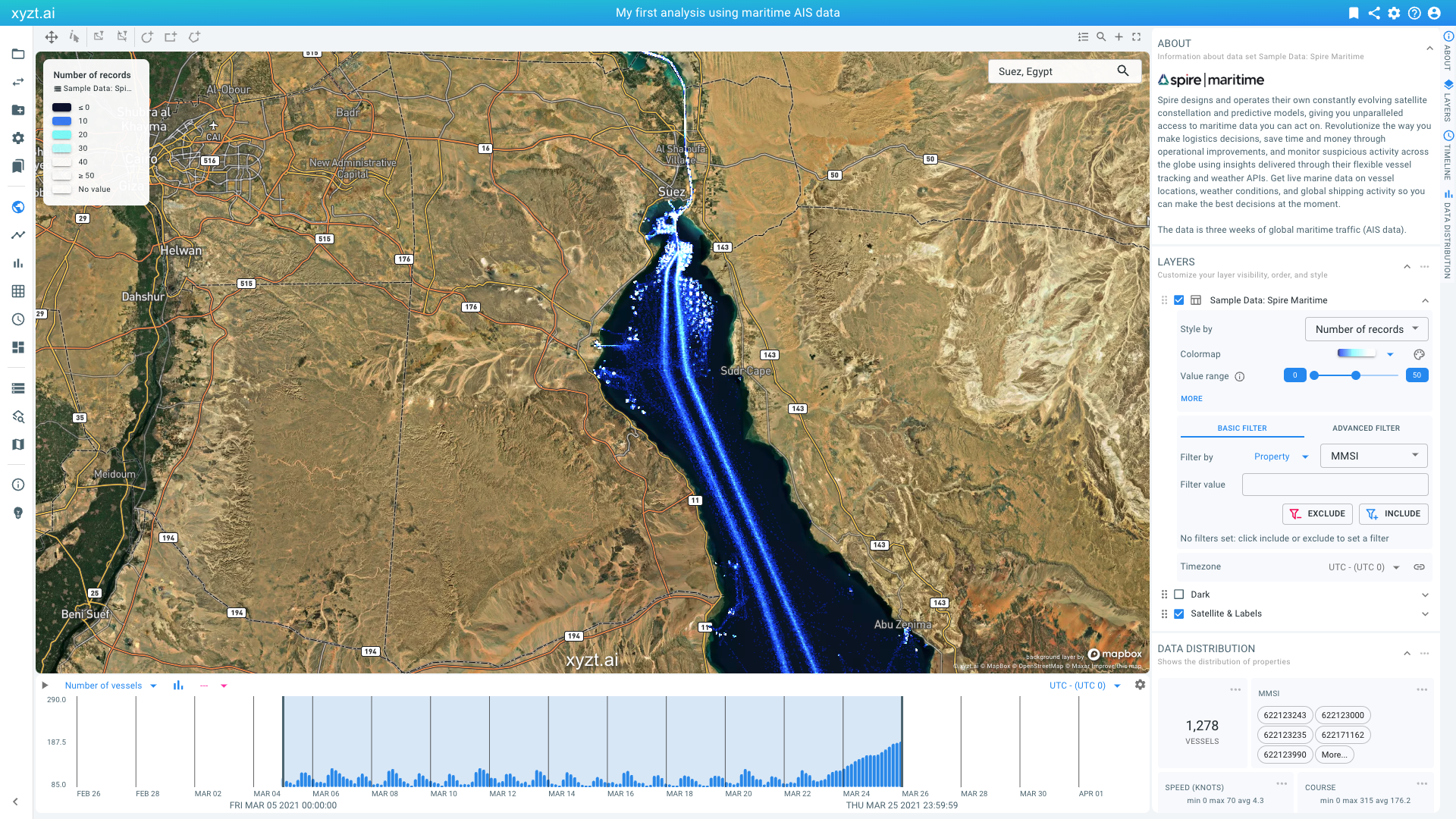 Figure 2. Fitting the map on
Suezand disabling the Dark background layer.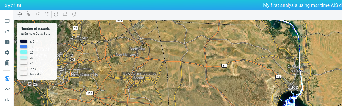 Figure 3. The map menu bar allows to draw circles, boxes, and polygons on the map.
 -
To restrict our analysis to the anchorage areas south of the Suez canal, let’s draw a circular shape as shown in the video below.You do so by clicking on the circle icon in the map menu bar above the map.
-
Provide a name for the shape, for example
Suez. -
Check the box Use shape as filter and leave the filter type to Inside
-
Press CREATE to create the shape on the map. Note: during shape creation you can always hit the escape button to cancel the shape creation.
-
-
We now are looking at the AIS records inside the shape. You can further zoom in using the scroll wheel to focus on the data.
Let’s visualize the data by the Speed (knots) attribute, mapping speed to a color using a suitable colormap.This is done in following steps:
-
In the LAYERS panel, locate the
Sample Data: Spire Maritimelayer. TheStyle bynow saysNumber of records. SelectSpeed (knots)instead. -
Change the colormap to one with more color variation, for example the purple-to-yellow plasma colormap.
-
Change the Value range slider so that the left knob says
0and the right knob is close to15. Notice how we can now clearly distinguish moving vessels from vessels at anchor or moored.Note also how the legend adapts to your configuration and how the SPEED (KNOTS) widget in the DATA DISTRIBUTION on the right is colored according to the configuration. You should also see on that bar chart how most vessels are not moving (about 75% of the location records depending on the shape that you use for filtering).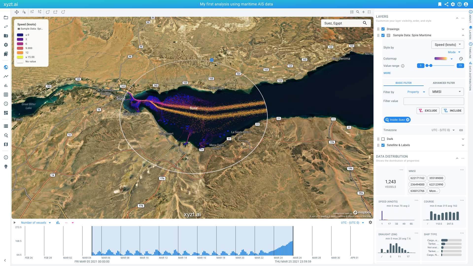 Figure 4. Filtering by a user-drawn shape and coloring by the Speed property.
 -
Let’s further analyze the distributions of the moving traffic and the standstill traffic.
-
In the LAYERS panel, locate the
Sample Data: Spire Maritimelayer and find the Filters panel. You can find it by looking for BASIC FILTER. Click on the second dropdown box in that filters panel and selectSpeed (knots). -
Drag the left-most knob to the
2value and click on INCLUDE. This applies a filter to only maintain the records that have a speed of at least 2 knots (and that are inside the Suez shape that we created before). This hence highlights the moving vessels and their locations.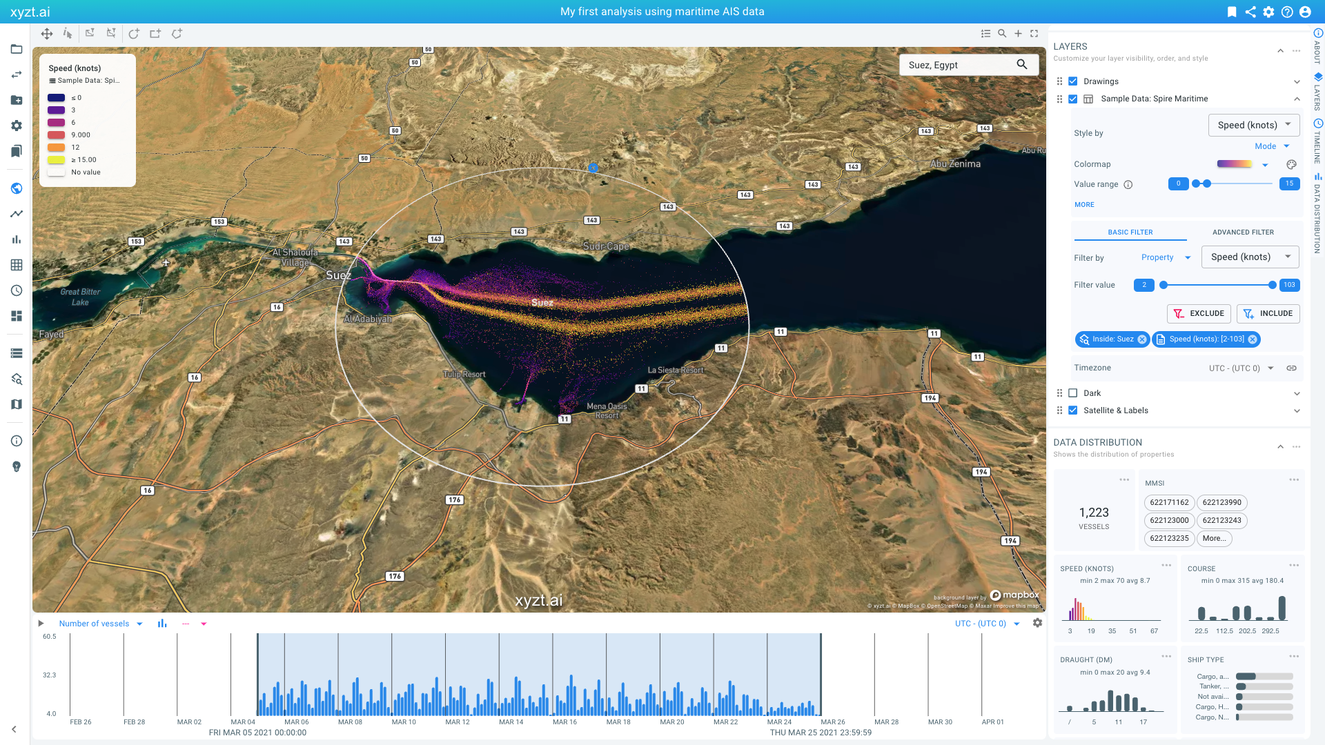 Figure 5. Filtering by a data property Speed (knots) to only look at traffic that is moving
 -
Notice how the circular patterns on the map disappear (those are vessels at anchor) and notice how the velocity profile shows a clear peak around 7 knots. Also look at the histogram on the timeline, showing total numbers of vessels over time. As you can see by March 23-25 there are less moving vessels.
-
Let’s now visualize the opposite: the vessels at anchor., This can easily be done by clicking on the EXCLUDE button in the Filters section in the LAYERS panel. Note the very different histogram on the timeline. The number of vessels stuck is clearly increasing from March 23 and on.
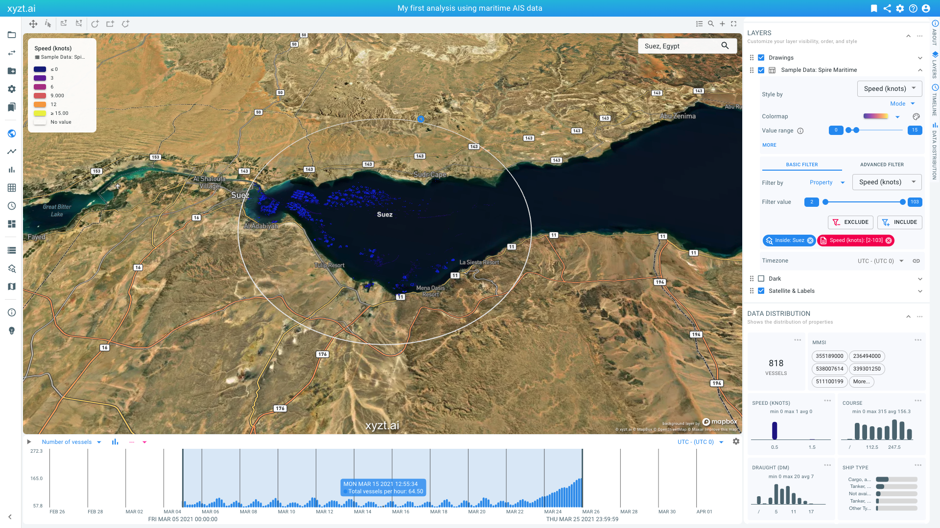 Figure 6. Filtering by a data property Speed (knots) to only look at traffic that is not moving.
-
Using the styling and filtering capability you can extract and highlight any insight on the map. Let’s disable the Speed filter again, by clicking on the red chip in the Filters section in the LAYERS panel.
Before continuing with the next step, let’s save our analysis as follows:
-
Press the bookmark icon in the top right corner of the page menu bar.
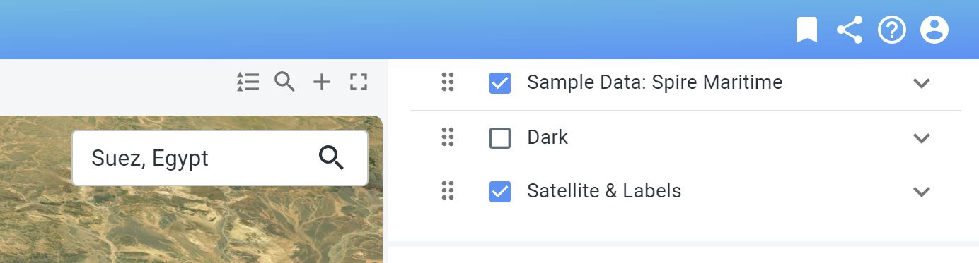 Figure 7. Bookmarking a page to save the project state.
 -
Provide a name and optional description. Let’s just use the name
Suezfor now. -
Press CREATE BOOKMARK
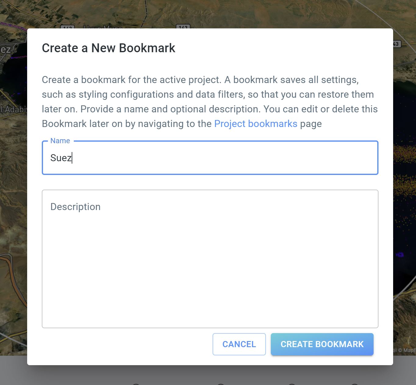 Figure 8. Naming your first bookmark.
You can now always return to your analysis from this step by clicking on Project bookmarks on the navigation bar and by clicking on the relevant bookmark card.
Step 2.2: Analyze change in traffic density over time, using the split view capability
In the previous part of the tutorial, we toggled between looking at traffic moving and not moving.
You can also compare different situations using the split view capability. For this, click on the + button above the map on the top right side.
The page now displays two maps, two timelines, and two data distribution panels.
By default, these maps and timelines are linked. That means that if you navigate one map, the other follows in the same way. You can unlink the maps and timelines by clicking on the link button above the right map and the right timeline. Note, you can keep the link function activated for the map while the link function is deactivated for the timeline (and vice versa), as shown in the example below.
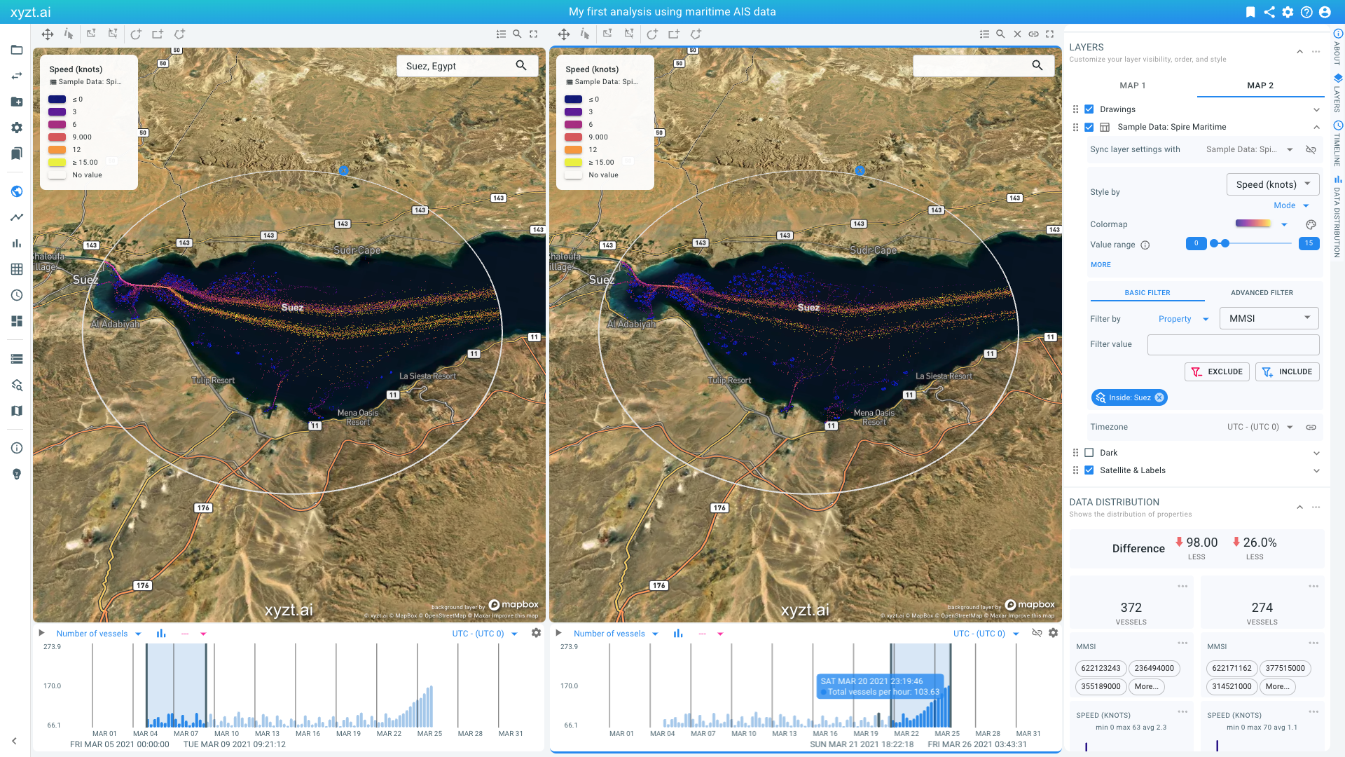
Figure 9. Split view analysis enables looking at different regions and periods.
Let’s unlink the timelines and set a different time filter on both maps:
-
To unlink the timelines, click on the link button in the top right corner of the second timeline.
-
On the first timeline, move the right-most thick vertical line to the left, so that the time range is set on the first 5 days in the data (Mar 5 until Mar 9).
-
On the second timeline, move the first thick vertical line to the right, focusing on the last 5 days in the data set (Mar 22 until Mar 26).
-
Notice that in the second period, there are about 38% less different vessels near Suez, while, surprisingly, the timeline indicates an increase in number of vessels per hour. The reason is that there is much less traffic moving, and vessels are stuck because of the Ever Given blocking passage.
The split view capability enables other side-by-side analysis use cases:
-
Look and compare two different regions
-
Apply two different filters in each view (e.g., looking at slow traffic in the first, and fast traffic in the second)
-
Style your data by two different properties (e.g., styling by speed in the first, and by vessel status in the second)
Step 2.3: Analyze traffic from, to, and through different areas
For this step of the tutorial, we are going to look at vessel movements through different ports in Europe. For the example, we will focus on Rotterdam, Antwerp, and Hamburg.
For this we will create an Areas of interest layer by uploading a GeoJSON file with the 3 port areas:
-
Download and save Antwerp_Rotterdam_Hamburg.geojson, a file with the different port areas.
-
Select Areas of interest on the navigation bar on the left.
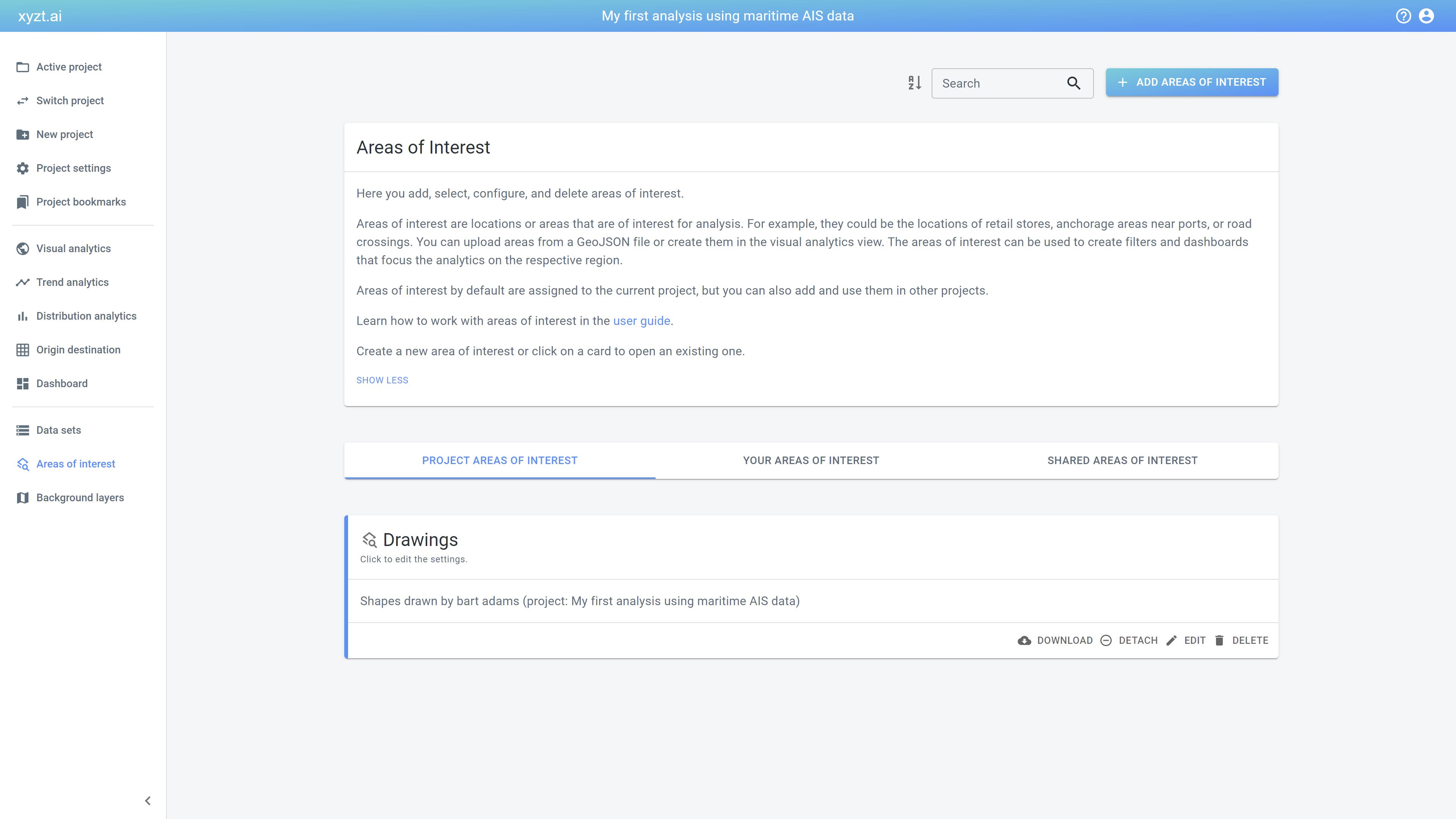 Figure 10. Areas of interest can be added by uploading a GeoJSON file.
 -
Click on the ADD AREAS OF INTEREST button on the top right of the page.
-
Drag 'n drop the
Antwerp_Rotterdam_Hamburg.geojsonfile on the drop box or click on the drop box and select the file using the file chooser UI.
When the file is uploaded it shows the shapes on a map, in this case only 3, next to a number of configuration options.
-
Display name: This is the name of that will be used for the layer on the map in the Visual analytics page.
-
Description: An optional description to help other users understand what this file is meant for.
-
Area display name property: Here you select which property is used to reference each shape.
-
Distance threshold: Allows to set a distance in meters surrounding the shape (or point) to extend the shape with. This is especially useful for point locations.
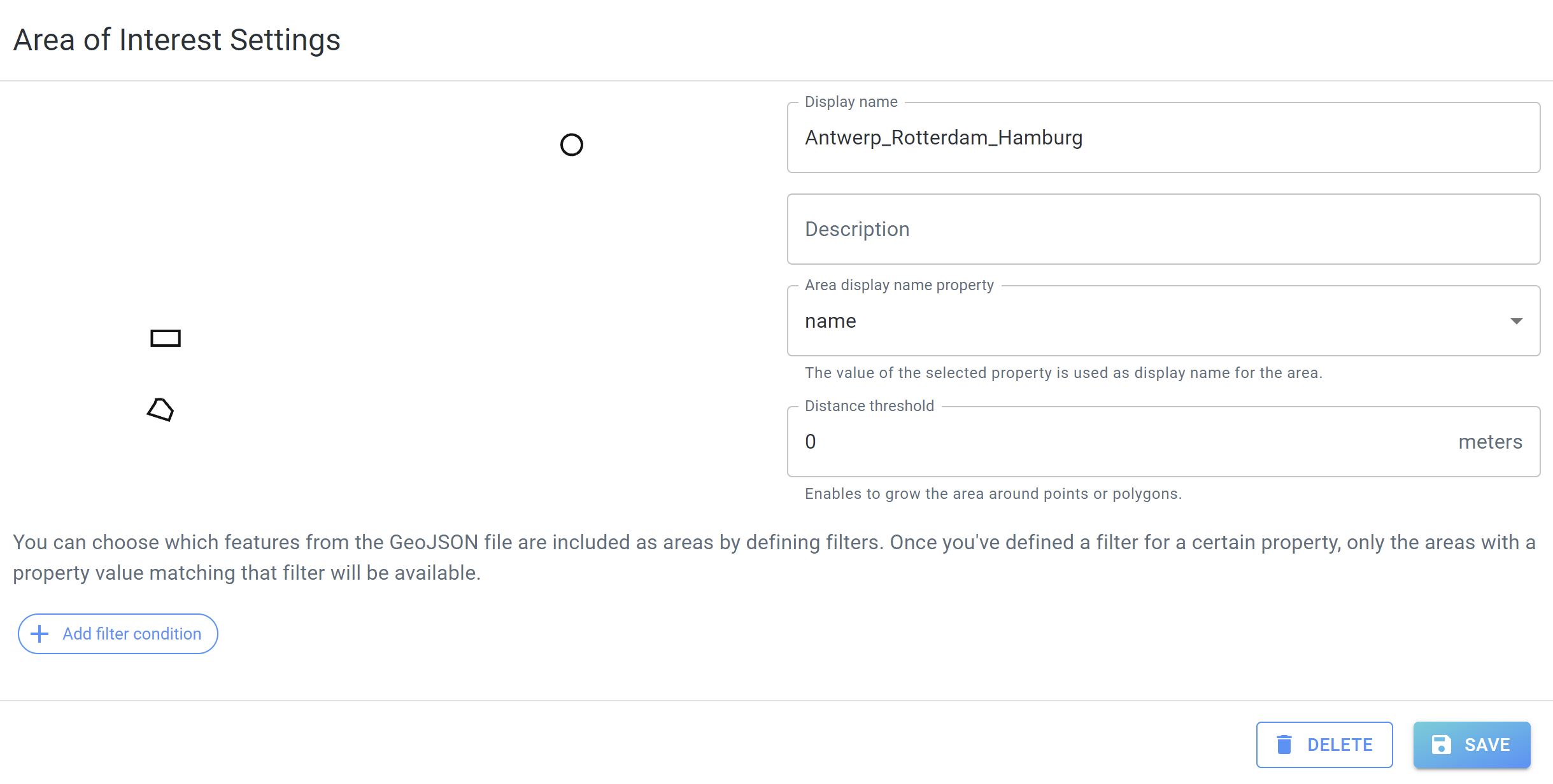 Figure 11. Choosing a GeoJSON data property as area display name property.
Let’s finalize the Area of interest creation clicking on SAVE.
Now, let’s look at all traffic inside and passing through these maritime ports.
For this follow these steps:
-
Go back to the Visual analytics page and reload the page to go back to the default settings.
-
Search for
Rotterdamin the search box on the map. Click on Rotterdam, South Holland, Netherlands or hit enter to fit the map on the searched location.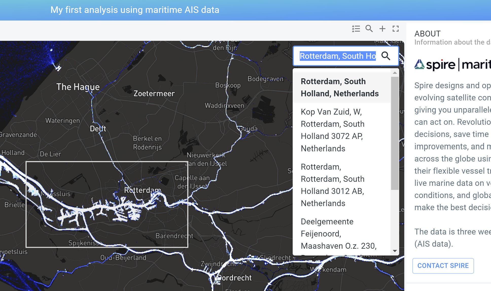 Figure 12. Searching for a location and fitting the map on the found location.
 -
In the Filters section in the LAYERS panel, set an area filter using the
Rotterdamport:-
Next to Filter by, click on the first dropdown box in the Filters section and select Area.
-
Next to Filter by, click on the second dropdown box and select Through.
-
Next to Filter value, click on the dropdown box and select
Rotterdam. -
Click on the INCLUDE button.
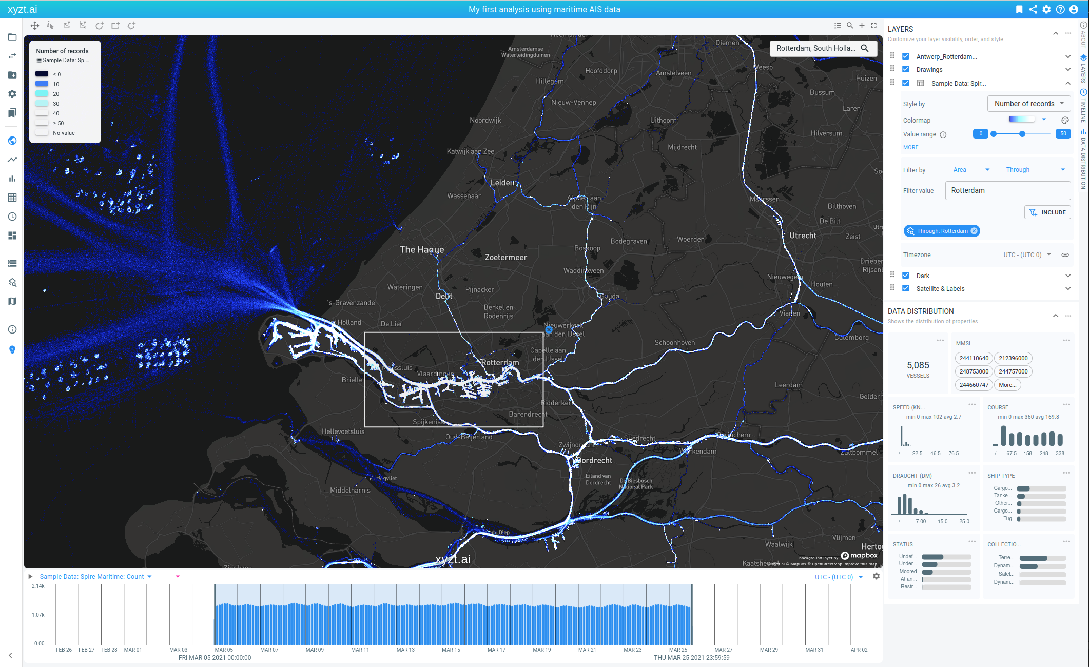 Figure 13. Filtering using one of the uploaded GeoJSON shapes, to look at traffic through a port.
-
We now have applied a filter that retains only the AIS records of vessels passing through the Rotterdam area. You can navigate and zoom in on the data to further inspect the area. Note that the histogram statistics, for example on the timeline, are now reflecting the applied spatial filter.
Look at the global traffic over the past 3 weeks passing through Rotterdam as follows:
-
Right click on the map.
-
Select Fit On → All Data. You should now see where these vessels came from and went to.
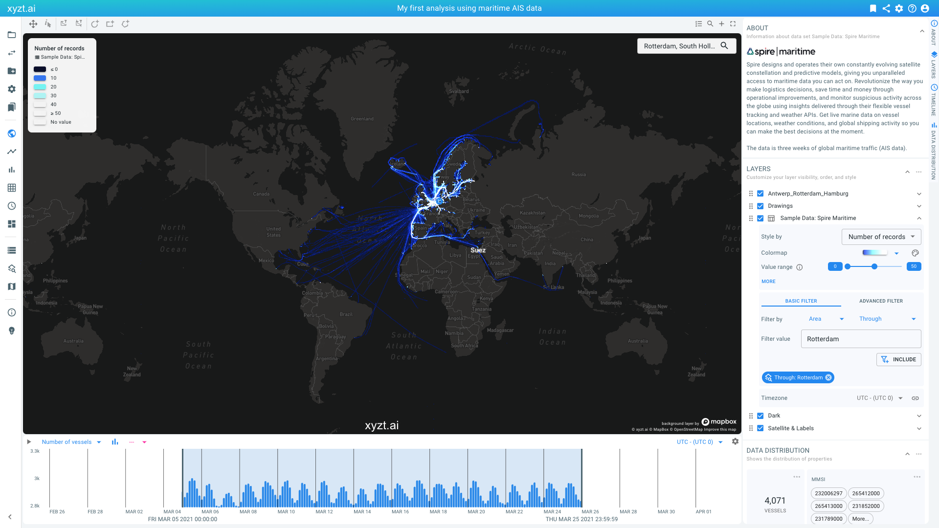 Figure 14. Identifying where traffic comes from and goes to after applying a passthrough filter.
You can disable the filter again in two ways:
-
By clicking on the x button on the map.
-
By clicking on the x button on the chip in the Filters section in the LAYERS panel.
Note that you can also enable spatial filters for shapes on the map, directly from the map:
-
Type
Antwerpin the search box and hit enter.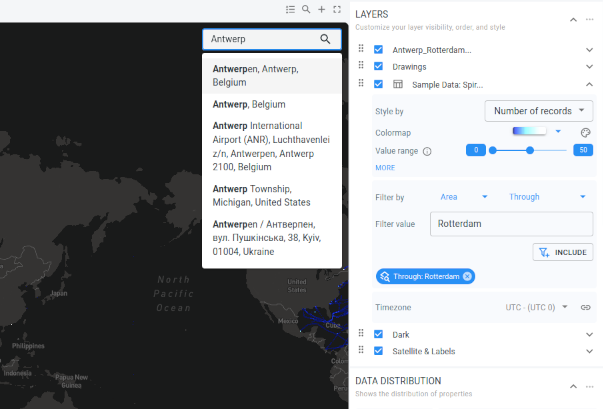 Figure 15. Fitting the map on the Antwerp region.
 -
Now right-click on the polygon shape surrounding the port and select Use Shape Antwerp as Filter → Through.
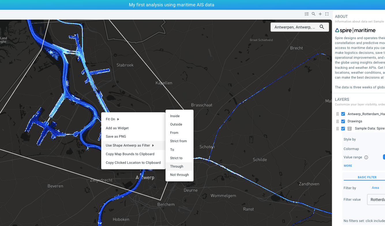
Figure 16. Right clicking on the map reveals the context menu that can be used to add a shape filter.
-
Right-click on the area on the map.
-
A context menu should now be shown. Select Use shape Antwerp as filter.
-
Then select Through.
-
Note how in the Filters section in the LAYERS panel a chip appears saying
Through: Antwerp (x). We have now applied a filter that retains all records of all trips passing through the Antwerp area.
-
-
Right-click and fit the map again to see the global traffic passing through Antwerp.
-
You can then zoom in on any area with traffic and analyze and identify the vessels coming from that area.
Remember that the viewport of the map itself serves as a filter, meaning that just moving around provides you information on the traffic inside the region you are looking at, considering also the other filters defined.
Next part
Go to the next part: Trend analytics
Got feedback? Additional questions? Just want to have a friendly chat?
Get in touch!