Got feedback? Additional questions? Just want to have a friendly chat?
Get in touch!
Available parts
- Goal
- Understanding AIS data
- Create new project
- Visual analytics
- Trend analytics
- Origin-destination (current)
- Create a dashboard
- Sharing your insights
- Conclusion
Step 4: Using the origin-destination capability
Origin-destination analysis looks at how traffic flows between various areas and instantly shows the difference in traffic through an easy-to-read matrix. Each area can be both an origin and a destination.
The Origin-destination analytics page displays a section with one or multiple matrices and a data distribution panel to configure the type of matrix, select a time range and time zone, define areas of interest, and apply data filters.
Click on Origin destination in the navigation panel on the left.
Step 4.1: Look at how vessel traffic moves between different areas
Similar to the Trend analytics, the first time you open this page, it will load with a number of default settings:
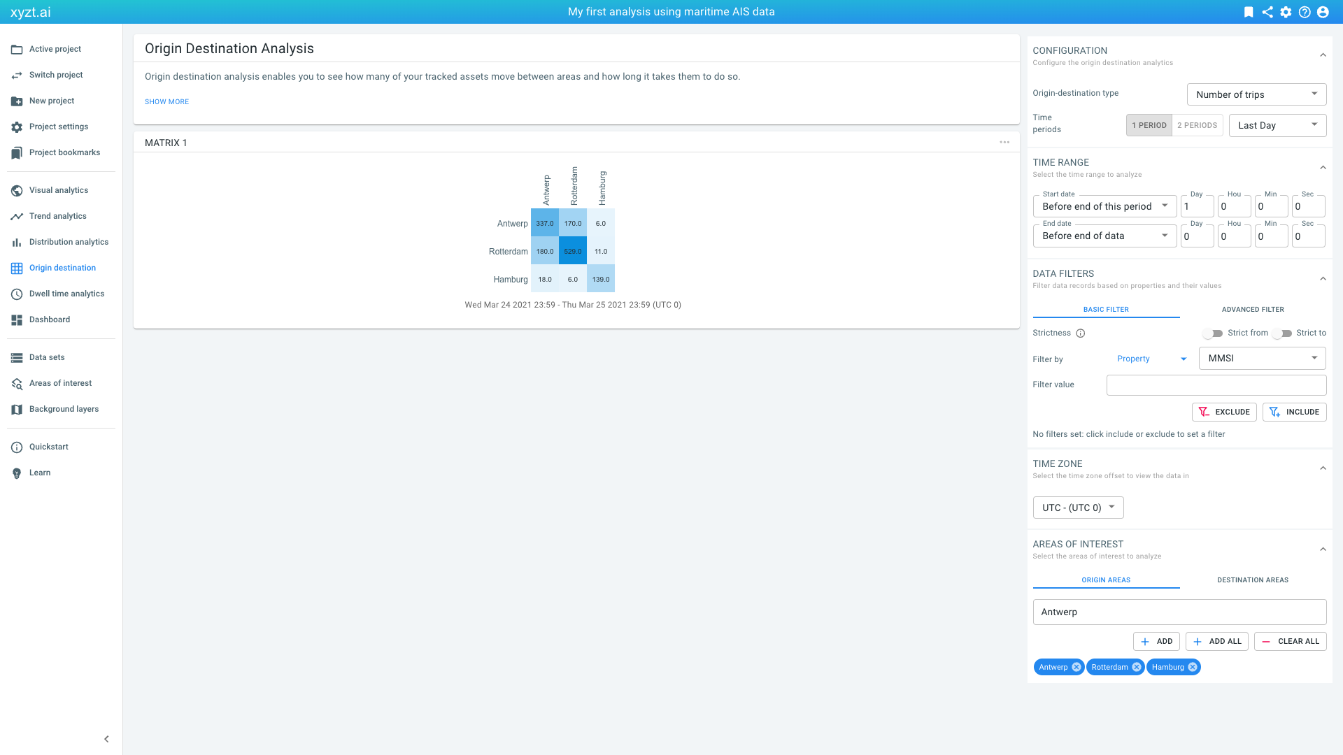
Figure 1. Default origin-destination view, analyzing the last day of traffic.
-
The CONFIGURATION box is used to select the type, by default
Number of trips, but you can also select for exampleAverage travel time. Here you can also choose between analyzing one period or comparing two periods. -
The AREAS OF INTEREST box automatically selects 3 areas from your drawing layers and uploaded GeoJSON shapes. In this case, traffic flows between Antwerp, Rotterdam, and Hamburg are visualized as you have downloaded the areas of interest document in a previous tutorial, Visual analytics.
-
The matrices show the absolute number of trips.
-
The DATA FILTERS box allows you to filter on the data similar to the filtering in the LAYERS PANEL on the visual analytics page.
|
Difference between from/to and strict from/to
In the DATA FILTERS box you notice that are two toggles for Strictness. By default these are disabled. When strictness is disabled, this means that any vessel sailing between the origin and destination area is counted, even if that vessel started its journey before entering the origin and/or proceeds its journey after leaving the destination area. When strictness is enabled, the vessel’s journey is only counted, if it starts in the origin area and/or ends in the destination area. |
Step 4.2: Understand origin-destination matrices and the different visualization modes
Let’s look in more detail what the origin-destination analysis can teach us. For this, let’s focus on the port areas Rotterdam, Antwerp, and Hamburg for the past week and the week before:
-
Click on the (x) on the
Suezchip in the AREAS OF INTEREST panel to remove the area, if it is there. Make sure our 3 port areas are selected in the AREAS OF INTEREST panel. -
On the CONFIGURATION panel, select 2 PERIODS and select
Last Week vs Week Before
We should now see 3 matrices with dimensions 3x3 each.
Because we have a time range active that compares two time periods, the analysis for the first day is shown in the first matrix (time period one), and the analysis for the second day is shown in the second matrix (time period two). The third matrix shows the difference between the traffic activity of time period one and two.
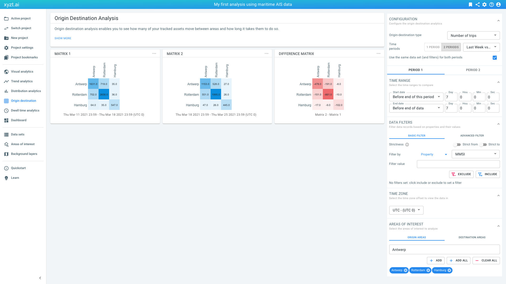
Figure 2. Origin-destination analysis for the 3 port areas.
The numbers indicated are the number of vessels that move between the origin (labels on the left) to the destination (labels at the top). We see a decrease of all traffic in the second week compared to the first week.
These numbers are absolute numbers, and sometimes it is more informative to use percentages. To look at percentages:
-
Select Percentage of trips (same origin) or Percentage of trips (same destination) from the dropdown box in the CONFIGURATION panel on the top right of the page.
You can now see what percentage of trips start or go to a certain area.
Let’s bookmark this analysis by clicking on the bookmark icon found at the top right of the screen and naming it Origin Destination Ports.
|
You can update bookmarks
When you have loaded a bookmark before and try to create a new bookmark, the platform will ask you if you want to update the previously loaded bookmark. If you do not want to update, but instead create a new one, select CREATE NEW. |
Next part
Go to the next part: Create a dashboard
Got feedback? Additional questions? Just want to have a friendly chat?
Get in touch!