Got feedback? Additional questions? Just want to have a friendly chat?
Get in touch!
Available parts
- Goal
- Understanding floating vehicle data
- Create new project
- Visual analytics
- Trend analytics
- Origin-destination
- Create a dashboard (current)
- Sharing your insights
- Conclusion
Step 5: Creating a dashboard
Now that we have analyzed traffic on Highway 1 and in the Hamburg port area, let’s put our analysis result on a dashboard and share it with others.
For this, let’s revisit the analyses we did:
-
Click on the Project bookmarks button in the navigation bar on the left. You should now see a page with 3 bookmarks called
Step 4.3,Step 3.1, andStep 2.1. -
Click on the VISUAL ANALYTICS button under
Step 2.1on the last card. -
You should again see a map with the circular
Highway 1area where the floating vehicle data is colored based on Speed and filtered based on the heading.
Let’s put two widgets on the dashboard, the map and the speed profile widget:
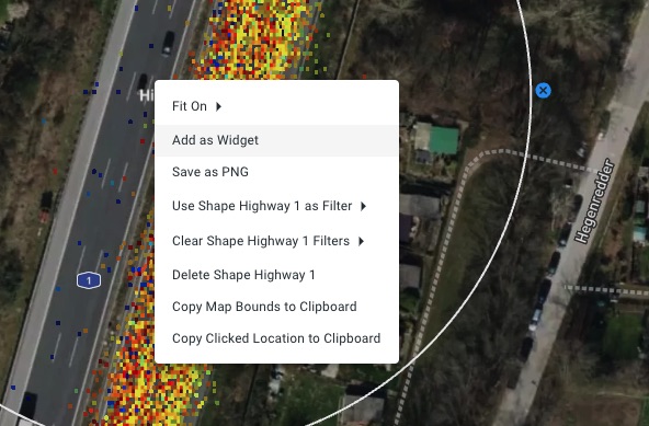
Figure 1. Each map, timeline, widget, can be added to the dashboard by right-clicking.
-
Right-click on the map and select Add as Widget.
-
Give the widget a title:
Highway 1 -
Add a description (optional):
Trips along highway 1 colored by velocity. -
Choose a widget group. Since this is the first widget we create, we also have to create a widget group. Type
My first analysis.
-
-
Press the CREATE button.
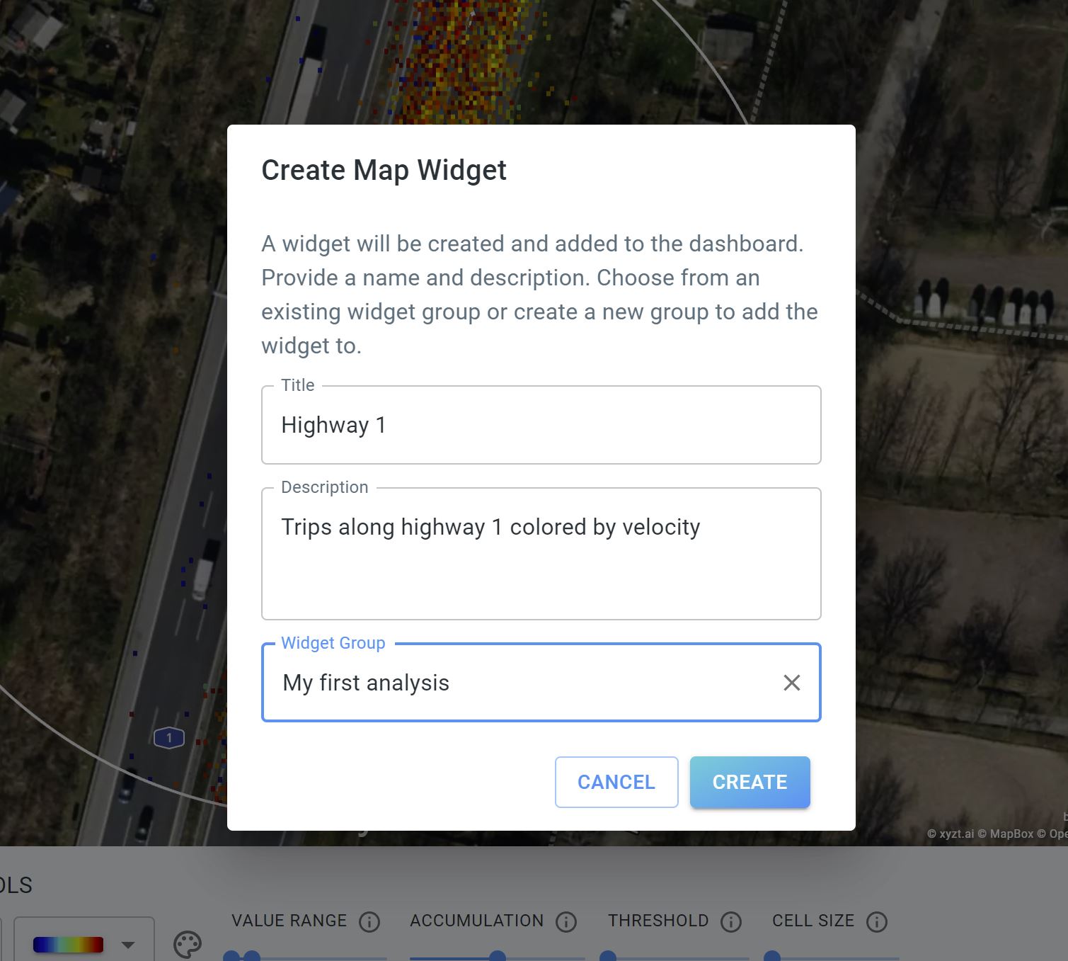 Figure 2. Widgets on the dashboard have a title, an optional description, and a widget group.
You should now see a notification in the lower right corner that the widget was created successfully.
Let’s add a second widget:
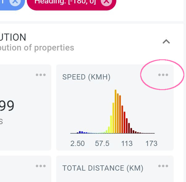
Figure 3. Also bar charts can be added as a widget on the dashboard.
-
Click on the 3 dots (…) in the top right corner of the SPEED (KMH) widget in the DATA DISTRIBUTION panel.
-
Select Add as Widget.
-
Give the widget a title:
Highway 1 speed -
Add a description (optional):
Speed profile along Highway 1. -
Select the previously created widget group
My first analysis.
-
-
Press the CREATE button.
Now click on Dashboard to open the newly populated dashboard. Note how the two widgets are present.
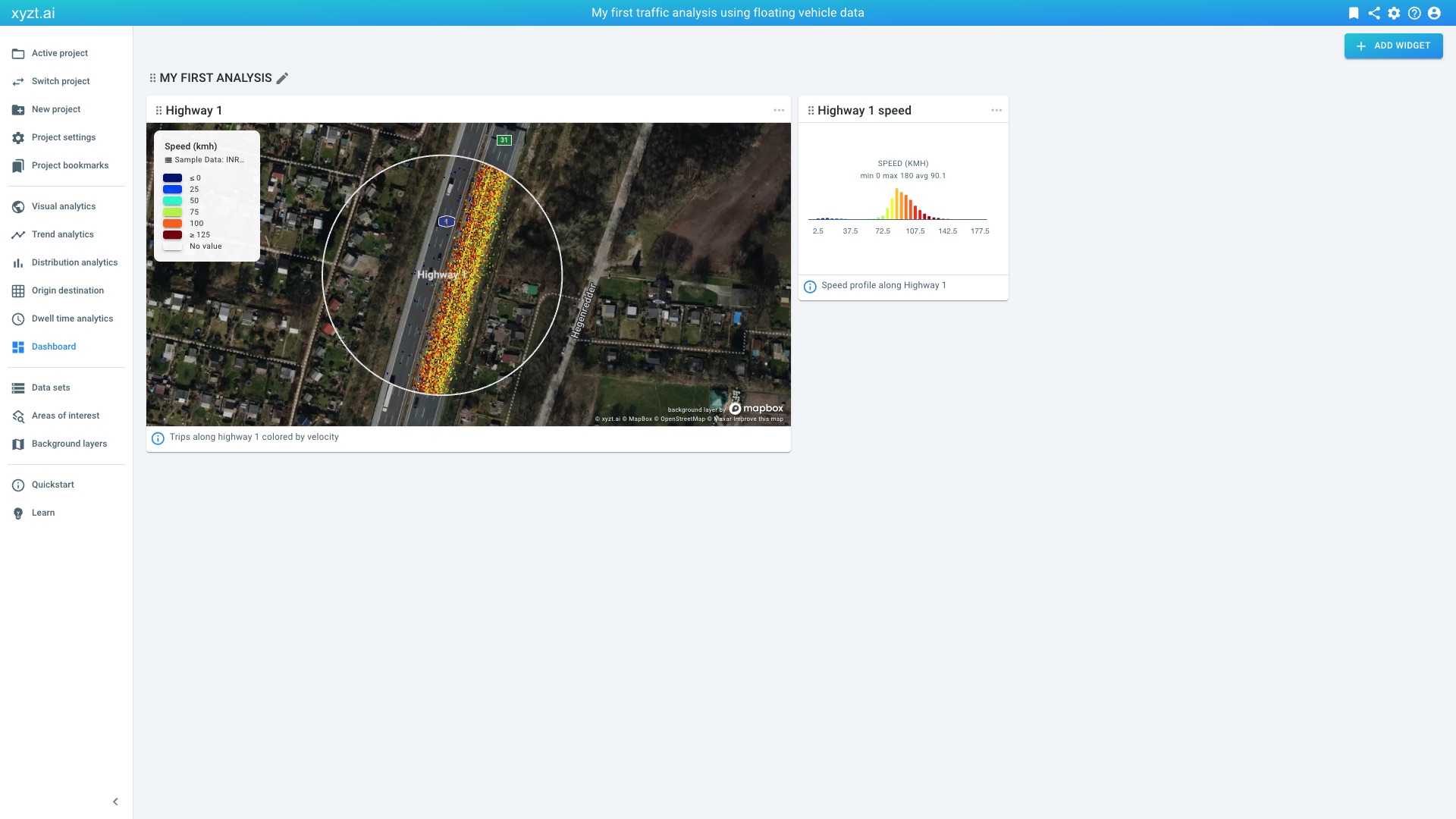
Figure 4. Dashboard with two widgets from the Visual analytics page.
Let’s add a 3rd widget to provide more information to the dashboard:
-
Click on the ADD WIDGET button in the top right corner of the Dashboard page.
-
Provide a title:
About -
Provide content, this can be basic html:
This dashboard is the result of my first floating vehicle data analysis applying styling and filtering to gather insights. -
You can leave the description empty.
-
Select the previously created widget group
My first analysis.
-
-
Press the CREATE button.
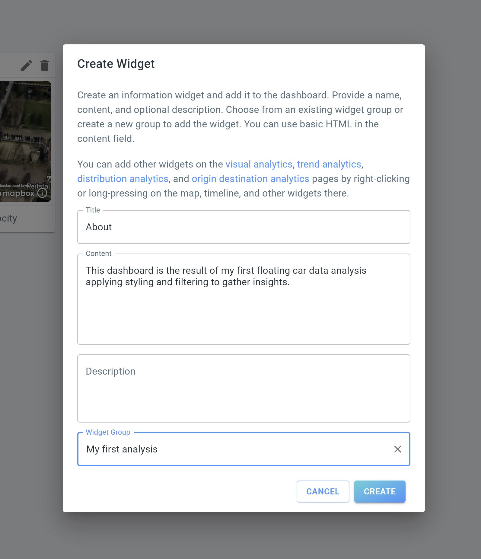 Figure 5. On the dashboard page you can add HTML-only widgets, for example to add About information.
The new widget is now added to the right. You can drag it, for example to the first place, using the drag handles left to the 'About' title.
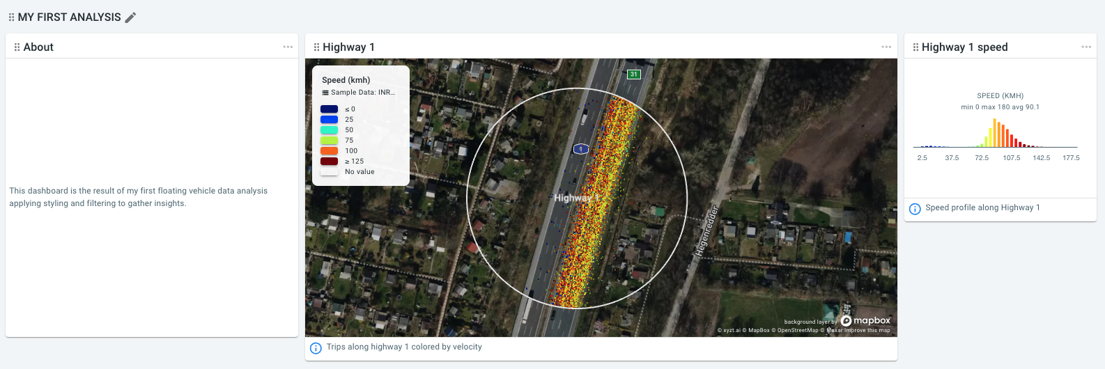
Figure 6. Widgets can be moved around by dragging them with the mouse.
Let’s now also add our origin-destination analysis to the dashboard:
-
Click on Project bookmarks on the navigation bar.
-
Click on ORIGIN DESTINATION on the Step 4.3 card.
-
Right-click on the 3rd card and select Add as Widget.
-
Provide a title:
Travel time changes -
Provide a description:
Shows change in travel times between Steinwerder and Highway 1 comparing Aug 5 with Aug 6. -
Choose our only widget group.
-
Now go back to the dashboard by clicking on Dashboard on the navigation bar.
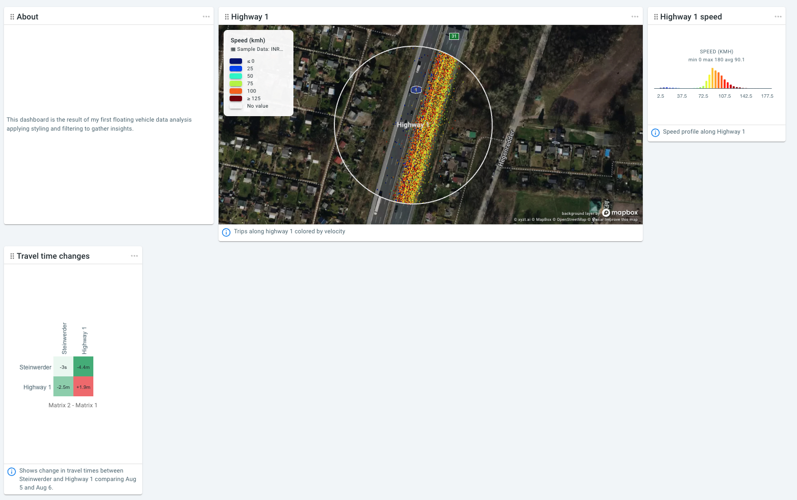
Figure 7. Dashboard now also showing a widget from the Origin destination page.
|
Customizing the position and size of widgets
When you create a widget, they take a default size. You can customize the size of the widgets by clicking on the three dots in the top-right corner of the widget. You can change the position of a widget, by dragging it around. |
Next part
Go to the next part: Sharing your insights
Got feedback? Additional questions? Just want to have a friendly chat?
Get in touch!