Got feedback? Additional questions? Just want to have a friendly chat?
Get in touch!
Available parts
Step 2: Performing visual traffic analysis tasks
Now that we have set up our own project, we are ready to explore the data, and use it for traffic analysis.
We will use the Visual analytics page for this. Visual analytics is the science of analytical reasoning using interactive visual interfaces.
With visual analytics you can explore and answer questions on-the-spot, without having to run long and complex algorithms beforehand.
Step 2.1: Analyze the velocity profile at a highway segment, comparing both directions
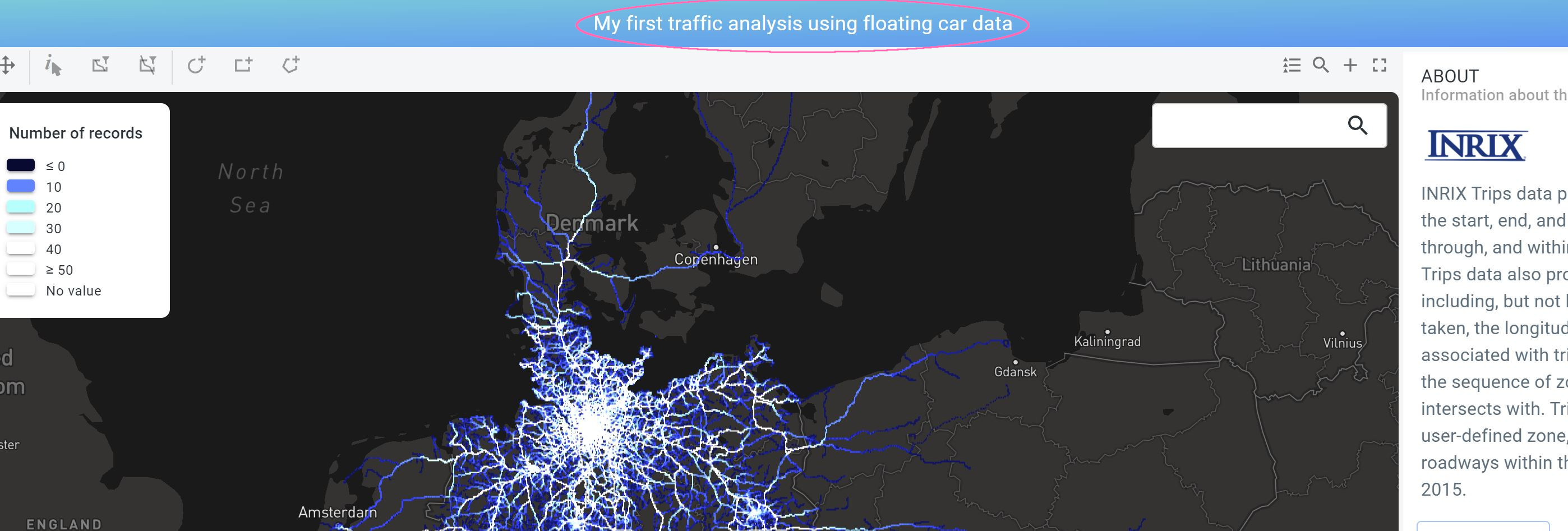
Click on Visual analytics to open the visual analytics page for your newly created project. Note by the way how the name of the active project is shown at the top of the page.
|
Use the browser’s zoom functionality
If you don’t see the active project name at the top, this means your screen is using a low resolution. In that case, you can use the browser’s zoom functionality to reduce the font size and give the different components such as the map, timeline, etc. more screen space. |
Figure 1. The active project is indicated at the top of the Visual analytics page.
In this part of the tutorial we will zoom in on the data, and perform a local traffic analysis by styling and filtering the data.
To get familiar with the Visual analytics page, zoom in and out on the map with the scroll wheel and on the timeline. Note how the histogram on the timeline updates when you zoom in on the map: The histogram corresponds to the data shown on the map. This means that the map viewport itself serves as a filter.
Similarly, when zooming in on the time line, the time range is reduced and the map updates.
Finally, also the statistics on the floating vehicle data properties on the right side in the DATA DISTRIBUTION panel update and reflect the summary statistics of the data being shown on the map.
Now, let’s focus on a single highway segment, for this perform following steps:
-
In the search box on the top right of the map, type
Hegenredder, and selectHegenredder, 22117 Hamburg, Germany. The map now fits on an area with Highway 1 going in the north-south direction. -
Disable the Dark background layer by disabling the checkbox next to
Darkon the LAYERS panel.This should reveal the aerial imagery.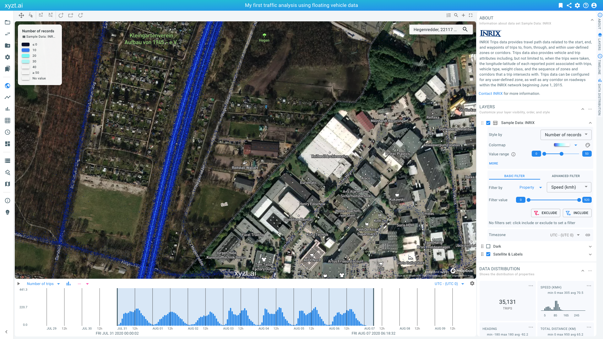 Figure 2. Fitting the map on
Hegenredderand disabling the Dark background layer.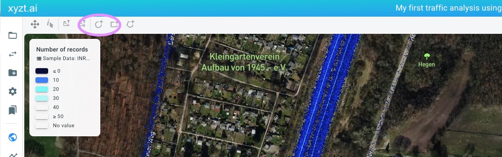 Figure 3. The map menu bar allows to draw circles, boxes, and polygons on the map.
 -
To restrict our analysis to the highway, let’s draw a circular shape as shown in the video below.You do so by clicking on the circle icon in the map menu bar above the map.
-
Provide a name for the shape, for example
Highway 1. -
Check the box Use shape as filter and leave the filter type to Inside
-
Press CREATE to create the shape on the map. Note: during shape creation you can always hit the escape button to cancel the shape creation.
-
-
We now are looking at the floating vehicle records inside the shape. You can further zoom in using the scroll wheel to focus on the data.
Let’s visualize the data by the SPEED (KMH) attribute, mapping speed to a color using a suitable colormap.This is done in following steps:
-
In the LAYERS panel on the right, locate the
Sample Data: Inrixlayer. Click on the dropdown box calledStyle bythat now saysNumber of recordsand selectSpeed (kmh)instead. -
Change the colormap to one with more color variation, for example the JET colormap that goes from dark blue over green and yellow to red.
-
Change the VALUE RANGE slider so that the left knob says
0and the right knob is close to125. Notice how traffic south colors up more blue and traffic north more red. Note also how the legend adapts to your configuration and how the SPEED (KMH) widget in the DATA DISTRIBUTION on the right is colored according to the configuration.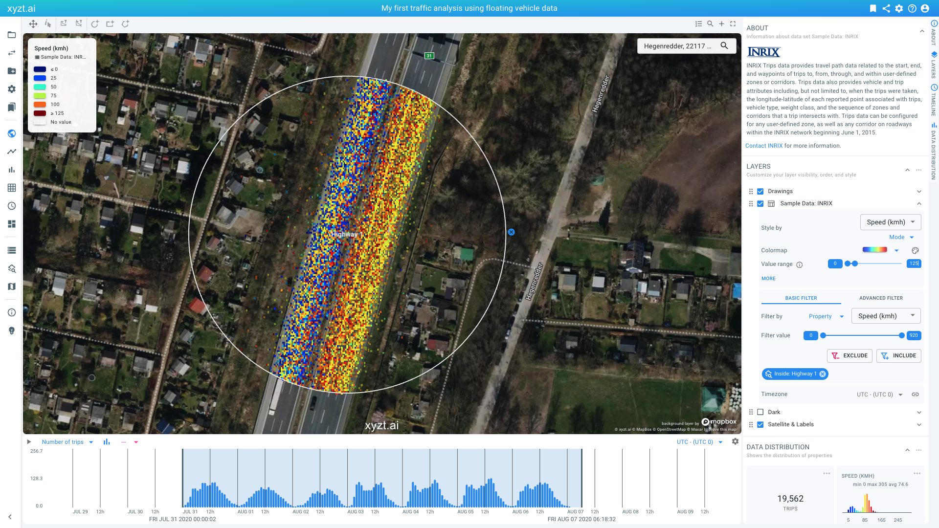 Figure 4. Filtering by a user-drawn shape and coloring by the Speed property.
 -
From looking at the map, we can see that traffic differs quite a bit between south and north. Let’s look at the velocity profile in more detail in both directions.
-
In the Filter by section of the LAYERS panel on the right, click on the second dropdown box and select
Heading. -
Leave the first knob at
-180and drag the right-most knob to the-90value and click on INCLUDE. This applies a filter to only maintain the records that have a Heading in the [-180, -90] interval (and that are inside the Highway 1 shape that we created before). Figure 5. Filtering by a data property Heading to only look at traffic in one direction.
 -
Notice how the velocity profile shows two peaks, one 25 and one around 90. This means that traffic in this direction (south) sees quite some congestion.
-
Let’s now look at the other direction, this can easily be done by clicking on the EXCLUDE button in the Filters section of the LAYERS panel. Note the very different velocity profile, indicating no congestion.
-
Using the styling and filtering capability you can extract and highlight any insight on the map.
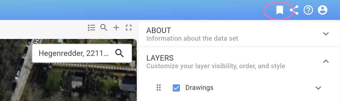
Figure 6. Bookmarking a page to save the project state.
Before continuing with the next step, let’s save our analysis as follows:
-
Press the bookmark icon in the top right corner of the page menu bar.
-
Provide a name and optional description. Let’s just use the name
Step 2.1for now. -
Press CREATE BOOKMARK
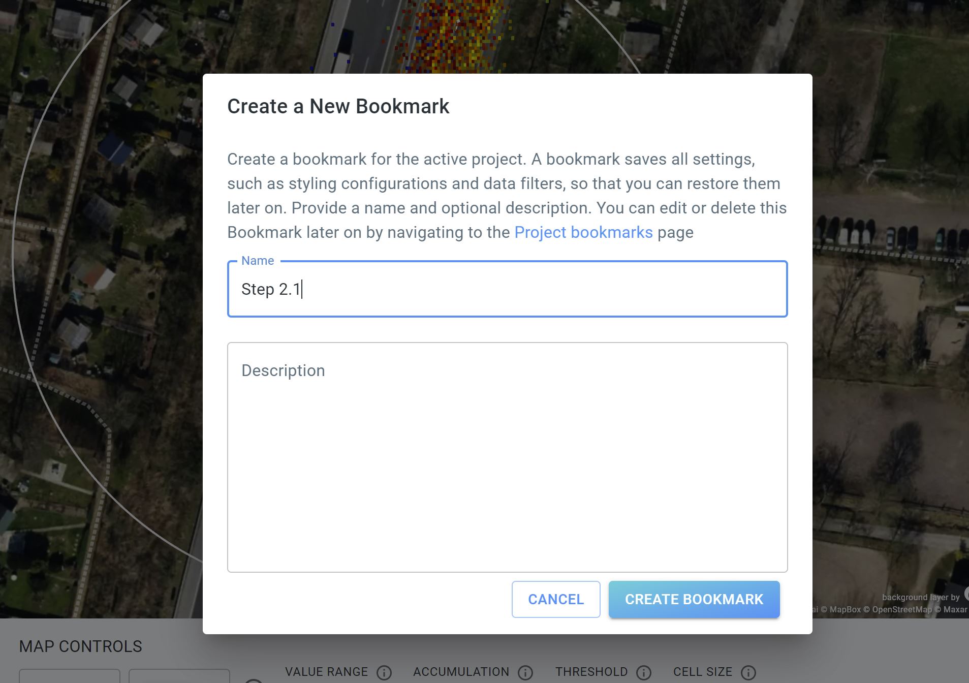 Figure 7. Naming your first bookmark.
You can now always return to your analysis from step 2.1, by clicking on Project bookmarks on the left and by clicking on the relevant bookmark card.
Step 2.2: Analyze change in traffic density over time, using the split view capability
In the previous part of the tutorial, we toggled between looking at traffic traveling south and north by changing a filter.
You can also compare different situations using the split view capability. For this, click on the + button above the map on the top right side.
The page now displays two maps and two timelines.
By default, these maps and timelines are linked, meaning that if you navigate one map, the other follows. You can unlink the maps and timelines by clicking on the link button above the right map and the right timeline.
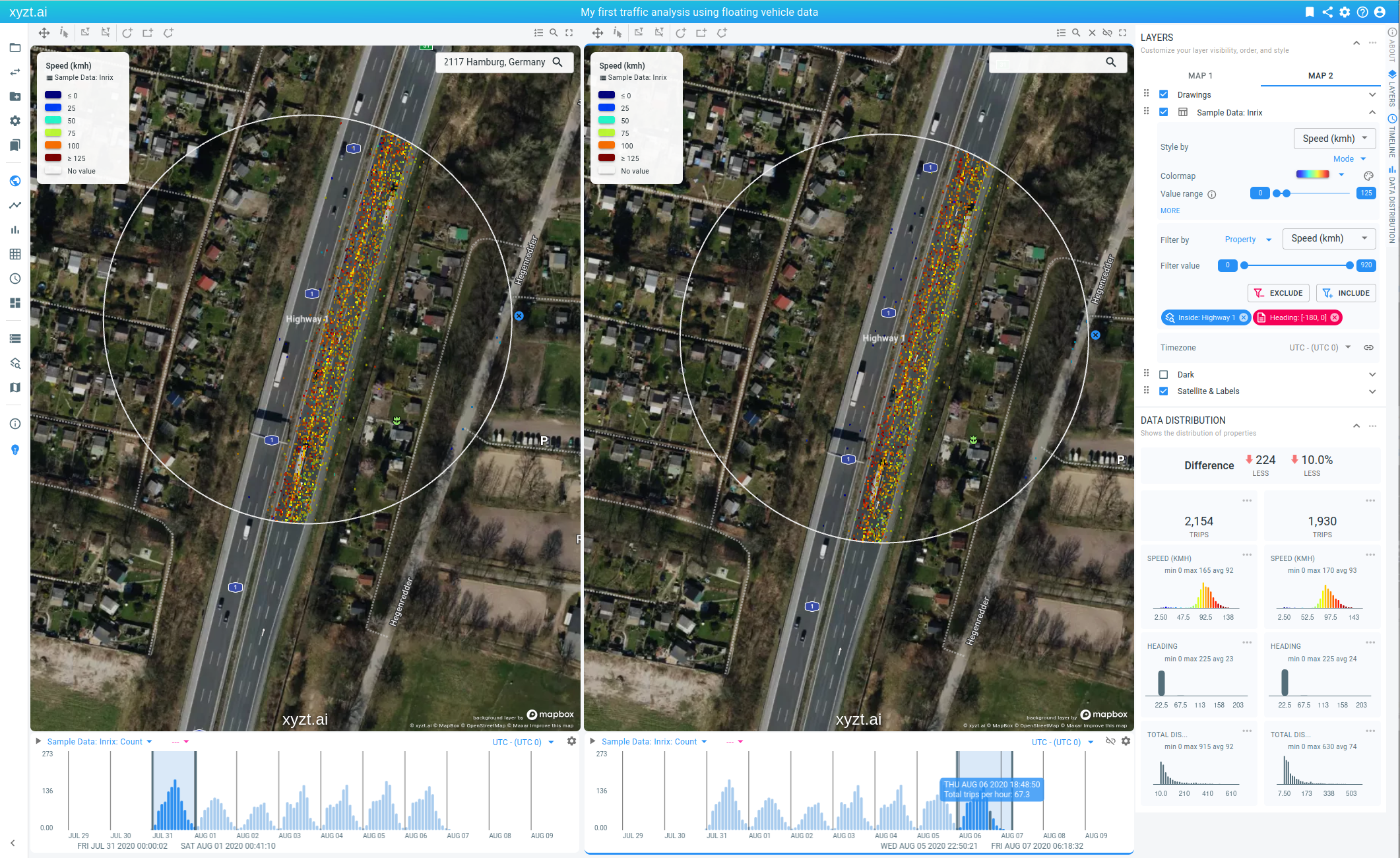
Figure 8. Split view analysis enables looking at different regions and periods.
Let’s unlink the timelines and set a different time filter on both maps:
-
Click on the link button in the top right corner of the second timeline.
-
On the first timeline, move the right-most thick vertical line to the left, so that the time range is set on the first day (July 31).
-
On the second timeline, move the first thick vertical line to the right, focusing on the last day in the data set (August 6).
-
Notice about 10% less traffic on the second day.
The split view capability enables other side-by-side analysis use cases:
-
Look and compare two different regions
-
Apply two different filters in each view (e.g., looking at slow traffic in the first, and fast traffic in the second)
-
Style your data by two different properties (e.g., styling by speed in the first, and by total distance in the second)
Step 2.3: Analyze traffic in different city neighborhoods, also looking at all traffic passing through a certain neighborhood
For this step of the tutorial, we are going to look at traffic in different neighborhoods in Hamburg, Germany.
For this we will create an Areas of interest layer by uploading a GeoJSON file with the neighborhoods:
-
Download and save
hamburg.geojson, a file with the different neighborhoods. -
Select Areas of interest on the navigation bar on the left.
 Figure 9. Areas of interest can be added by uploading a GeoJSON file.
 -
Click on the ADD AREAS OF INTEREST button on the top right of the page.
-
Drag 'n drop the
hamburg.geojsonfile on the drop box or click on the drop box and select the file using the file chooser UI.
When the file is uploaded it shows the shapes on a map, next to a number of configuration options.
-
Display name: This is the name of that will be used for the layer on the map in the Visual analytics page.
-
Description: An optional description to help other users understand what this file is meant for.
-
Area display name property: Here you select which property is used to reference each shape.
-
Distance threshold: Allows to set a distance in meters surrounding the shape (or point) to extend the shape with. This is especially useful for point locations.
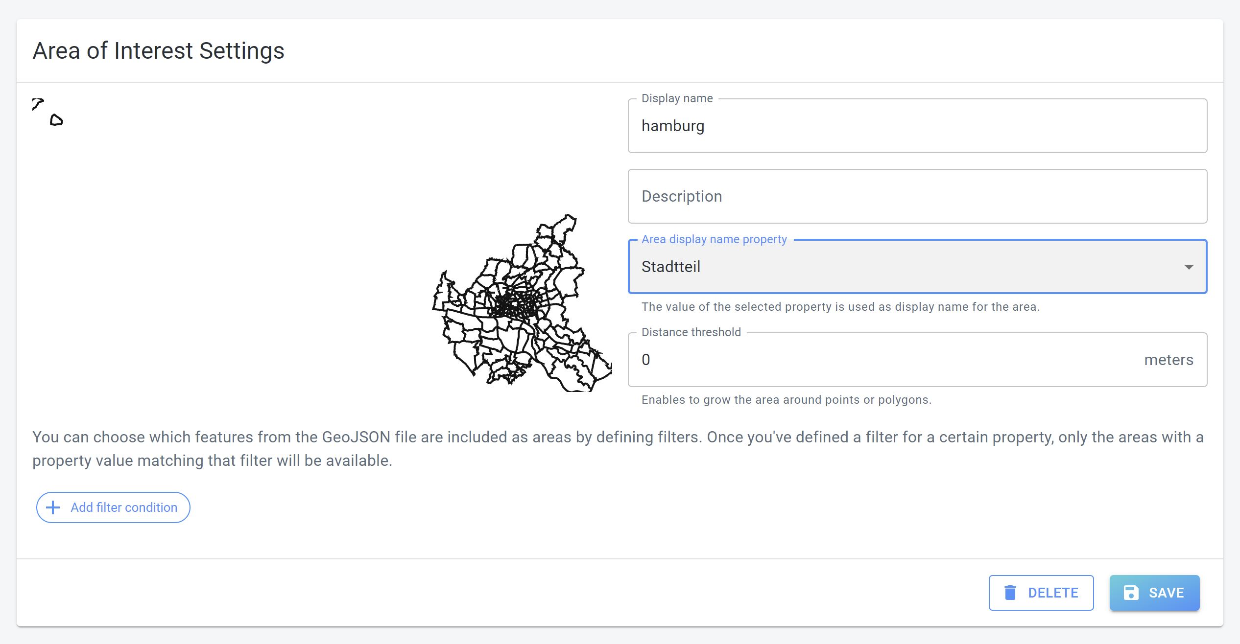 Figure 10. Choosing a GeoJSON data property as area display name property.
Let’s finalize the Area of interest creation:
-
Click on the dropdown box to select the Area display name property.
-
Select
Stadtteil. -
Press SAVE.
Now, let’s look at all traffic inside and passing through a specific neighborhood.
For this follow these steps:
-
Go back to the Visual analytics page and reload the page to go back to the default settings.
-
In the Filters section in the LAYERS panel, set an area filter using the
Steinwerderneighborhood:-
In the Filter by dropdowns, select Area in the first dropdown and leave the second dropdown on Inside
-
In the Filter value dropdown, select
Steinwerder. -
Click on the INCLUDE button.
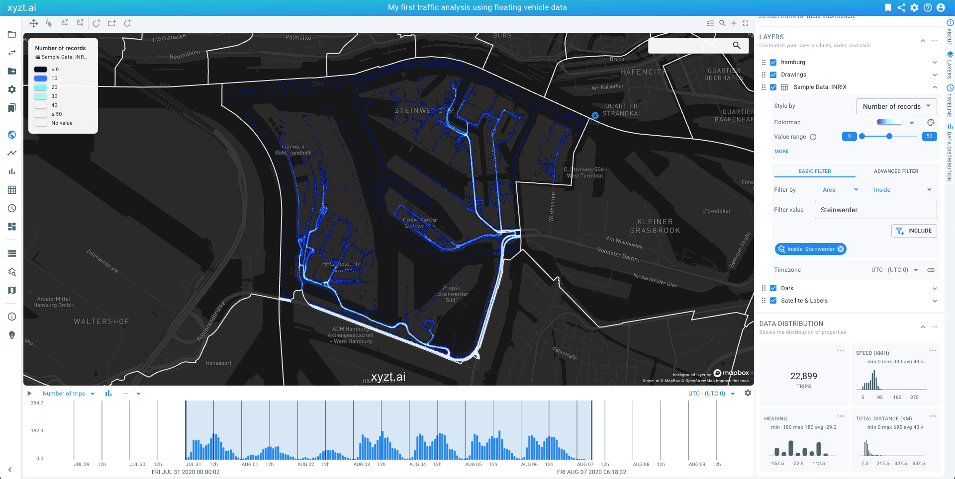 Figure 11. Filtering using one of the uploaded GeoJSON shapes, to look at traffic inside a city neighborhood.
-
We now have applied a filter that retains only the floating vehicle records inside the Steinwerder area. You can navigate and zoom in on the data to further inspect the area. Note that the histogram statistics, for example on the timeline, are now reflecting the applied spatial filter.
You can disable the filter again in two ways:
-
By clicking on the x button on the map.
-
By clicking on the x button on the chip in the Filters section of the LAYERS panel.
Let’s now try and identify what traffic passes through this area:
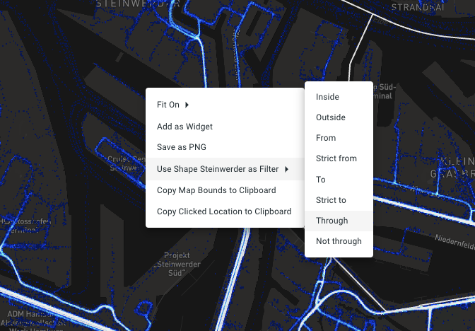
Figure 12. Right clicking on the map reveals the context menu that can be used to add a shape filter.
-
Right-click on the area on the map.
-
A context menu should now be shown.Select Use shape Steinwerder as filter.
-
Then select Through.
Note how in the Filters section of the LAYERS panel a chip appears saying Through: Steinwerder (x).
We have now applied a filter that retains all records of all trips passing through the selected area.
Let’s look at where this traffic is coming from:
-
Right-click on the map and select Fit On → All Data.
-
Select
Total Distance (km)as the property to visualize on the map from the Style by dropdown box in the LAYERS panel. -
Click on MORE under
Value Rangeto reveal additional styling options -
Move the Accumulation slider in the LAYERS all the way to the left to disable density coloring.
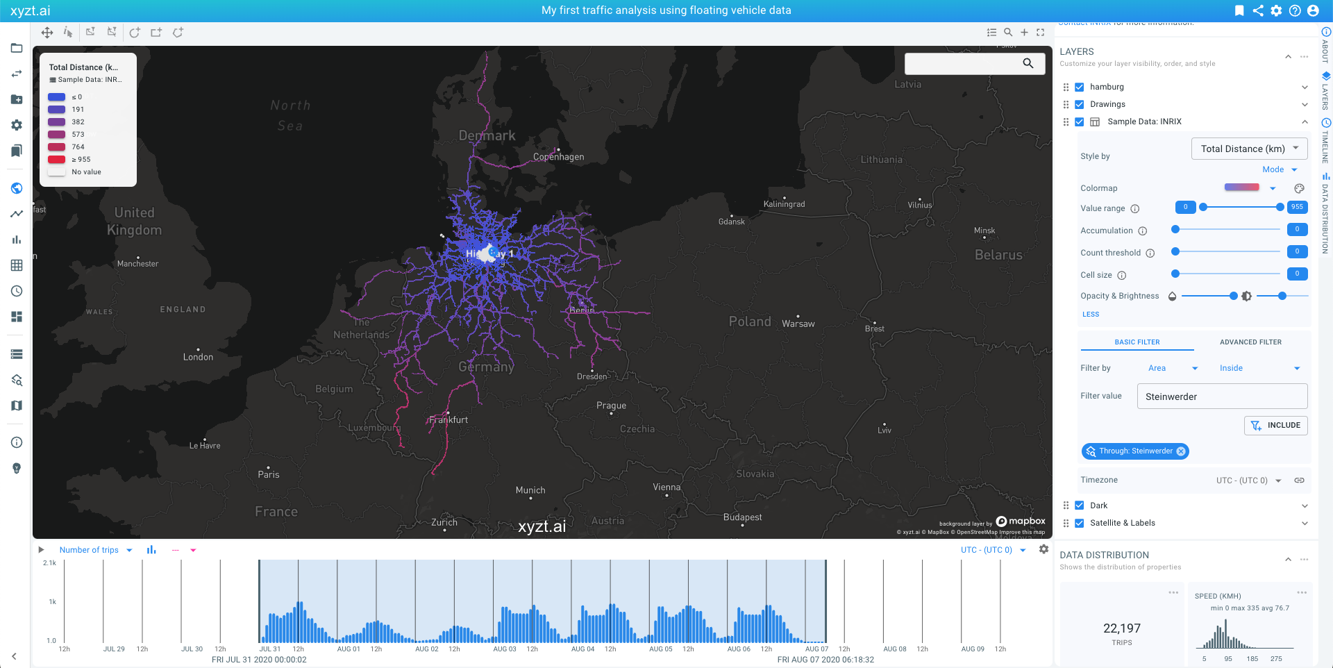 Figure 13. Traffic through the Steinwerder neighborhood in Hamburg colored by trip length (short trips in blue, long trips in red).
This picture now shows all trips passing through Steinwerder from all over Germany, the Netherlands, and Denmark.
|
Accumulation coloring
Accumulation modifies the intensity based on the number of records underneath each pixel, providing a sense of where your data is dense. Accumulation does not modify the hue. Move the slider completely to the left to disable accumulation coloring. |
Next part
Go to the next part: Trend analytics
Got feedback? Additional questions? Just want to have a friendly chat?
Get in touch!