What is xyzt.ai?
xyzt.ai is a spatio-temporal visual analytics platform to extract insights from data of things or people that move and change over time.
The platform enables extraction of insights for mobility, people flow, maritime and general traffic, weather and climate change use cases. It is meant to help you understand our dynamically changing world.
Don’t worry about data sizes, we designed the platform to scale to big data (it can handle for example point-based data sets of billions of records), while allowing for interactive exploration by zooming in on the data, filtering, styling, and computing summary statistics on the data.
xyzt.ai can be considered both a GIS (Geospatial Information System) and a BI (Business Intelligence) tool. We often say that it is a spatio-temporal BI tool.
Benefits of using xyzt.ai
We heard from our users that, without our tool, extracting insights from spatio-temporal data can easily take weeks to months of their time.
This is because spatio-temporal analytics is not an easy task. In addition, they have to invest in building data architectures, data processing pipelines, data visualizations, and reporting tools. In addition, for every new analysis they would have to spend as much time updating the scripts, code, and reports.
Often these same data scientists struggle with data sizes, having to wait a long time to obtain the results of a query, and in many cases facing out-of-memory crashes, due to overloading the application or browser.
We feel your pain. This is how we do it differently. With xyzt.ai you bring time-to-insight down from months to minutes, without all the aforementioned struggles.
That is a factor x1000 faster to monetize your data and insights and easily a factor x10 in operational cost reductions.
The main benefits of xyzt.ai are:
-
Extracting spatio-temporal insights easy and effortlessly, with the click of mouse, without the struggle of combining various (open source) tools or implementing your own Python scripts.
-
xyzt.ai scales to billions of location records. Others stop at millions. That is a factor x1000 which can make the difference between being able to analyze an hour of data versus a month or years of data. PowerBI for example only handles 3500 records on a map, that is a factor x300000 less.
-
xyzt.ai is not just a visualization tool. We provide dedicated analytical capabilities such as spatial pass-through and origin-destination filters, origin-destination matrices, trend and segmentation analytics, and multi-area reports.
-
Build dashboards, embed the platform in yours, and share with your colleagues and customers live and interactive dashboards, as easy as sharing a Word document in the cloud.
Supported data
The platform supports spatio-temporal data that can be categorized in different types: Movement data, Movement path data, Point data, Time series data, and Geometry data.
-
Movement data originates from tracking things or people. Examples are AIS data from vessels, or ADS-B data from aircraft, or floating vehicle data (FVD). It consists of traces of spatial coordinates (longitude, latitude), a time stamp, and attributes such as velocity, type of vessel, make of the car,… The platform accepts this data as (gzipped) CSV files or Parquet files. You specify your own format, each record should have at least an identifier to the asset being tracked, a location, and a time stamp.
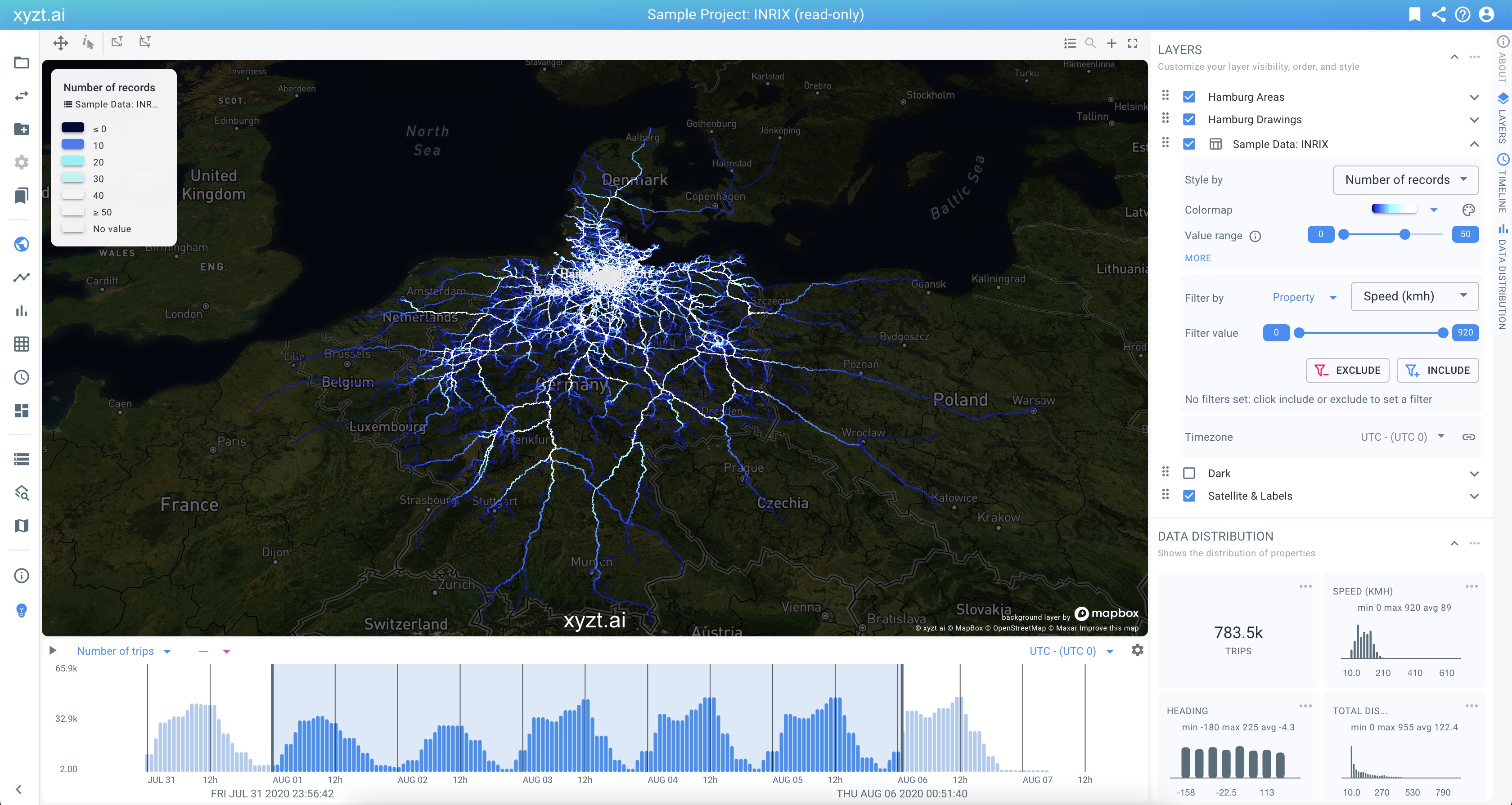 Figure 1. Movement data: floating vehicle data for traffic analysis.
 -
Movement path data is data consisting of trips, traces, vehicles… following routes along a traffic network. The most common case are trips along a road network, but you can also work with rail networks, maritime networks, internet network representations, and more. This data requires the definition of the network to be defined first as geometry data. The movements along the network can then be uploaded as (gzipped) CSV or Parquet files.
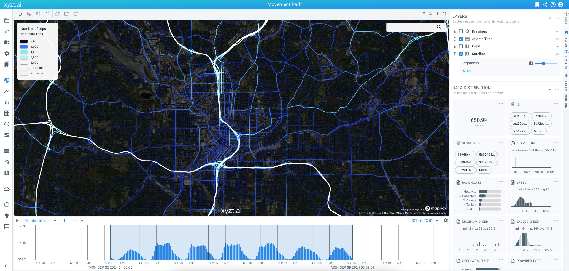 Figure 2. Movement path data: map-matched floating vehicle data for traffic analysis.
 -
Point data is data consisting of unrelated records, each with its own location and time stamp. Each record can additionally have optional other properties. Events data are a common use case of points data with a timestamp. Examples are vehicle accident events data or harsh car breaking data. Simple statistical location-based data are another common use case; an example is the location of all houses in a municipality, with for each house the number of residents.
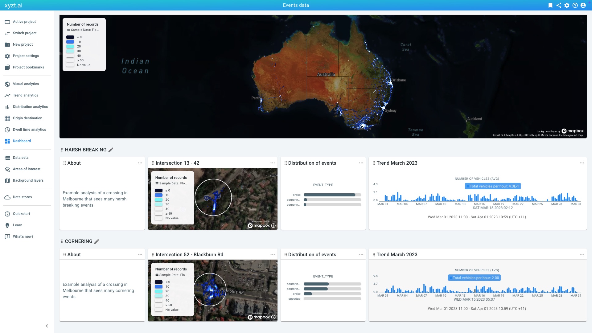 Figure 3. Dashboard comparing dangerous road events such as harsh breaking and cornering in different intersections in Melbourne, Australia.
 -
Time series data is data that varies over time and that is defined for fixed areas. Areas can be sensor locations, city neighborhoods, street crossings,… and are defined as shapes in (gzipped) GeoJSON files or zipped SHP files. The temporal data are records at different times for each shape, where a record consists of a shape identifier, a time stamp, and (possibly multiple) attributes such as humidity, number of pedestrians,… The platform accepts this data as (gzipped) CSV or Parquet files. You can specify your own format.
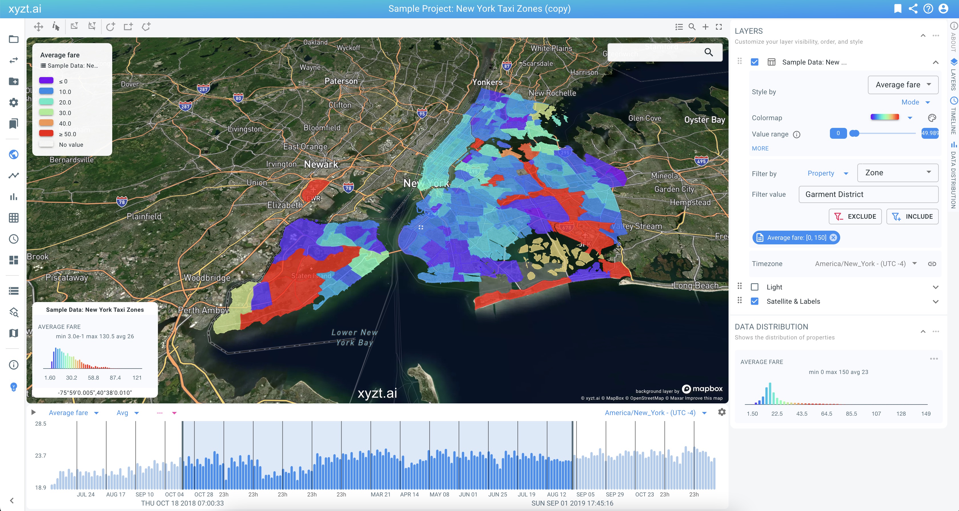 Figure 4. Time series data: aggregate taxi fare data for multiple zones in New York.
In addition, you can attach background layers (Mapbox, OGC WMS, GeoJSON, SHP,…), upload areas of interest (GeoJSON/SHP), and create drawing layers used during your analysis.
Extracting insights
The platform provides multiple pages dedicated to specific analytical tasks to extract insights:
-
Visual Analytics is the main analytics page, where the data is shown on a map, a timeline, and in bar charts showing distributions of the data properties. The visual analytics page allows you to filter, style, and compare data sets in multiple ways.
Learn about Visual analytics in this article.
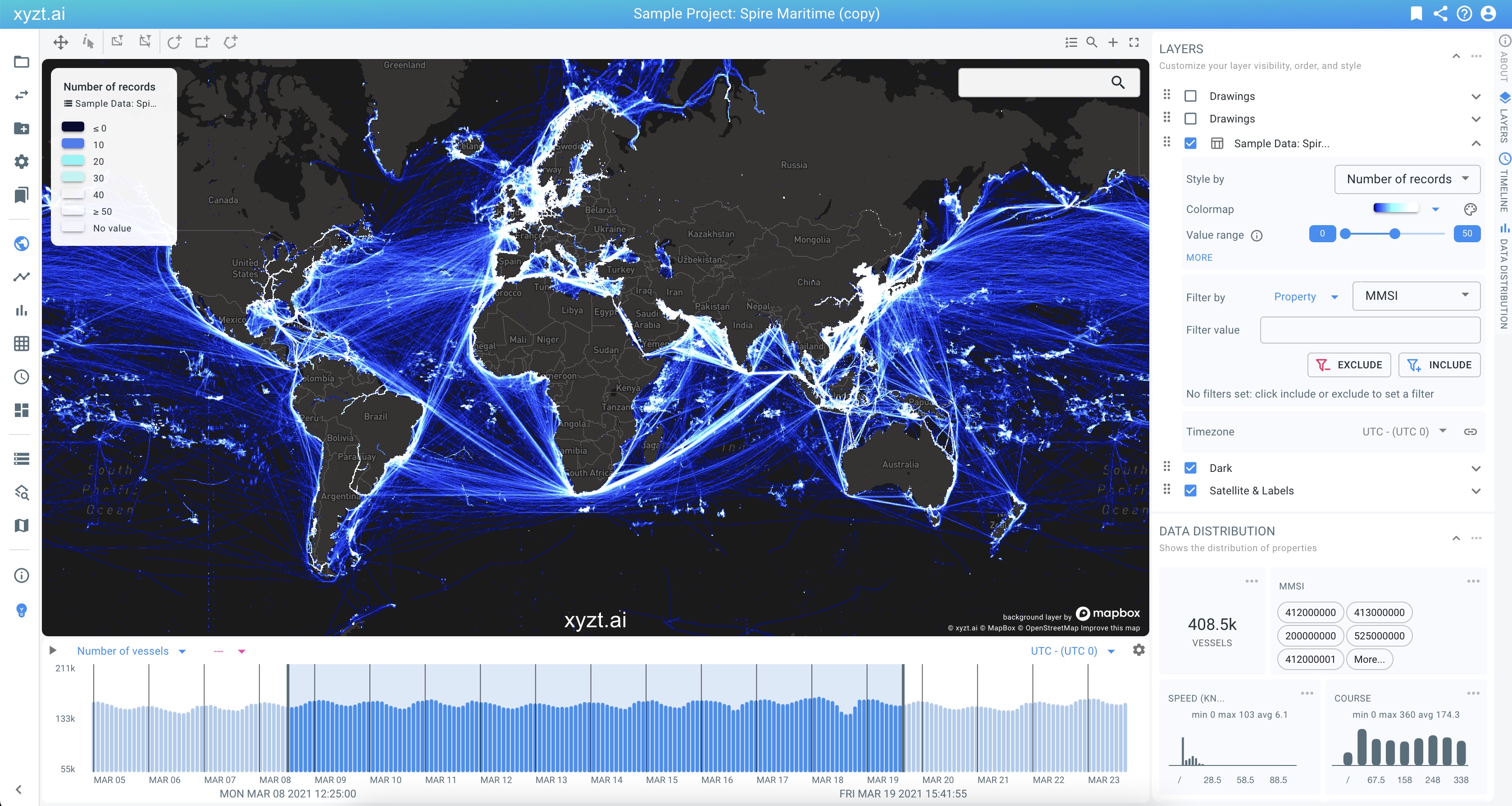 Figure 5. Visual analytics
 -
Trend Analytics focuses on trends in your data. For example, is traffic increasing or decreasing, and by how much?
Learn about Trend analytics in this article.
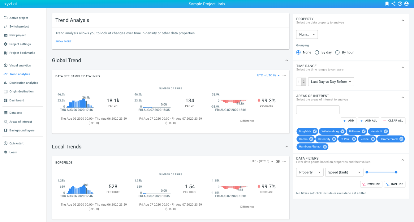 Figure 6. Trend analytics
 -
Distribution Analytics analyzes distributions of properties in your data for different periods and areas. This is sometimes also called segmentation analytics. For example, a retailer can use mobile device data to analyze the distribution of age groups visiting a shopping mall.
Learn about Distribution or segmentation analytics in this article.
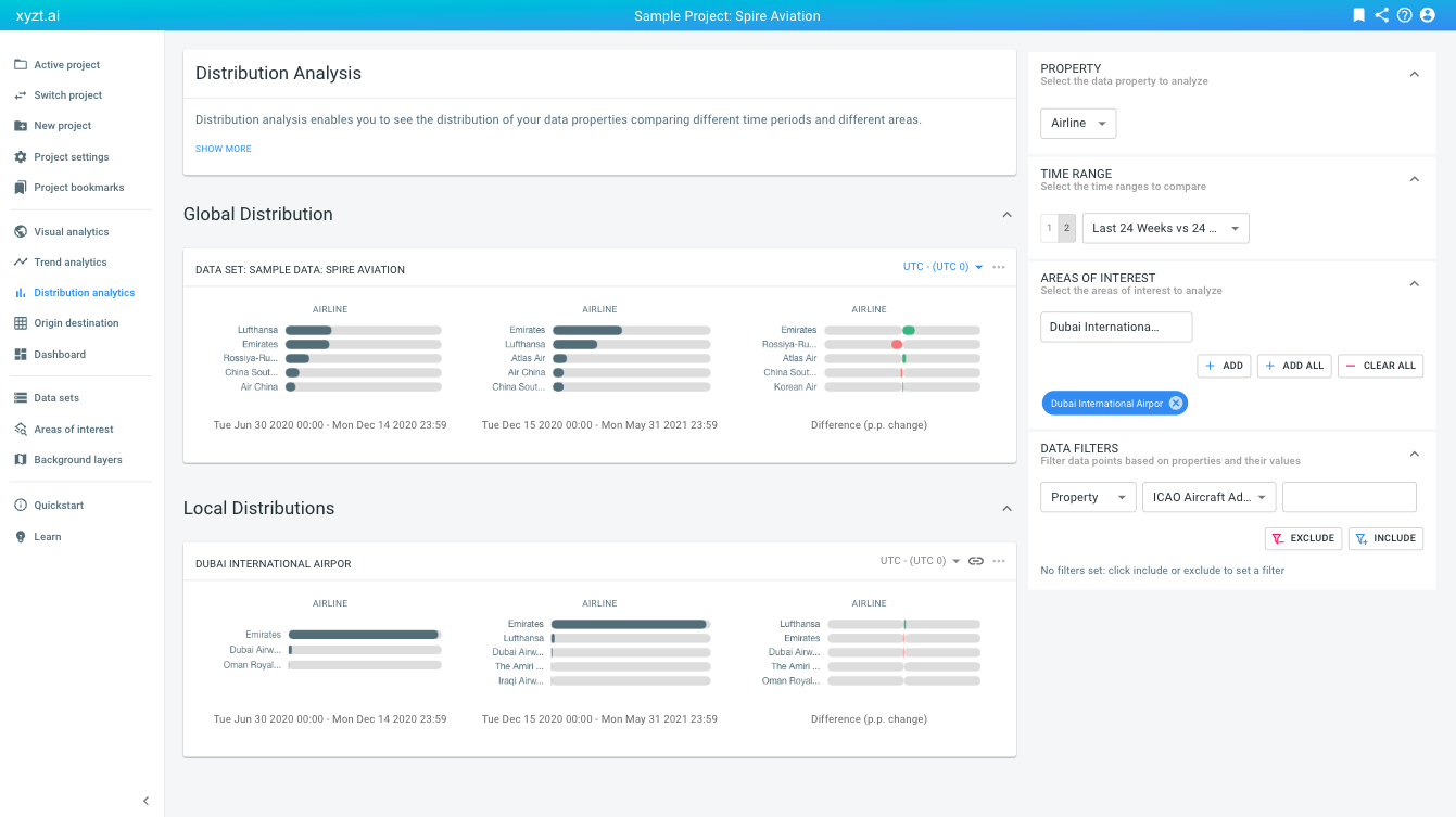 Figure 7. Distribution analytics
 -
Origin Destination looks at traffic or movements between different regions, for example counting the number of trips between the different neighborhoods in a city. It also provides information on travel times.
Learn about Origin destination analytics in this article.
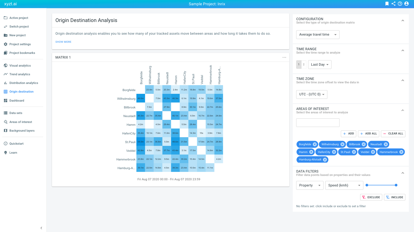 Figure 8. Origin-destination analytics
 -
Dwell Time looks at how long one spends in different areas. For example, how long do people spend in a shopping mall, or how long do vessels have to wait in an anchorage zone.
Learn about Dwell time analytics in this article.
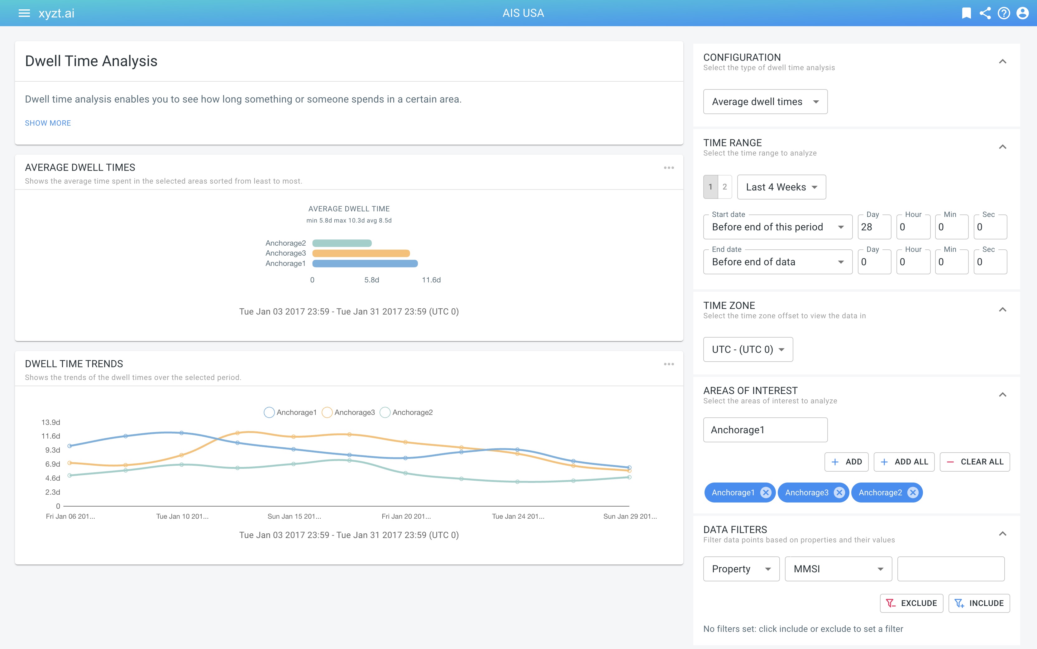 Figure 9. Dwell time analytics
Sharing insights
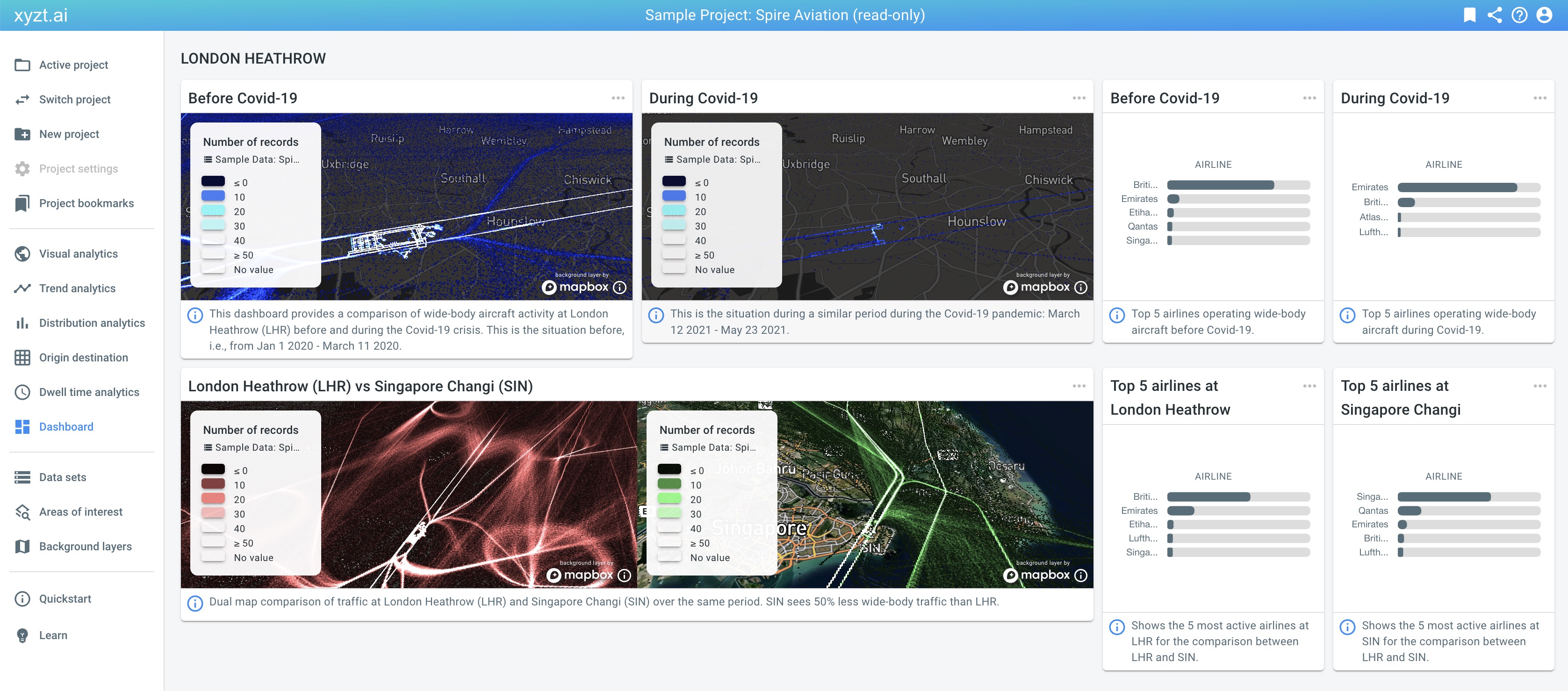
You can build informative and beautiful dashboards with advanced widgets, including the map, trend lines, and bar charts from all the analytics you perform and insights you extract. All analysis that you perform in the platform can be shared with your colleagues and customers.
Learn about saving and sharing your insights in this article.
Continue exploring
Why don’t you continue exploring the platform by watching a platform demonstration video or by following one of the step-by-step tutorials? Such as the introduction to maritime intelligence, or the introduction to traffic analysis with floating vehicle data.