Got feedback? Additional questions? Just want to have a friendly chat?
Get in touch!
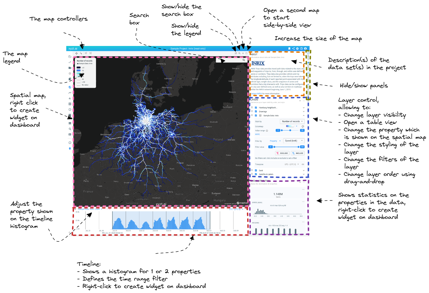
UI overview
Figure 1. Overview of the Visual Analytics page UI
Going clockwise, the visual analytics page has the following UI elements
-
The map controllers to interact with the spatial map. Check the tooltip of each controller for instructions on how to use them
See this article fore more information on how these controllers can be used to apply spatial filtering on your data.
-
The search box in which you can type place names. On entering a value, it will navigate the spatial map to that location.
-
Show/hide legend button: toggle the visibility of the legend on the spatial map
-
Show/hide search box button: toggle the visibility of the search box on the spatial map
-
Open second map button: create a second map and start doing side-by-side comparisons.
-
Increase the map size button: you can increase the map size twice compared to the default size.
-
Description of the data set: when you create a data set, you can enter a description. That description is shown here.
-
Hide/show panels: you can customize which panels are visible on the page.
-
Layer control: each of the layers present on the spatial map is shown in this layer control. You can change the layer order and layer visibility.
For data set layers, you can also adjust the filtering, select the property visualized on the spatial map and adjust the styling. The following articles explain how to define a spatial, temporal or attribute filter.
For GeoJSON/SHP layers, you can also adjust the fill, line and text styling.
-
Data distribution: here you see statistics about your data set. Learn also how to put widgets in focus.
-
Timeline: the timeline shows a histogram and is used to define the time range filter.
-
Timeline property: here you can choose which property is shown on the timeline histogram.
-
Spatial map: the spatial maps shows where your data is located and is used to define a spatial filter.
-
Legend: legend explaining what the colors on the spatial map represent.
Got feedback? Additional questions? Just want to have a friendly chat?
Get in touch!