
Got feedback? Additional questions? Just want to have a friendly chat?
Get in touch!
Available parts
Step 6: Exposing the geometries as areas of interest
By default when you create a time series data set (and a geometry data set), the geometries of the data set can be visualized, including data-driven styling.
If you also want to use the geometries as spatial filters within the data set or for another data set, you can expose the geometries as areas of interest as follows:
-
Click on General Settings at the top
Figure 1. Go back to the general settings. -
Check the box next to Make the geometries available as areas of interests
-
Click SAVE
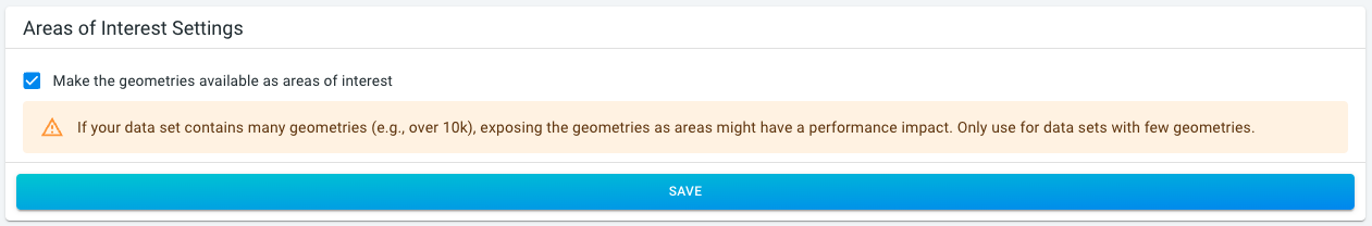 Figure 2. Expose geometries as areas of interest.
|
Only expose areas of interest when needed and for small data sets
If your data set contains many geometries (e.g., over 10k), exposing the geometries as areas might have a performance impact. Only use for data sets with few geometries. |
Step 7: Use your data set
Once processing is finished, you can start analyzing your data set. For this, you will need to create a project and add the data set to it.
Follow these steps:
-
Click on New project on the navigation panel on the left.
-
Provide a name,
Taxi ridesand optional description (we leave it empty for now), click CREATE PROJECT. -
Attach our data set:
-
Click on Data Sets on the navigation panel on the left.
-
Click on YOUR DATA SETS (…).
-
Click on ATTACH on the New York Taxi Data card.
-
-
Add a background layer:
-
Click on Background layers on the navigation panel on the left.
-
Click on the ADD BACKGROUND LAYER button in the top-right corner.
-
Select the Satellite & Labels Mapbox layer and click ADD MAPBOX BACKGROUND LAYER.
-
Click on SAVE.
-
We now have a project set up with our uploaded data and a background layer.
Click on Visual analytics to see your data on the map. You can now change the color map, or choose which attribute to analyze, apply filters, etc.
Next part
Go to the next part: Further reading
Got feedback? Additional questions? Just want to have a friendly chat?
Get in touch!